Your website is there to sell. Sure, it should look great and sometimes make your readers laugh. It should have fantastic photography, easy-to-blog posts, and excellent product and sales pages. But never forget: Your website is there to sell. In this comprehensive guide, you’ll learn the top three ways to improve and optimize your website conversions rate, boosting web leads and making more sales.
The Problem With Most Websites Is…
A web designer creates them. (No offense to web designers—I am one, too.) Most web designers are focused on design and not on your business goals. Unfortunately, your website is not online just to look good; it’s there to sell (I’m repeating myself so you don’t forget).
Designers love to create stunning graphics and amazing scrolling parallax pages with all manner of bells and whistles. They enjoy design, and who can blame them?
They usually don’t drive visitors to your website goals through the strategic use of website elements and SEO.
The designer, or their employer, focuses on the job at hand – website creation, not on your goals. That is why I approach web design differently, with the end in mind (sales). And you should too.
How Can You Make Sure To Fix Your Website?
Here are some of the many ways you can improve your website to attract more customers. Comprehensive guide to learn the top 3 ways to improve and optimize your website conversions rate, boosting web leads & making more sales.
1 Focus On Your Homepage For Better Conversions
The most popular page on your website is often the homepage, so you must be driving visitors to your primary business goal from there. This goal could be:
- Learning more about your business
- Signing up to your email list
- Discovering your best-selling product
And so on. It is different for each business and changes with the business and time of year.
Note: Be careful not to jump in and assume everyone will buy or call on their first visit. Mainly if you sell an expensive product or service.
Here is an example from Keap, where they encourage visitors to their homepage to try out their software:

Action Steps: Review the top area of your homepage and ensure that you are driving visitors to your website’s number one goal. Exit-intent pop-ups are also great for converting customers.
Call to Action (CTA)
Your website has to have a clear and strong call to action (CTA). What can this CTA be? Here are some options:
- A simple question that your prospect is called to reply to
- A link to your calendar so that the prospect can book a call with you
- A link to your portfolio to let your prospect learn more about you to better conversions
The problem is that most people are afraid to take the lead and add a strong CTA when they build websites. Alternatively, companies often include a CTA that’s too sales-y. If your CTA is weak, your prospect may not bother replying at all or may simply forget to get back to you.
The CTA we’ve chosen—the action we want our prospect to take next—is booking a meeting on our calendar. They must book a meeting instead of us booking it for them because it changes the dynamics of the relationship entirely. When “them” (the prospect) book a meeting, we have the lead and present ourselves as a solution to their problems. Keep reading this tutorial to learn the best 3 methods to improve & optimize your website conversions rate, boosting web leads & making more sales
2 Ensure Your Visitors Can Get In Touch (As Easily As Possible) Boosting Web Conversions
Another fundamental website issue is not allowing visitors to get in touch as quickly as possible. After all, you do want to hear from your potential (and even existing) customers.
I am sure you have a contact page (or at least I hope so), as this is one of the most critical and common pages visitors will look for when wanting to
- get in touch online (your email or a contact form)
- write to you by mail or visit your store (i.e. your address)
- give you a call (your phone number or hotline)
However, there are other ways to make this task easier, especially if you have a physical location and phone number.
Add It To The Header to improve the website for better conversions
The header is often, if not always, present, so why not use it more?

Like this header from a niche hosting company called Krystal, they ensure that their phone number, support website, and email are in the header so their clients can easily get in touch (on any page and at any time). This makes it easier for existing and new clients to find and contact them for boosting web conversions.
Add It To The Footer to improve the website for better conversions
Another commonplace to provide all of your contact details is in the footer. Similar to the header example above, but now you have a lot more space.
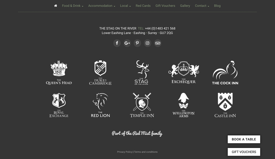
An example from one of my favorite restaurants (The Stag On The River) in Godalming, UK (close to where I live). They have a footer that not only provides all the information you need to get in touch but also their sister restaurants and a reservation link. They are thinking of how to make your life easier!
Action Steps: Place your business contact details in as many locations as possible (header, footer, contact page, etc.) so that people can easily get in touch. as a result, a great way to optimize your website for more conversions.
3 Focus Your Navigation On The Most Important Things to Optimize Website For More Conversions
You may not realize it, but what you put in your navigation (aka menu) is heavily influencing your visitors. It is actually one of the most clicked-on areas on your website (it is on every page) and is, as a result, very powerful. So, you need to seriously consider what you put in the menu because these links drive visitors to these linked-to pages more often.
I have had to seriously rethink my navigation recently because:
- space is limited when you include a logo and take mobile into consideration
- less is more when it comes to choice (you may have heard about the famous Jam study)
So, when you create your next version of your website navigation, break it down, think about it again, and then do it again.
- What are the most critical pages on your website (sales pages, product pages, contact, about, blog?)
- Can some be placed in a sub-menu with the main item summarizing them all
- Can some be placed in the footer as they are not used and don’t drive business goals (terms and conditions, team, jobs)
Examples to improve the website for better conversions
Here are two great examples to give you an idea of how different industries tackle this problem:
Coschedule offers blog editing and scheduling software for WordPress, focusing on getting people to sign up for their product. So, their menu is limited to the areas their potential customers care most about.

You can even see their blog (which is excellent, by the way) on the menu. They are laser-focused on their business goals!
Chris Drucker is a famous marketing entrepreneur with some areas of his business that he focuses on. These include his podcast, speaking engagements, and giving access to his private membership. As you can see, they are all focused on the menu (as well as his contact, about, and blog).

Action Steps: Look at your menu, see what could be improved, and focus on the most important elements—the things that move your visitors closer to buying. Now, you have a number of ideas about what could be improved on your website. Take a little time to review and improve your website every month.
Review all of the following to improve the website for better conversions
- Your homepage – taking into account your primary business goals
- How easy it is to contact your business – add where appropriate
- How focused your menu is – adjust according to the most useful pages
It will lead to more customers, and I can assure you of that.