Content management systems and various site builders may have made website creation possible for non-developers, but that doesn’t mean you can just go around, slap some page elements together and hope for the best. We’ll explain how to do it right and share the anatomy of a great website and sales page that really converts.
It still requires a certain degree of skill and digital marketing acumen to create a website that can effectively achieve your online goals.
For most brands transitioning into the online world, it’s usually about closing more sales or generating more leads. Unfortunately, these goals require more than just a flashy site with loads of visuals.
In this post, we’ll dissect the anatomy of a website that excels in converting visitors into subscribers or paying customers.
Let’s jump right into it.
1. A User-Oriented Design
What does it mean for a website to be user-oriented?
Remember, as a web developer, the website you’re creating isn’t for yourself or the client who hired you. You’re doing it for the target audience who will visit the site and utilize its resources.
That said, your priority is to make sure you choose a layout that makes sense to what your visitors want to do.
Are they there to learn something new? Will they come to your site expecting full-length blog posts or a digital storefront?
By answering these questions, you can determine which page elements must be highlighted on your website, such as:
- Your call to action
- An opt-in form
- An explainer video
- A pricing table
You can probably inject a couple of branded images in there. Still, you need to maximize the visibility of conversion elements while presenting them in a way that resonates with your target audience.
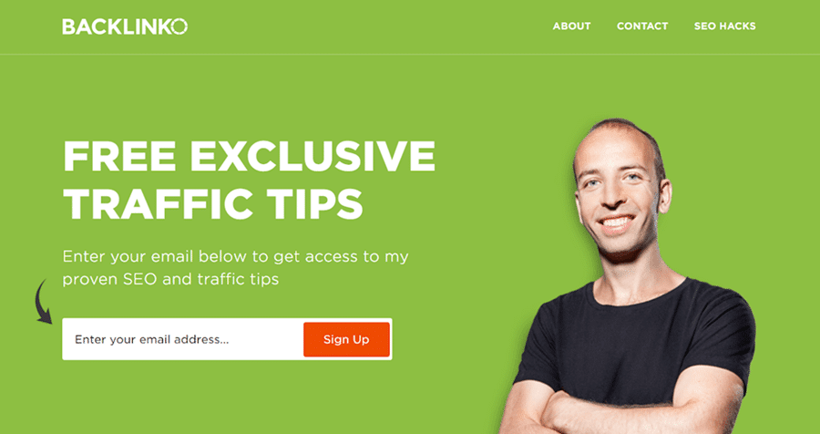
Marketing thought leaders like Brian Dean, for example, play by the rules of clutter-free web design as well:
Another example would be the BuzzSumo website, which makes no room for distractions and gets straight to its value propositions:
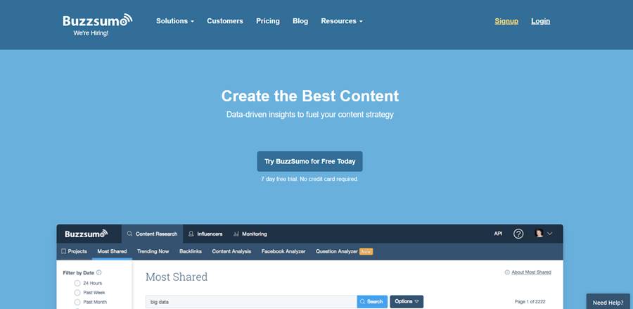
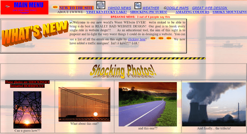
The key takeaway here is simple — identify the elements users need to move forward and let them take the spotlight. Otherwise, you might as well go for something like:
2. Mobile-Friendliness Sales Website Anatomy
It’s 2018 — you should already know that more internet users are coming from mobile devices than personal computers. But you can probably still get off the hook even if you don’t.
The dominance of the mobile internet has prompted website platforms to support more responsive themes than ever. These work by automatically adjusting, repositioning, and scaling page elements to match different display sizes.
However, a responsive theme is sometimes not enough to deliver a compelling experience to your mobile users. You must also optimize your mobile site content to make the experience as smooth as butter.
For example, a wide aspect ratio image may look good on a desktop browser. But on a mobile device, viewing them doesn’t exactly feel natural.
A better strategy is to incorporate long-form infographics to take advantage of the vertical displays of smartphones and tablets. Users only need to swipe the screen up and down to view all the information they have to offer
To access more detailed resources on how you can improve the mobile experience on your website, the only surefire way is to run your website through the Google Mobile-Friendly Test for a full breakdown of what can be improved.

3. Trust-Driven Content
Whether you like it or not, the vast majority of your audience won’t convert on their first visit, regardless if you have the most amazing website in the world — mobile or desktop.
Don’t worry, and it’s in a consumer’s nature to view any unfamiliar brand with a grain of salt. You need to win their trust first by presenting them with trust-driven content.
As the name suggests, this can be anything that can help build your brand’s trustworthiness in the eyes of your audience. Common examples include customer reviews, testimonials, accreditations, and other user-generated content or UGC forms.
Of course, there’s no one-size-fits-all solution when trying to present trust-driven content on your website.
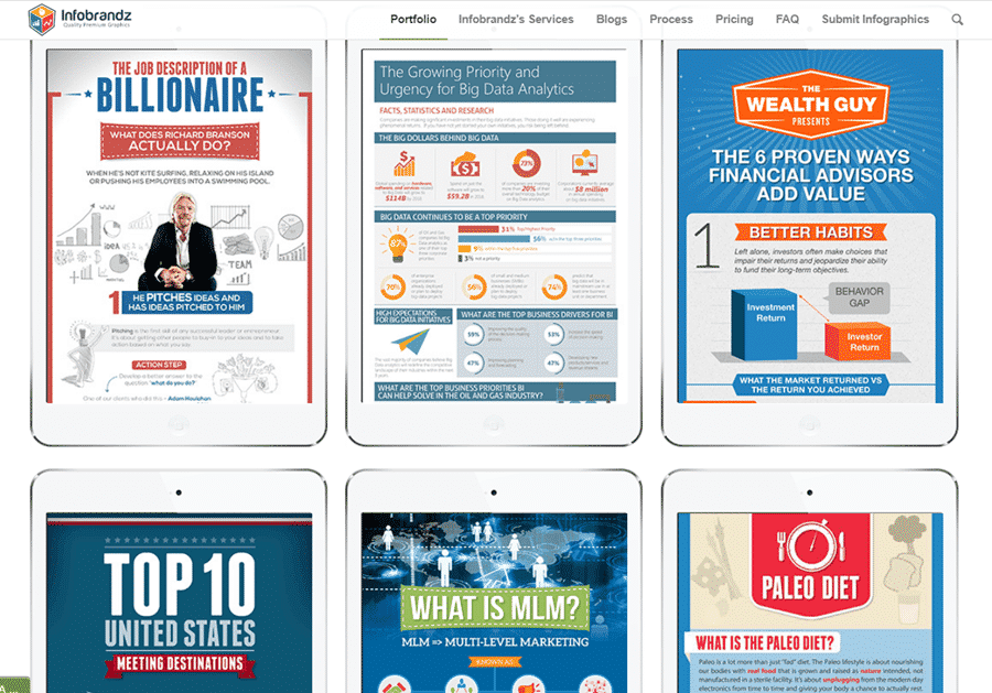
For creative agencies or freelancers, your professional portfolio is often the only trust-driven content you need to convince your prospects to convert. To give you an idea of how this works, here is an example portfolio from an infographic design agency:
It’s also a good idea to associate brands your target audience may be familiar with. For instance, marketing professionals tend to showcase a list of all the sites they’ve been featured in:

Lastly, informative blog posts deserve a place in the content strategy of any site. Not only will they help you establish your authority as an information source, they can also positively impact your website’s rank worthiness — as long as you consistently publish relevant content.
Need to concoct a content strategy? Apart from BuzzSumo, below are other content research tools that will help you get started:
- Google Trends
- Ubersuggest
- Scoop.It
- Ahrefs
- Semrush
4. Website Loading Performance: Sales Website Anatomy
If you genuinely want maximum conversions, you need to look at factors that aren’t found on the website itself. So, pay attention to this part of the sales website anatomy.
Loading speed, for example, is possibly one of the biggest bottlenecks in your website’s conversion performance.
A recent study by Google reveals that a whopping 53% of mobile users would coldheartedly abandon a website if it takes a little over 3 seconds to load. This statistic is reduced to only 40% for desktop users, but that’s still a considerable loss, especially if you think about how hard it is to get traffic to your site in the first place.
Regarding website loading speed, one of the best strategies to benefit any site is leveraging a Content Delivery Network or CDN.
In simple terms, a CDN is powered by a network of globally-distributed servers to host and transfer content. Whenever a user from a particular location tries to access your site, the nearest network or “Point of Presence” works to deliver the site’s data — effectively eliminating any latency that may result from long distances.
Big ol’ Google also has a handy tool that can hold you by the hand as you try to find ways to speed up your website.
With PageSpeed Insights, you must enter your website’s URL to run a thorough analysis. The tool will then detect the specific issues that affect your website’s loading times — right before it shows you “Optimization Suggestions” that will help you fix them.
5. The Website Title For The Sales Page
Consider the last print journal you read, whether it was a newspaper, magazine, or something else. How do you choose which articles to read and which not to? Title. You’ll move on without reading the report if the headline immediately grabs your attention and piques your interest.
The same idea applies to your website sales page; a catchy headline is essential to convince visitors to stay and read more. To increase the likelihood that you will stop and read a story, newspapers often use both the main title and a subtitle.
However, on an online sales site, you need to use three different headings:
- Firstly, the “Gotcha” Headline
- Secondly, Main Headline
- Finally, the “Still Gotcha” Headline
If you want the best results, you must use them precisely for particular reasons.
Gotcha Headline Usage
This is the title that visitors initially see on the site’s sales page. It doesn’t have to be very large or very long. However, it has to pique the interest of the potential customers you care about.
For example, if your main prospect is a teenager, you would write it this way, but if your main prospect is an elderly person, you will write it differently.
Main Headline Usage: Sales Website Anatomy
The most comprehensive, eye-catching, and concise summary of the product’s key selling points to the dream customer is in this header, making it the most important on the entire page. It has to be large enough that readers can’t ignore it when they jump from one page to another.
What matters most, however, is how your prospect feels after reading that headline. If you can engage them emotionally, you have a good chance of converting them from an opportunity to a customer.
Third Headline
Many sales page sites don’t use a third header, which is a big mistake. Why? This type of headline gives potential customers a clear idea of what benefits or benefits they might get from their purchase and helps reinforce the message conveyed in the main headline.
Using too many words and lengthening titles is one of the worst mistakes you can make when using these titles. Remember that a few well-chosen, adequate words have a far more significant impact on your target audience than many words used in a lengthy statement.
Conclusion For A Website That Sells
There you go, the anatomy of a conversion-ready website — or a well-oiled conversion machine.
Of course, none of the tactics shared above is guaranteed overnight success. These may be ready and working by basically every other successful brand out there, but you still need to be patient with them.
Remember, the best accomplishments take time. So, be prepared to give as long as it takes until your efforts finally bear fruit.


