Which colours work best for you, and which ones work well together?
Colour theory for headshots, learn how to achieve colour harmony. At a basic level, colour theory is the concept of using colours to create a specific impression on the viewer – so how does this apply to headshot photography?
Headshots are some of the most critical portrait photos that we can take of ourselves. They are often our introduction to new jobs, customers, and life partners!
Splento are professional photographers who understand the power of correct colour use in headshots – they can create stunning headshot photos for you at a fixed cost (including retouching) and deliver the finished photo within 24 hours.
Colour theory has been known since Sir Isaac Newton created the colour wheel in 1666, but colour theory in photography – or more specifically, colour theory in headshot photography- is important to understand as it can dramatically affect a person’s reaction to your headshot photo.
Colour theory for headshots involves recognising the colours that harmonise, and those that complement, with others, to make an image more appealing. And here, we will outline how it all comes together, leaving you with a better understanding of the colour harmonies for your headshot photography and learning how to achieve colour harmony.
Colour Theory in headshot photography
When considering the look of your headshot, you need to reflect on both the background and your apparel and how they will work together.
The two need to harmonise (see below), but before we get that far, we need to realise that the colours we choose for our headshot will highlight or hide aspects of our personality.
Broadly, darker colours will make you appear more dominant, whereas lighter tones will give you the impression of being more friendly and approachable. So with that said, let’s dive into the colours and how they affect your headshot image.

Headshot photography colour harmonies theory and tips
Different colours create different feelings in people and can produce varying responses as people look at your headshot photograph.
Once you have decided on lighter / darker, you can begin to think about specific colours. As you will see below, colours communicate – and the colours you wear / use as a backdrop can speak louder than the face in the photo! So choose your colours carefully when selecting. And also, there is a lot more that can be said about colour theory when shooting a headshot and which colours to choose for a portrait photograph, but we can only give a brief overview here.
Aside from this, you may also need to keep in mind your company brand colours, if you are required to do so, but even if you have free rein, think about which colours are associated with your specific profession, if any. For example, green is often associated with health, and blue is often connected with financial institutions.
Here are some of the main colour groups and the message they can highlight in your headshot photo:
Cooler colours
Cool colours like blues, greens, and purples make us feel relaxed, confident, and calm. Blue tones can have a very soothing effect on a person.
Consider blue tones for creating a sense of trustworthiness, professionalism, and honesty with formality (darker blues).
Purple tones generate an atmosphere of sophistication and luxury – for centuries it has been associated with royalty and wealth.
Meanwhile, greens connect to nature and evoke a sense of calm, serenity, and peace.
Warmer colours
In contrast, the warmer yellows, oranges, and reds are more emotional, passionate tones. And also are great for conveying a sense of energy and vibrancy. Warmer colours, especially reds, communicate energy.
Yellow tones speak of positivity and optimism. It is the colour of summer and happy times.
Similarly, achieving orange is a very positive colour harmony, creating a sense of informality and creativity.
Red, meanwhile, evokes strong feelings in the viewer, such as passion, energy, and attention-getting.

Colour Harmony in headshot photography
So how can we begin to understand how to achieve colour harmonies in headshot photography?
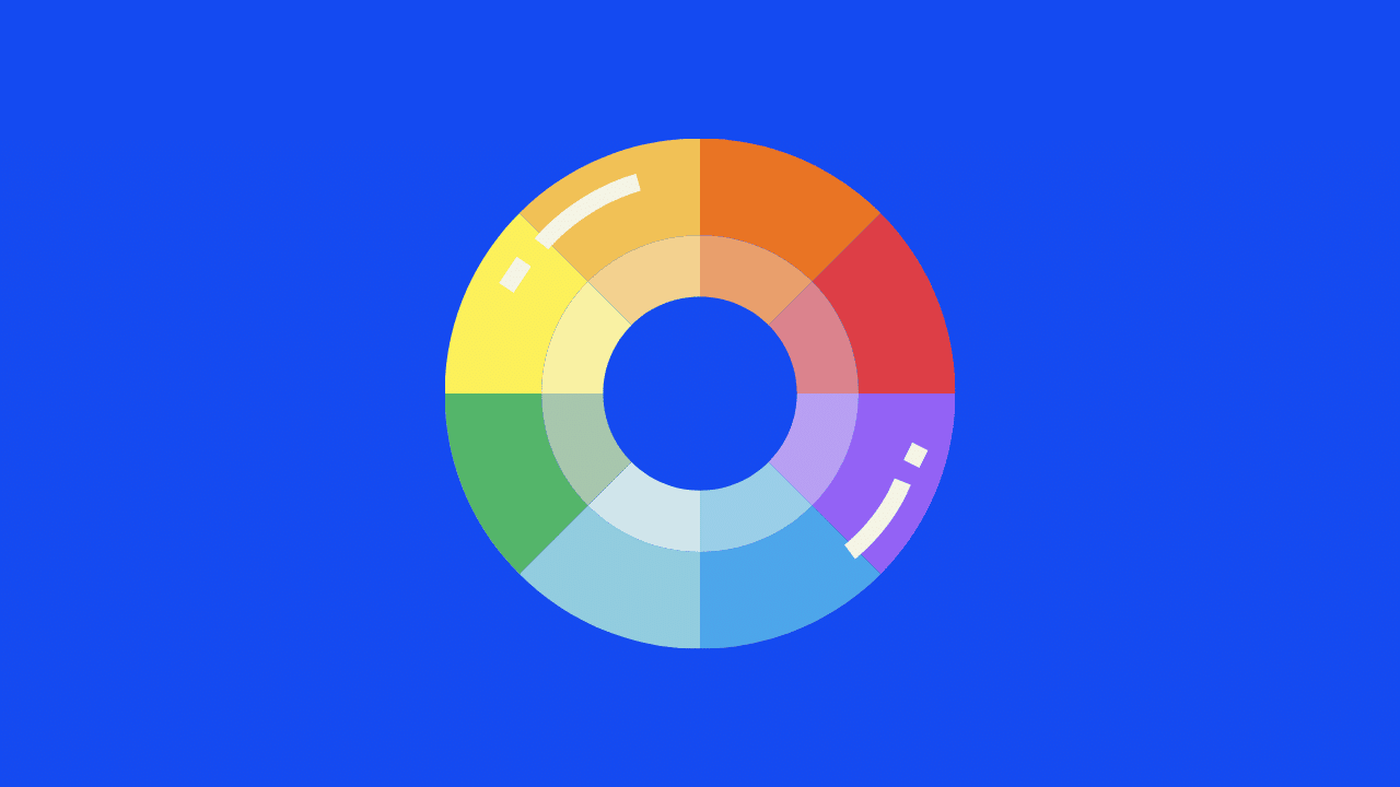
Here, we will turn to the modern colour wheel, which you have no doubt seen before in one form or another.
The colour wheel has three primary colours, red, blue, and yellow. So, all other colours are made by mixing these three in various ways.
As shown in the diagram, you can create various colour harmonies. That is, colours that work well together, depending on the effect you are trying to create for your headshot image.
Complementary colours harmonies in headshots
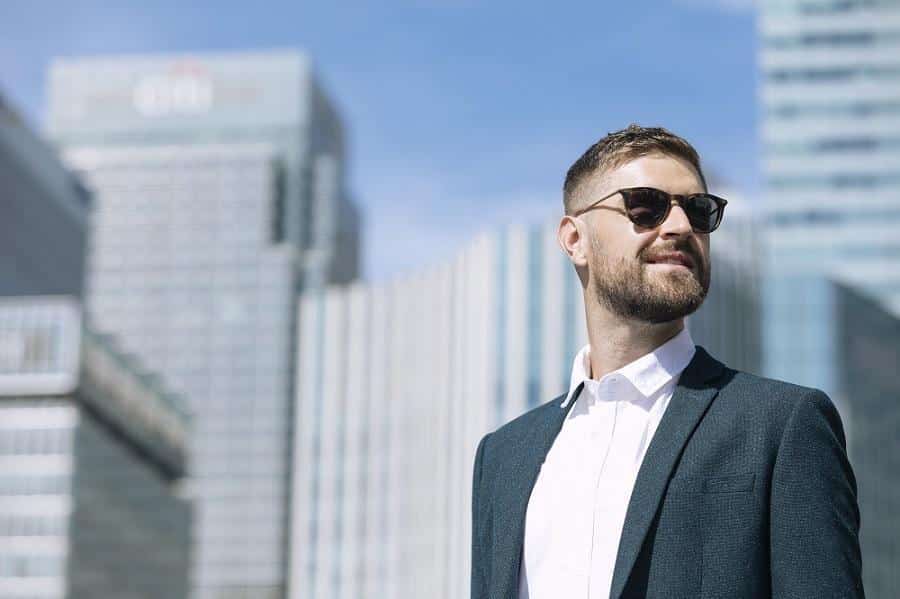
Complementary colours are always direct opposites on the colour wheel, such as yellow and purple. However, if you combine them in your headshot photo, for example, wearing one colour and using the other as background. They will provide great contrast and will ‘pop’ you out of the background. And here is an example of a great headshot utilising the blue and orange complementary colours.

Split-complementary colours in headshots
If you like the idea of using complementary colours but want to add a little subtlety. Then go for split complementary colours. Find your complementary colour on the colour wheel (opposite your main colour) but then look to the colours on either side of it. These are the split complementary colours. They still provide ‘pop’ in contrast to your primary colour, but the effect is a little subdued.
Analogous colours in headshots
Analogous colours on the colour wheel harmonise beautifully – they sit next to each other on the colour wheel, and instead of a colour pop, they provide smooth continuity. The main colour dominates, one of the ‘next door’ colours supports it, and the third one provides accent. This is a great example of colour harmony in a headshot photograph – note the various blue-based tones used throughout the image.

Monochromatic colours harmonies in headshot
Monochromatic colours are different shades, tints, and tones of the same colour. And Monochromatic photos tend to highlight shadow and textures and create a very different vibe from your headshot image. Moreover, you may not want to try this at first with your headshot photo. But experiment and also see what you come up with! And remember – a black and white headshot photo can look stunning – and they are all monochromatic!
Looking for a great headshot photo?
So, if you’re looking for professional photos for your business, love, or just to update your social media profile. Take time to think about the impact your colour schemes will have on the final image and the message it sends. And consider using a professional for what can often be one of the most important photos we ever take of ourselves.


