See the most common contact page mistakes in design and creation and how to avoid it.
If your business website’s goal is to get in touch with (potential) customers, you should avoid a number of contact page mistakes. Here, we’ll mention the errors we find most annoying. And we’re not unique in that.
Common Contact Page Mistakes
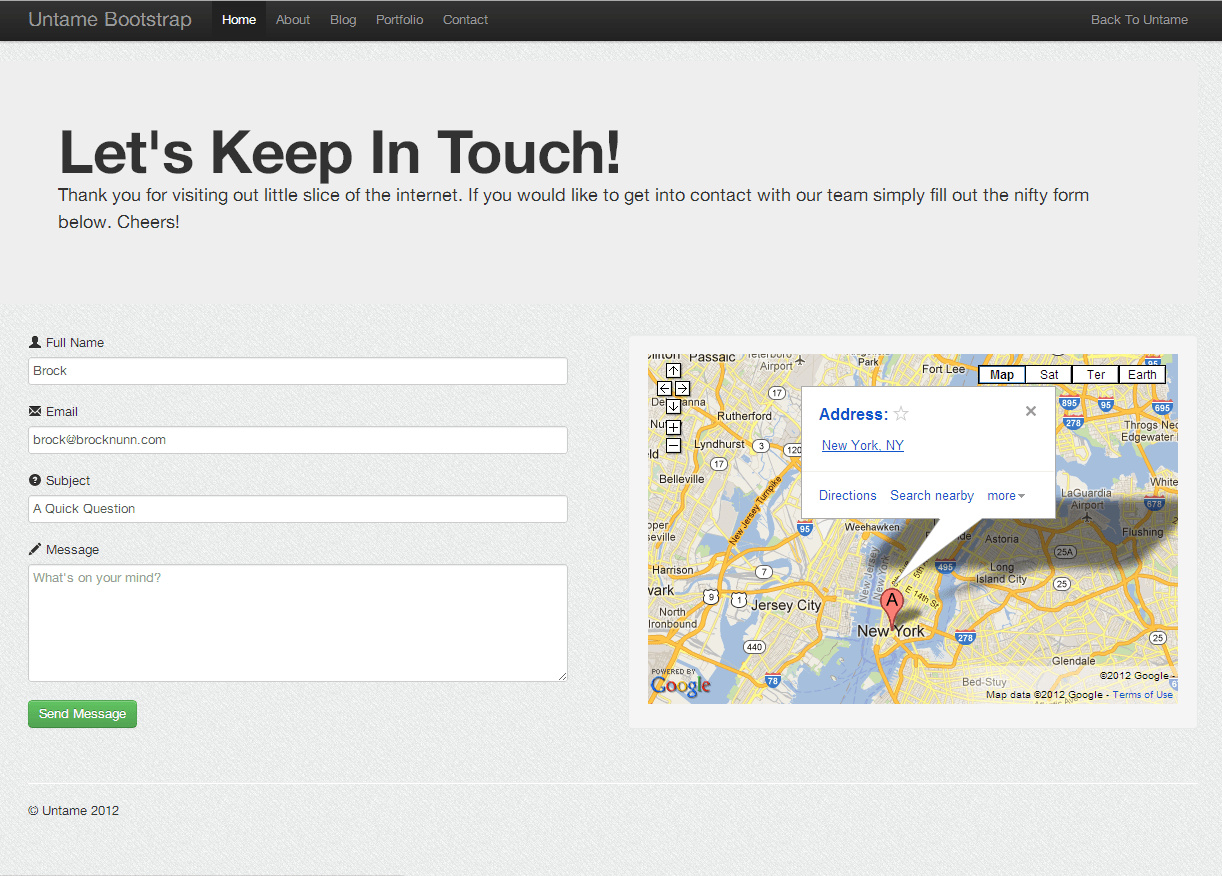
In my previous post about contact pages, I already mentioned that the right content on this page could improve both user experience and SEO. In the comments on that post, Simon asked: “What do you think are the 5 most common mistakes on a website contact page?” What I think are the most common mistakes make it my list, so I decided to dedicate this post to what I find the most annoying 🙂 Let’s dive straight in with number one.
Just a form
If your contact page consists of a form and nothing but a form, you are not serving all your visitors. Naturally, there will always be people that don’t understand the form. Provide a fallback option, like an email address or a phone number. Here are some reasons why people might dislike/do not understand your structure:
- Your form is too long. People get lost or simply don’t take the time to fill out everything you want to know. Keep documents short and precise.
- Your form isn’t responsive. This ruins the mobile experience on your contact page. Labels might get lost, as a mobile browser will focus on the form fields.
- Your form can get broken. Perhaps you missed an update of your favorite contact plugin, just to name one reason.
Fancy names for your contact page: Common contact page mistakes
Don’t you just hate when you have to do an internal search on a website just to find their contact page? In my opinion, there are two options:
- Add the menu item “Contact” to your principal and/or footer menu.
- Add your contact page at example.com/contact/.
I won’t look in any other spots. It’s straight to your search or back to Google to find the next company that’s going to answer my question. Preferably, you want that link to your contact page to be above the fold. But I have to say that a footer link is common as well, both as an extra and as the primary link.
Just like the link in the URL, I’d like the title of that page to be “Contact” or a variation of that, like “Contact us” or “Get in touch.” Don’t use “Let’s talk business” or whatever strange sentence that won’t cover the immediate goal of the page. It will confuse people, even Google already. Make it clear that this is the page where they can contact you.
Outdated information
C’mon people. Like all your other pages, your contact page needs some tender love and care from time to time. Moving offices? Adjust your website. New sales rep? The change profile picture and email address. Make sure your information is accurate at all times.
Don’t take this lightly. I think outdated information is one of those contact page mistakes that we choose to ignore sometimes. “I’ll get to that one of these days.” “It’s on my to-do list.” No, update it when it changes. And if your address changes, let Google know in the process.
Make sure people can contact you privately

That means “Reach out to me on WordPress Slack,” “Talk to me on Twitter,” or even “Drop a comment below” isn’t enough. And yes, contact pages that use a comment form as a contact form do exist. People that want to talk to you probably just want to talk to you. Make sure they can.
Is it wise to display links to social profiles on a contact page? I believe that only makes sense if you want people to contact you on, for instance, Twitter, and you monitor these social profiles for questions. If you mention Instagram on your contact page and don’t check Instagram at least every other day, it’s probably not the preferred way to contact you. In that case, that link shouldn’t be on your contact page. Best case scenario: two options to get you privately (form and email address or phone number would be an excellent start), so visitors can use the other if one fails.
Not having a contact page at all: Common contact page mistakes
If only I got a penny for every website that lacks a (transparent) contact page… I’ve said it before, and I’ll repeat it: every website should have a contact page. Most websites are set up to interact with visitors, get them to buy products, or provide information. But they can always have different questions or exciting business opportunities for you. Make sure it’s clear how they can get in touch.
It’s probably the most obvious of all the contact page mistakes listed here, but I felt the need to mention it.
Are there any more contact page mistakes you can think of?
For sure. And if you’d ask me the same question another day, I could probably come up with more. The above ones are the ones I find most annoying, but what about:
- No explicit confirmation that a form has been sent. So I’ll send it again, just in case.
- Crappy captchas. The horror! Need I say more?
- Contact pages that are flooded with distractions. I just want to contact you!
Now over to you
Feel free to spill your guts in the comments. Let me know what annoys you the most about contact pages!


