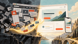
Most business websites don’t lose customers because they look ugly. They lose them because a visitor lands, can’t tell what the company does or what to click, and opens a competitor’s site in the next tab.
Using web design to boost your business has less to do with trends than with a handful of decisions: what people see first, how fast the page responds, where proof shows up, and how much effort it takes to get in touch. Get those right and your site starts producing calls, bookings, and orders instead of just sitting there looking nice.
Below are 9 practical ways to put your business website design to work, each tied to a number you can track. Good web design for business rarely needs a full rebuild. Most of these changes fit inside a well-made WordPress theme and a few focused afternoons.
The short answer: web design boosts a business when it helps visitors understand the offer quickly, trust the company, and act without friction. Clear visual hierarchy, fast pages, trust signals near decisions, short forms, and accessible layouts do most of the heavy lifting.
Key takeaways
- Clarity, speed, proof, and low friction drive more results than visual trends.
- Google rates a page as good on Core Web Vitals when LCP is 2.5 seconds or less, INP is 200 milliseconds or less, and CLS is 0.1 or less.
- Trust signals work best next to buttons, pricing, and forms, where visitors hesitate.
- Every form field should change what your team does next, or it should go.
- Judge design changes by calls, bookings, and qualified leads, not pageviews.
Table of contents
- How Web Design Affects Business Results
- 9 Creative Ways to Use Web Design to Boost Your Business
- 1. Design the First Five Seconds Around One Question
- 2. Use Visuals as Proof of What You Do
- 3. Build a Visual System People Recognize
- 4. Treat Page Speed as a Design Decision
- 5. Organize Navigation Around Customer Tasks
- 6. Put Website Trust Signals Where Doubt Happens
- 7. Design Forms and CTAs Around the Next Step
- 8. Treat Website Accessibility as a Growth Channel
- 9. Make Pages Easy for Search Engines and AI Assistants to Quote
- A Worked Example: Fixing a Typical Service Business Homepage
- How to Measure Whether Your Web Design Is Working
- Web Design Mistakes That Quietly Cost Sales
- Frequently Asked Questions About Web Design for Business
- Where to Start This Week
How Web Design Affects Business Results
Design choices show up in revenue even when nobody connects the two. A hero video that takes four seconds to load delays every visitor. A contact form with twelve fields filters out people who were ready to buy. A menu written in internal jargon sends good leads to the wrong page, and most of them won’t try twice.
Speed is where the link is easiest to see. Google collected case studies on the business impact of Core Web Vitals, including Vodafone Italy, which improved Largest Contentful Paint by 31% and recorded 8% more sales. Those examples come from large brands and date back a few years, so read the percentages as direction rather than a forecast for your own site. The pattern behind them hasn’t changed: when pages feel fast and stable, more people finish what they came to do.
9 Creative Ways to Use Web Design to Boost Your Business
1. Design the First Five Seconds Around One Question
Every new visitor is silently asking one thing: am I in the right place? The area above the fold should answer before anyone scrolls. Say what you offer and who it’s for, then give one obvious next step. Anything else on that first screen is competing for attention it probably doesn’t deserve.
This is where visual hierarchy earns its keep. Make the headline the largest text on the screen, give the primary button a color nothing else on the page uses, and move secondary links further down. Then test it cheaply. Show the page to someone outside your company for five seconds, close the laptop, and ask what you sell and what they would have clicked. If they hesitate, the page is trying to say too much.
Rotating sliders are the usual suspect. They add weight to the page, and the messages on later slides are easy to miss. For a small business website, one static hero with a clear offer usually works harder.
2. Use Visuals as Proof of What You Do
Images should answer a buyer’s question. A stock photo of people shaking hands in a glass office answers nothing. Real photos of your team, your workspace, or your product in a customer’s hands do. So do annotated screenshots of your software, before and after shots of finished jobs, and a simple diagram of how a project moves from first call to delivery.
Infographics still pull their weight when they replace a wall of text, like a pricing comparison or a five-step onboarding process. Keep text inside images to a minimum, since screen readers can’t read it and search engines understand it poorly. Write descriptive alt text, and export in WebP or AVIF so the visuals don’t drag down load time.
3. Build a Visual System People Recognize
A unique design doesn’t have to be custom-coded. Plenty of businesses stand out on a solid theme, and plenty of expensive custom builds are forgettable. What makes a brand identity recognizable online is repetition: the same small color palette, the same type scale, the same button style, and consistent spacing on every page.
Start with typography, because it carries most of your content. Pick one heading typeface and one body typeface that stay readable at small sizes on a phone. The Visualmodo Font Pair tool lets you preview combinations before you commit. Write the rules down, even in a one-page style sheet, so the next landing page someone builds in a hurry still looks like your company made it.
Save the creativity for your photography and your offers. Hidden menus and clever navigation labels make visitors think harder, and a visitor who has to think too hard usually leaves.
4. Treat Page Speed as a Design Decision
Speed problems usually start in the design file, long before a developer touches the code. A background video, four font families, scroll animations, and a chat widget all look harmless in a mockup. In production, they add up.
Google measures real-user experience with Core Web Vitals, and its Search Central documentation on Core Web Vitals sets specific targets. A page is rated good when, for at least 75% of visits, Largest Contentful Paint (LCP) is 2.5 seconds or less, Interaction to Next Paint (INP) is 200 milliseconds or less, and Cumulative Layout Shift (CLS) is 0.1 or less. Design affects all three. Size and compress images before upload, limit font weights, reserve space for images and embeds so content doesn’t jump, and ask whether each third-party script earns its place.
Check your work on a phone, not just the office monitor. A mobile-friendly website is one that loads and responds well on a mid-range device over an average connection, which is how a lot of your customers will actually see it.
5. Organize Navigation Around Customer Tasks
Menus often mirror the company org chart. Customers don’t care about your departments. They arrive with a task: check prices, book a visit, compare plans, find support.
Use the words customers would type into Google as menu labels, keep the main menu short, and show the same navigation on every page. Larger sites benefit from visible search and breadcrumbs so people always know where they are. On mobile, keep the main action (call, book, or buy) reachable without opening the hamburger menu.
Your analytics already show where navigation breaks. Look for pages with high exit rates that sit one click from a conversion page, and read your site search terms for things people should have found on their own. Fixes like these tend to improve user experience (UX) more than a new color scheme ever will.
6. Put Website Trust Signals Where Doubt Happens
Trust signals work best at the moment someone hesitates, not buried on the About page. Put a short review next to the main button, a refund or cancellation policy beside pricing, and a single line under the email field explaining what you’ll do with the address.
Specific proof beats generic praise. A testimonial with a full name, company, and the result the customer got does more than a carousel of anonymous five-star quotes. For local businesses, a real address, a phone number someone answers, and photos of the actual team settle the question every new visitor has: is this company real, and will it treat me fairly?
Only show proof you can back up. Invented review counts and badges you didn’t earn can backfire with customers, and they carry legal risk. In the US, the Federal Trade Commission’s rule banning fake reviews and testimonials took effect in late 2024.
7. Design Forms and CTAs Around the Next Step
Every field in a form is a small tax on the visitor. Ask only for information that changes what your team does next. A plumber might need a ZIP code and the type of job. A software company might need team size. The rest can wait for the first conversation. Trimming fields is one of the most direct ways to lift your website conversion rate, and it costs nothing.
Write every call to action (CTA) as the outcome the visitor gets: “Get my quote,” “Book a 15-minute call,” or “See pricing.” Labels like “Submit” and “Learn more” give people nothing to agree to. Under the button, remove the biggest worry with one honest line, such as no credit card required or a reply within one business day.
Then test the whole path yourself. Fill in the form on your phone, check that the lead lands in the right inbox or CRM, and make sure the thank-you page tells people what happens next and when.
8. Treat Website Accessibility as a Growth Channel
An accessible site reaches more buyers. People with low vision, color blindness, or tremors are customers, and so is anyone reading your site in direct sunlight or with one hand on a crowded train. The fixes that help them help everyone: readable color contrast, bigger tap targets, visible focus states for keyboard users, captions on video, and link text that makes sense out of context.
It is also a legal question. Most accessibility laws and audits benchmark against the Web Content Accessibility Guidelines (WCAG) 2.1 Level AA, and WCAG 2.2 is the newest version worth designing to. The European Accessibility Act has applied to many e-commerce and digital services offered to EU consumers since June 2025, with an exemption for microenterprises that provide services, and ADA website lawsuits remain common in the US. If you have never audited your site, read about the real cost of ignoring website accessibility before your next redesign.
One warning: an overlay widget installed with a single line of code is not a substitute for fixing the underlying design and markup. In 2025, the FTC approved a final order requiring one overlay vendor to pay $1 million over claims that its AI tool could make any website WCAG-compliant.
9. Make Pages Easy for Search Engines and AI Assistants to Quote
More buyers now meet a business through Google’s AI Overviews, ChatGPT, or Perplexity before they ever click through. Those systems lift short, self-contained passages from pages that are easy to parse. Design for that with descriptive headings, a direct answer in the first sentence under each one, real HTML tables for comparisons and pricing, and schema markup for your organization, products, and reviews.
Fresh content still matters, but freshness means substance. Updating prices or answering a question customers keep asking counts. Changing the date on an old post does not. For a deeper look at page structure, see how to design a website layout AI assistants can use.
A Worked Example: Fixing a Typical Service Business Homepage
Picture a small landscaping company with a solid local reputation and a quiet website. The homepage opens with a four-slide carousel. The menu lists internal package names like Silver Plan and Premium Care. The only testimonial lives on the About page, and the quote form asks for eleven fields, including budget and how the visitor heard about the company.
None of the fixes require a new theme. Swap the carousel for one photo of a finished garden and a headline that names the service and the area. Rename the menu items after the jobs people search for, such as garden design, lawn care, and tree removal. Move the strongest review, with the customer’s name and neighborhood, directly under the quote button. Cut the form to name, phone, ZIP code, and type of job, and add a line saying when the team will reply.
The honest expectation is not a guaranteed percentage. It is a homepage that answers the first question faster and a form that more people finish. If you set up a quote-request event before making the changes, you also get a clean before and after number, and that number tells you which fix to try next.
How to Measure Whether Your Web Design Is Working
Without numbers, a redesign turns into an opinion contest won by whoever has the loudest taste. Choose one or two business outcomes before you change anything, record a baseline for at least four weeks, and compare the same length of time after launch.
| Change | What to track | Where to find it |
|---|---|---|
| First-screen clarity | Engagement rate, scroll depth, clicks on the primary CTA | Google Analytics 4, heatmap tool |
| Page speed | LCP, INP, and CLS from real visitors | Search Console, PageSpeed Insights |
| Navigation | Exit rate near conversion pages, site search terms | Google Analytics 4 |
| Trust signals | CTA click-through rate with and without proof nearby | GA4 events, A/B test |
| Forms | Form starts versus completions, qualified leads | GA4 events, your CRM |
| Accessibility | Contrast errors, keyboard-only task completion | WAVE, Lighthouse, manual testing |
| Search and AI visibility | Impressions, clicks, pages cited in AI answers | Search Console, an AI visibility tracker |
Pageviews on their own rarely prove anything. What counts is the business event behind them: a booked call, a paid order, a qualified lead your sales team actually follows up on. If your site feeds a CRM or booking system, plan what happens after a visitor submits a form so tracking and follow-up survive the redesign.
Numbers show where visitors drop off, but not why. Add a one-question survey to your key pages, such as “What almost stopped you from contacting us today?”, and watch session recordings on the pages with the biggest drop-offs. A handful of honest answers often explains a metric faster than another month of data.
Web Design Mistakes That Quietly Cost Sales
A few habits show up again and again on sites that look fine and still underperform:
- Hiding prices or the next step behind a generic Contact Us page while competitors show both.
- Pop-ups that cover the content on mobile the moment the page loads.
- Light gray body text on white that looks elegant in a mockup and is hard to read on a phone.
- Launching a redesign without redirecting old URLs, which can erase rankings that took years to build.
- Award-style animation on pages whose only job is to generate leads.
Frequently Asked Questions About Web Design for Business
Web design decides whether visitors understand your offer, trust your company, and take the next step. A clear layout, fast pages, visible proof, and short forms raise the share of visitors who call, book, or buy. It also supports SEO, because well-structured, mobile-friendly pages are easier for search engines to crawl and for people to use.
For most small businesses, yes. A well-coded theme customized with your own colors, typography, photos, and copy is enough to compete. Custom design makes sense when you need unusual functionality, complex integrations, or an experience a theme cannot support. Spend first on content, real photography, and speed.
There is no fixed schedule. Instead of a full website redesign every few years, many businesses get more from steady improvements tested one at a time. A bigger redesign is worth it after a rebrand, when the site struggles on mobile, when the platform is hard to update, or when conversions keep falling despite smaller fixes.
The elements that most often move conversions are a headline that states the offer plainly, one primary call to action per page, fast load times, trust signals near buttons and pricing, and short forms. Change one thing at a time so you know which change moved the number.
Yes. Page speed, mobile usability, heading structure, internal links, and image optimization are design decisions that affect how search engines crawl and evaluate a page. Google has also made clear that relevance comes first, so good design will not rescue thin content, but it helps strong content compete.
Common warning signs include a high bounce rate on mobile, forms that many people start but few finish, poor Core Web Vitals in Google Search Console, and customers calling to ask for information that is already on your site. A five-second test with someone outside your company gives you a fast outside view.
Where to Start This Week
If you only have a few hours, skip the color debate. Run the five-second test on your homepage and open the Core Web Vitals report in Search Console. Then cut your main form down to the fields that matter and move your strongest testimonial next to the primary button.
None of those changes is expensive, and together they usually show where the bigger opportunities are. Measure the difference first, then decide what deserves a larger redesign.