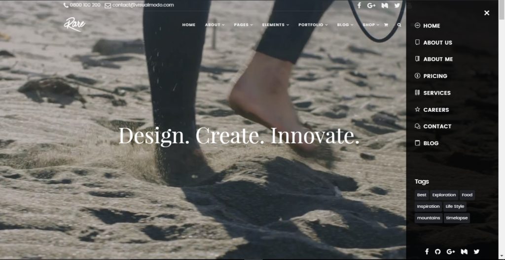
In this guide & tutorial, you’ll learn a simple method on how to add a side navigation menu in your WordPress website or blog header section.
Side Menu Area / Side Navigation
In this tutorial on Visualmodo knowledge base, we will show how to create a Side Menu simply and easily with our WordPress theme and place widgets and pages on it to raise your site to the next level and show more items on your site menus. A creative navigation site style.

To enable this side navigation icon on your header main menu, you need to go to WP dashboard > Visualmodo > Theme options > Header > Side Navigation < and select the style you want for the side menu while the icon is clicked; Overlay/push or full-screen. The image below uses an overlay side menu style.

You also can edit other styles on this area of your theme options panel, backgrounds, colors, and images modes.
You can apply pages as a menu and widgets to populate this side nav area. To upload pages, you need to create a menu and save it with some names you will remember. I recommend you use the name ‘side navigation menu’ to add page items on this menu on WP Dashboard > Appearance > Menus > Create Menu > Name it > Save the menu.
After that, you go to WP dashboard > Appearance > Widgets < and you will drag widgets and Drop it on the ‘side navigation’ tab. (To call the menu, use the ‘Visualmodo menu‘ widget)
Video Tutorial: Side Navigation Menu in WordPress Header
In the narrated video tutorial above, you’ll learn how to create this menu style simply and easily. Watch in and subscribe to our YouTube channel for more WordPress tutorials.
How to Add Sliding Side Cart in WooCommerce WordPress Navigation Menu?
If you’re using Woocommerce, a sliding side menu with your cart icon and content may be very useful. Learn how to add on in the video for the side menu guide & tutorial below.
How to Create a Collapsible Sidebar Menu in WordPress?
The most user-friendly menus have easy access to all the links visitors need. However, this can be difficult for websites with many pages or a more complex design. Consider the size of an eCommerce store with various product categories and subcategories, such as Amazon.
It wouldn’t be ethical to have every single category of product on a standard menu. Shoppers would have to browse the menu to find the category they’re interested in.
This is where collapsible menus are beneficial. These menus structure their content as a parent-child association. If the visitor clicks on a parent item in a collapsible menu, then all of the child content of that parent will be displayed.
Collapsible menus are sometimes called openable menus. This is because the sections of their vary when someone clicks on them. By default, collapsible menus obscure many information and intricacies for visitors. This is more convenient for the user than browsing through a lengthy list of categories or subcategories.
If you wish to apply a nav menu on your WordPress blog sidebar, please follow the video tutorial below.
Website Header Side Navigation Menus Usage Benefits
Side navigation menus in website header sections can provide several benefits, including:
- Improved navigation: Firstly, side navigation menus make it easier for users to find what they’re looking for on a website, as the navigation options are clearly displayed and easily accessible.
- More screen real estate: Secondly, by moving the navigation menu to the side of the page, more space is available for content in the main section of the page, allowing for a cleaner and more visually appealing design.
- Consistency: Side navigation menus are a standard design element on websites, so users are likely familiar with them and can quickly find what they need.
- Mobile responsiveness: Side navigation menus can be optimized for mobile devices, providing an intuitive navigation experience for users on smaller screens.
- Accessible: Side navigation menus can be accessible to people with disabilities. In addition, by incorporating keyboard navigation and screen reader compatibility features.
- Scalability: Side navigation menus can easily accommodate many pages or sections without compromising the user experience.
- Branding: Finally, side navigation menus can be customized to reflect a website’s branding, creating a consistent visual experience across the entire site.
