Let’s get down to it. When it comes to web design, less is better and attractive. Your website is part of your branding. It reflects who you are and how you engage with your audience. So what and how many colors should you use for your website? This Is How Many Colors You Should Use For Your Website
To answer that, let’s take a look at these top five foodie websites – and I’m sure they’re some of your favorite sites too – for design and color ideas.
Color Combinations Used By These Food Websites
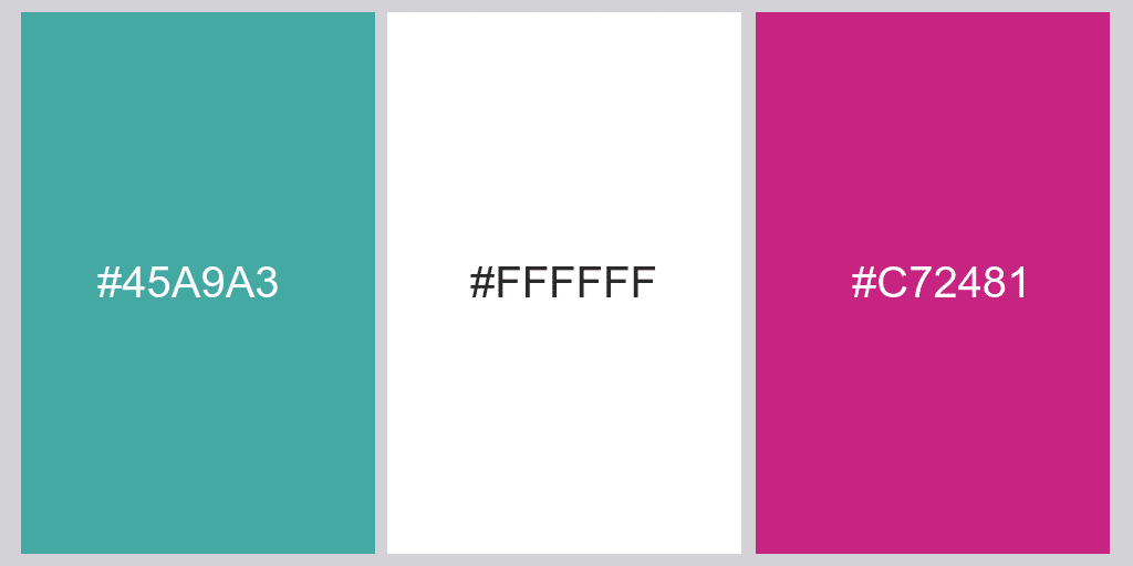
Jamie Oliver

The masculine color of green balances the strong feminine color of pink. This allows the website to engage with both male and female audience. Three major colours under use:
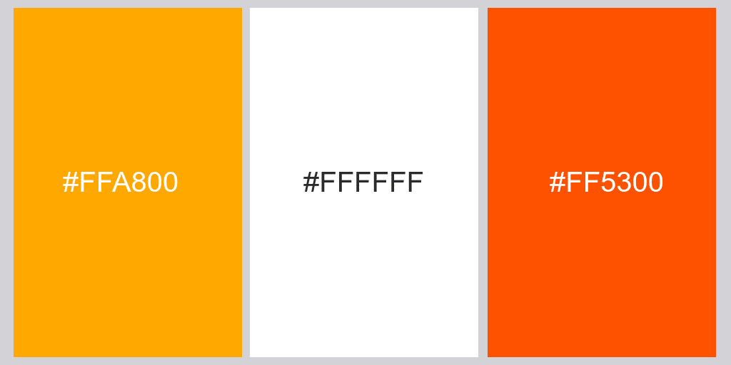
All Recipes: Colors Use Website

This website uses the softness of gray and white while also using vibrant pictures and lively shades of oranges. Three major colors present:
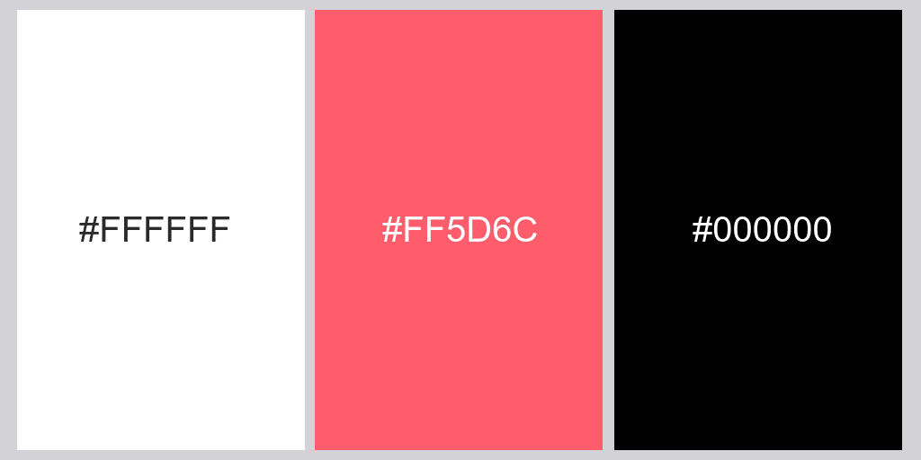
Delicious Magazine

Just like Jamie Oliver’s website, this website has a feminine touch by including a small amount of pink and, instead of green, they used classy and stylish black. Three major colors under use:
How Many Colors Should We Use in a Website? A Taste of Home

This food website mainly uses gray and uses black, in addition to red, making buttons and other elements pop more. Three primary colors in use:

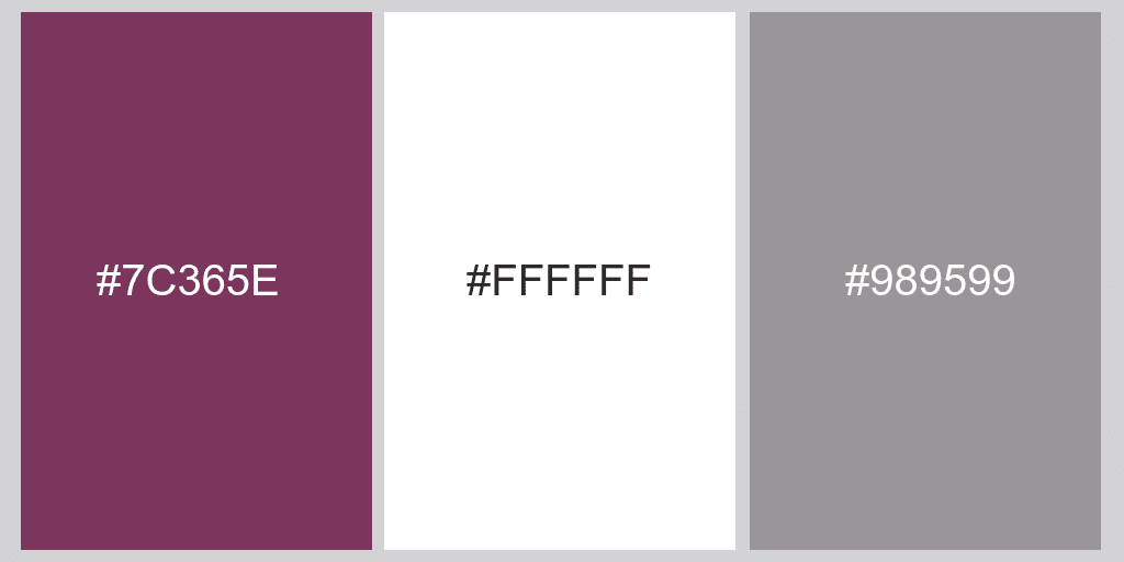
Pinch of Yum

You’ll mostly see the color white here and the use of purple to show the header, the logo, and the buttons. They also use vibrant and colorful food photos to add more life to their website. So, three primary colors in use on this website:
How Many Colors Should You Use
All five websites I’ve shown above have one thing in common: the use of the color white. White makes your website look clean and professional – like it was created by a professional web designer.
So to finally answer this question, use only three colors – make sure two of these are your brand colors, and the other one should be white.
If you have a colorful logo, you can always put a white version on your website if you’re aiming for a minimalist design. And, just in case you don’t have a logo yet, you can use Instant Logo Design to create one, even if you have no design skills. So a good way to use colors on your website.
Remember The Cultural Background
While different colours have different meanings on an individual level, some colors also have deep-seated cultural meanings. For example, in Western cultures, red is a striking color that signifies danger and urgency (think stop signs).
However, red represents good luck in some Eastern cultures, such as China and India. Another example in Western culture, black is the color of death and mourning. In some Eastern cultures, a similar color is white.
As the examples above show, context is the key to color spaces. Depending on where a brand’s target market is located, the colours used on its website can convey very different messages. So how do you know which colors to include or avoid based on your client’s target market? A simple Google search will suffice.
If the brand has a global target market, consider avoiding colors with deep cultural meaning, such as red. Because the cultural implications of colours are so ingrained in our psyche, we may not be consciously aware of our aversion to specific colors.
Of course, there are some exceptions. The Coca-Cola Company is known around the world for its distinctive red brand color. In this case, the awareness associated with the brand color was enough to overshadow any negative connotations associated with red in Western society.
Contrat Usage: How Many Colors You Should Use For Your Website?
Another important principle of color theory involves the use of contrast. The higher the difference, the more the two colors stand out.
When evaluating contrast, it’s essential to consider not only colors (such as blues and greens) but also their hues. Two different colors with an even tone will not create high contrast. A simple trick to determine the distinction between two colors is to convert them to grayscale. The contrast difference will be more apparent.
We generally want to use high-contrast colors in website design for better readability. For example, white text on a dark background and vice versa. Contrast draws attention and can visually emphasize certain essential elements. However, too much color contrast on a website can strain our eyes. The website below is an excellent example of balancing high and low contrast in web design.


