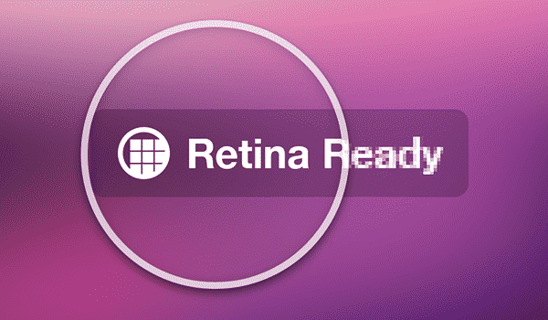
Apple’s Retina Display, or HiDPI, is a topic of discussion among web designers and developers. WordPress developers and designers have started responding to this technology by providing Retina Display-ready themes and plugins. “Do I need to make my site Retina Display ready?” is the question that most website owners ask themselves. I hope this post will help people decide whether or not they should optimize their websites for Apple’s Retina Display.
What is Retina Display?
Retina Display is the registered trademark used by Apple for a HiDPI display technology which they started using in their latest devices such as the iPad, iPhone, and MacBook pro. This technology displays more dots per inch than older devices ( around 300 DPI). This means crispier images and smoother font rendering. However, it is essential to note that many other devices already have higher DPI displays.
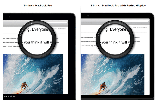
The Apple MacBook Pro with Retina display has a screen resolution of 2880×1800 at 220 pixels per inch. You would think that this resolution on a 15-inch screen would make things look smaller for retina display support in WordPress.
Why is it a Challenge?
I am totally in favor of high-definition web. I feel that optimizing websites for modern devices and taking advantage of their display capabilities is the right thing to do. Already, there are lots of users accessing the web through not just Apple’s devices but other devices with similar capabilities. If trends are any indication, I feel more improvements will come in the display technology, so the change is inevitable. Adapting to it will eventually become critical if not necessary.
On the other hand, website owners need to consider several other factors. First, serving higher resolution images means a slight increase in page load time; for busier sites, this will also increase bandwidth usage. Secondly, with the number of browsers and devices people use these days, it is challenging to sort browsers and devices and prepare websites for all of them.
How to Add Retina Display Support to Your WordPress Site
It is relatively easy to add Retina support to your existing WordPress theme. You are essentially adding an extra image twice the size and then using a script to decide whether to serve the standard definition image or the high-resolution image.
You can download and add the Retina.js script here.
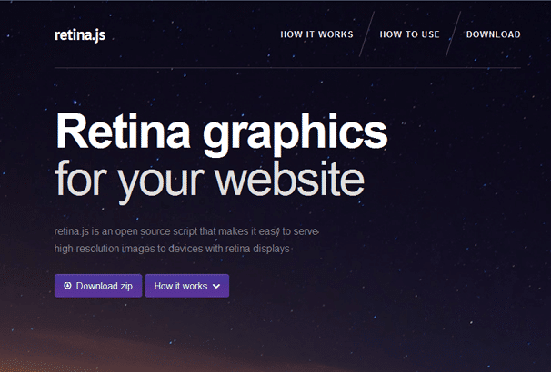
Add that to your theme’s js directory and then enqueue the script in your functions.php file. When your users load a page, retina.js checks each image on the page to see if your server has a high-resolution version of that image. If a high-resolution variant exists, the script will swap that image.
All you have to do then is when you are adding a new image to the site, save one file as, for example, logo.png and another one twice the size as logo@2x.png, and the script will detect which version to display. This works for any file name. Just add @2x after the file name. So, a good start to adding retina display to WordPress.
Other things to note to make your display consistent is to use icon fonts where possible as these will always display in high resolution, recreating your favicon at 32×32 size instead of the standard 16×16 size, and make sure any background images also are doubled in size as this script does not detect background images.
The code for displaying background images is :
.background {
  background-image: url(example.png);
  background-size: 200px 300px;
  height: 300px;
  width: 200px;
}

@media only screen and (-Webkit-min-device-pixel-ratio: 1.5),
only screen and (-moz-min-device-pixel-ratio: 1.5),
only screen and (-o-min-device-pixel-ratio: 3/2),
only screen and (min-device-pixel-ratio: 1.5) {
  .background {
    background-image: url(example@2x.png);
  }
}
Implement Retina Display in WordPress with Plugins
We already have WordPress developers responding to the challenge and providing practical and creative solutions. Currently, two common approaches exist to serve Retina Display-ready images in WordPress. Hopefully, we will see even more brilliant and perfect keys to that.
WP Retina 2x Plugin
WP Retina 2x plugin attempts to detect the device used to access a webpage. If the device is Retina display capable, then it serves a higher resolution version of images on your website. Written by Jordy Meow, WP Retina 2x provides a dashboard to manage Retina Images for your website. This dashboard shows you the current status of files in your media library, which one of them has their Retina Display ready versions, and which images have issues. This awesome plugin provides four different ways to display Retina images :
- PictureFill: The Picturefill method rewrites the HTML on-the-fly to use the new SRCSET. Since it is not supported by the browsers yet, the JS polyfill Picturefill is used to load the images. It is now the recommended method.
- Retina.js: The Retina JS method is a 100% JS solution. The HTML loads the usual images. Then, if a retina device is detected, the retina images will be loaded. It is fail-safe but not efficient (images are loaded twice) to add retina display support to WordPress
- IMG Rewrite: The IMG Rewrite method rewrites IMG’s SRC tags on-the-fly with the retina images directly if the device supports them. This method does not work with most caching solutions.
- Retina-Images: The Retina-Images method uses a server handler: the images will be loaded through the Retina-Images PHP handler. Your .htaccess will be modified automatically.
How To Use It?
]After installation, the plugin adds a WP Retina 2x tab in the admin menu, which takes you to the plugin’s dashboard. There you will see two tabs for Basics and Advance settings. On the Basics page, you can tell the plugin which image sizes you don’t want to be regenerated for retina display. It will show sizes like medium, large, and small, and you may also see other sizes added by your themes to generate post thumbnails or sliders. I mostly use the medium or large-sized images inside the posts and thumbnails as featured images on the index and archive pages. So I will leave them unchecked and check other sites I don’t want to optimize.

The Advanced tab allows you to choose between Server Side and Client Side methods. This plugin also adds a Retina 2x tab under your Media tab in the admin menu. There, you can see the status of images you have uploaded, which one of them has their Retina versions ready, which one of them have issues. The author recommends using the “Enable Media Replace” plugin, which will put a replace button next to the images with problems, and you can easily replace those images.
Simple WP Retina: Add Display Support to WordPress Site
A quick and easy way to implement the Retina Display capabilities to your website. Simple WP Retina plugin works at the server side to detect Retina or high pixel density capable devices and displays high-resolution images for those visitors. It is simple, short, and sweet. However, this plugin has a few limitations. For example, it does not work with caching, so if any caching plugins are installed on your website, then this plugin will not work correctly. There is no dashboard, and there is no easy way to debug the plugin and see that it can detect and serve @2x images to high pixel density devices.
- Detects a HighDPI screen such as a Retina display
- Detects all image sizes added using add_image_size() and adds @2x versions.
- Replaces featured thumbnails and content images with the @2x versions for users with HighDPI screens.
Once installed, Simple WP Retina does not automatically regenerate images. You will need to do that by using the Regenerate Thumbnails plugin. It also restores 2x versions of all your pictures. So if your theme has added multiple image sizes, all of them will have @2x versions. This is a new plugin, and I hope the author will extend and improve it.
Retina Image Support

Another simple solution is the Retina Image Support Plugin which carries out the steps we outlined above, it will add the retina.js script, and you must upload images with the @2x name.
HiDPI Gravatars to Add Retina Display Support to Your WordPress Site?
This plugin will update your site’s Gravatars to high resolution. Simply upload and activate. For best results when uploading a new avatar, use an image of at least 128 x 128 pixels in size.
