Ready to talk about conversions? If you’re not getting them, then the answer is most likely a resounding yes. The one thing I hear most frequently from clients is, ‘I have a great product and some killer social media ads but, I’m not getting a great conversion rate – what am I doing wrong?’ In this article and guide you’ll learn how to create a killer landing page.
There are a few reasons why this may be the case, and, in my experience, the most common cause is also the simplest to fix. When running social media campaigns, many people make the rookie mistake of sending customers from the ad to their website home page. What’s wrong with that?
In almost every case, the content on your home page doesn’t mirror your ad’s content. This is a problem as the customer you’ve spent money on grabbing is then losing interest when they find themselves on a page that isn’t 100% relevant to the advert they’ve clicked on. So, essentially, you’ve wasted time and money on your campaign. Don’t worry – as I said, the answer is right there at your fingertips.
Build it, and they will come.
It’s been proven that using landing pages can significantly improve a business’s conversion rate – and here’s why. A landing page is like a mini-website for your business.
‘Unlike your website, however, a landing page is super-targeted and hyper-relevant to the content that interested your user in the first place. This means that, when your user clicks onto your content or ad, they find themselves on a page which contains information on just one thing – the topic that grabbed their attention enough to see them scrolling away from their social media platform,” remarks Milosz Krasinski MD at Web Consulting.
In an age where attention spans are shorter than that of your average goldfish, the use of landing pages is vital for brands who are serious about supersizing their conversion rates.
Happily, there are loads of landing page building tools out there now – some of which are free to use and allow you to put together a page in just minutes. Not so fast there, speedy – before you run headlong into creating your first page, there are a few things to bear in mind so, the following is my guide to creating a killer landing page following this guide.
Plain and simple
You only have limited space on a landing page so, the best thing to do is to stuff it with as much information as possible, right? Wrong. While the temptation will be there to fit as much into your page as you can, this is counter-productive.
When faced with a page that is ‘busy’ and overloaded, your average user will tend to lose interest (remember that attention span I talked about?) When creating your landing page, you want to keep it simple with one clear message to avoid becoming overwhelmed. For this reason, you need to put some thought into figuring out what your key message is – and then stick to it.
Most users will scan rather than read the content on your landing page using our guide – in fact, the majority of users will only actually read about 28% of the content. This means that you need to make your core message stand out by keeping it simple and by following a couple of simple rules:
- Use bullet points to draw the user’s eye to the critical parts of your message.
- Use your keywords in the first line of the first paragraph. People tend to scan copy from the top left so, this is where your messaging should be.
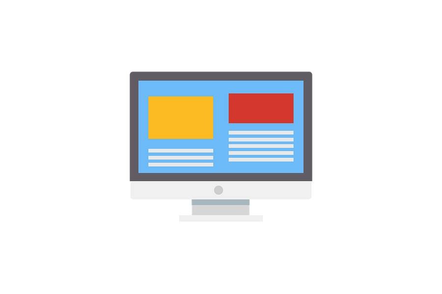
Imaging
Using images on your landing page is essential as you’ll see on our guide. Humans are visual creatures, and great photos or videos can help retain your user’s attention. As with your messaging, images should be clear, easy to understand, and relevant to the content. In the spirit of keeping things simple, it’s best to stick to one fabulous image which will tell a story by itself.
The team at classic gaming site, for example, had a list of all their solitaire games on their landing page. Understanding how users react to images, they instead replaced their directory of fun with an interactive game. This decreased their bounce rate by over 40% and improved their overall user funnel.
The color of money
When looking at your landing page’s overall design, color is more important than you may think. We’ve known for a while that people have an emotional reaction to the dye and some examples of this are:
- Red – denotes excitement and boldness.
- Orange – denotes clarity and warmth.
- Green – denotes growth, cash, and vitality.
- Blue – denotes strength and dependability.
- White – denotes neutrality and calmness.
Depending on the message you’re trying to get across, the use of color can help to hammer the point home.
Making Headlines to Create a Killer Landing Page
You only get one crack at stopping your user from scrolling away from your landing page using our guide, and, in a lot of cases, it’ll all come down to your headline. Creating headlines for your landing pages can take a bit of practice but, you’ll find that this is time well spent.
Headlines should be short, punchy, and should clearly explain what’s on offer. Always avoid jargon or ‘salesy’ messaging in your headline (in all of your text, for that matter). Remember, you’re not writing War & Peace. You’re putting together a message with one goal – to get those fingers clicking onto the next stage.
Keeping the sales cycle in mind
When heading into the world of landing pages, more is most definitely more – which means that you’ll probably want to create a few different pages? Why? For most brands, marketing is multi-faceted and, various campaigns are used to snag users at different stages of the sales cycle. In addition, for this reason, you’ll need separate pages for each part of the bike.
For example, your campaign to attract brand new users should include clear and straightforward information about your product or service. In contrast, a campaign targeting those who have already shown an interest in your offering should focus on answering questions that the user may have.
Don’t be shy
As we’ve said, sales speak is off the table when it comes to your wording. However, it is still possible to big yourself up without blowing your own trumpet. Using short testimonials or reviews on your landing page can reinforce the value proposition of your messaging.
An action plan to Create a Killer Landing Page
So, you’ve mastered your headline, you’ve used perfect pictures and your copy is short and sharp……….but it could all be for nothing if your call to action is less than ideal.
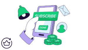
You’ve put all this work into creating your landing page for one reason in this guide – to nudge your user into completing an action.
Whether that action is to make a purchase, to sign up to a newsletter or request more information, if you’re not clear about what you want them to do, they’re pretty unlikely to actually do it. If you only have the time to focus on one part of your landing page, it should be your call to action and, your top commandments are:
Placement
We talked earlier about the placement of keywords in your text which should be placed top left. When it comes to placement of your CTA, the rules are slightly different. A call to action should, where possible, be placed in the top right hand section of your landing page. The reason for this goes back to an old advertising saying which goes, ‘Keep it in sight, keep it top right’. Our eye tends to be drawn automatically to the top right hand of a page and, this placement is the best way of keeping your CTA in the user’s eyeliner.
What’s in a word
Listen closely. I shall say this only once. Do not, under any circumstances, use ‘bossy’ language for your CTA like ‘Download Now!’ If you want your user to click on your CTA. You need to answer the question ‘What’s in it for me?’
Value proposition should be a thread which runs all the way through your landing page. So, you’ll get significantly better results with wording such as ‘Download my free ebook’ or ‘Sign me up for discounts’.
The reason for this is simple. Instead of telling the user to do something without any incentive, you’re giving them an apparent reason for doing so.
It’s all about me to Create a Killer Landing Page
Leading on from the last point. Nuance is essential when it comes to the wording of your call to action. For example, take the wording ‘Download my free ebook’. Studies have shown that this sentence would gain almost 90% more conversions than the sentence, ‘Download your free ebook’. I’m not saying that us humans are a self-centred lot but, this nugget is absolutely true. For most users, ‘its all about me’.
A great example of a high converting landing page is that of Cigital. As you can see, the headline is striking and straightforward. The value is made clear and, the bright yellow CTA button is clearly visible on the page.
Beat a path to the door
Picture your landing page as a road journey from your user’s doorstep to yours. Now, imagine that the road has a huge number of traffic lights, diversions, and tolls. It’s safe to say that your user will either run out of petrol halfway through or, will decide that the journey is not worth it.
“The key to conversions is to keep the path to conversion as fast and straightforward as you possibly can for the best chance of success. This means limiting the number of form fields and keeping them super short to avoid losing your user’s interest. Put yourself in their shoes. Would you want to spend ages filling in different forms and jumping through several hoops to get to the finish line?”
Jack Zmudzinski, a senior associate.
Converting the converted to Create a Killer Landing Page
So, your user has sailed through the process and has turned into a conversion. Great job, but you’re not finished yet. The trick here is to keep them wanting more. So, you can do this by following up with an engaging Thank You page. This makes the user feels valued, but you can also take the opportunity to upsell or provide further information.
Keeping consistent
IIn, all likelihood, I’ve mentioned that you will, need more than one landing page to showcase different messaging. In comparison, the CTA and key message may be slightly different. It’s important to ensure that the branding and overall core message are consistent throughout your pages.
Test and test again
While your page may contain everything, you think it should and might look great. This is not the time to take your foot off the gas. Testing should be an integral part of your landing page strategy. This is the only way that you’ll know for sure what’s working and what’s not.
Conclusion to Create a Killer Landing Page
In 2025, competition is more fierce than ever before. Treading water isn’t an option for brands looking to get ahead. Taking the time and effort to master landing pages is an investment that will pay dividends in the long run. So, wrings in those much sought-after conversions.