Your website is the face of your business on the Internet, and that’s why you need it to look as professional as it can be. However, some webmasters equate a visually gorgeous website with a professional-looking one. The truth is a site can look incredibly pleasing to the eyes and still look unprofessional in the eyes of people. In this article, see the best tips on how to make your web design look more professional and make it incredibly nice to impress people enough to get them to do business with you.
Make Web Design Look Professional
Make your site easy to navigate
A website can look plain and simple and still be highly professional to people who find it easy to navigate. When everything on the site is well-organized, users will be more likely to explore it and eventually provide the leads and conversions you need. A gorgeous site that’s hard to navigate because of a cluttered structure will never seem professional to anyone. In addition, you can enjoy some web development services to get it faster.
When availing of expert web development services, it’s important to ensure that you’re dealing with a reputable company. You can ask for referrals from other website owners and check reviews of verified clients online. A good web design agency can also show you its portfolio to help you decide on the best design suitable for your business.
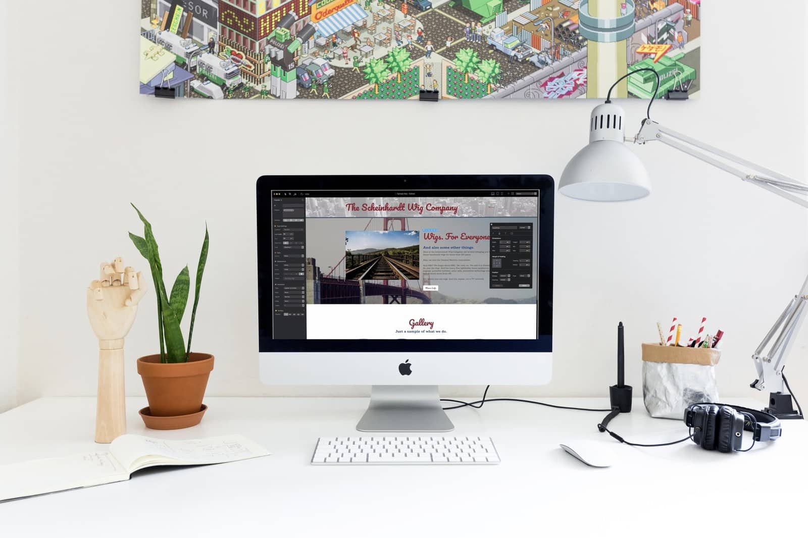
Simple web design does the trick to make a web design look professional
Web designers love to show off their artistic abilities. They end up with a design that seems cramped and cluttered with all the borders, colors, and drop shadows they put in. You should keep this in mind when using a website or landing page builder.
What they don’t realize is that people don’t like any form of visual overkill. Flashy elements even turn them off. What users prefer nowadays is simplicity in design. A web designer can, for example, put in plenty of whitespaces, which is easier on the eyes and gives a lot of breathing room for other web design elements.
Use the right fonts and properly
You can’t just use font for your website because you like how it looks. If your business has a distinct style, flavor, or culture, then you should choose fonts that go with it. More whimsical fonts are perfect for companies that deal in fun and entertainment, while businesses with more formal offerings would do well to choose fonts that reflect that trait.
Larger fonts are more apt for headings, subheadings, and titles, so keep their use to them. The fonts in your written content should also be large enough to read. Avoid using too tiny fonts because users won’t have any qualms about exiting your site if they can hardly read anything.
Do some color coordination to make a web design look professional
Colors can impact a website’s overall design in a significant way. If you’re going to use more than one color in your web design, you should make sure they are well-coordinated and blend well. You would also do well to factor in color psychology and use only colors that you think embody what your business stands for.
Put up big, high-quality images

Large, high quality photographs are impressive and look very professional. And then they are forced to attract people and make them stay on your site a little longer. Use them all over your website, particularly on the landing page.
Write useful, relevant, and engaging content
The written content on a website is one of the clearest indicators of a website’s professionalism level. Visitors will find a website highly professional when the writing is impeccable and free from spelling and grammatical errors that bug many other sites. It would also help if the copy is also relevant and helps visitors get what they need. Use an online management tool to organize your work and a scheduling app to maintain contact with your team.
Webmasters who can write can do the content themselves to make their sites appear more professional. If they think their writing isn’t up to par or are too busy with other concerns, they can hire professional writers to care for their written content.
One CTA button is enough to make a web design look professional
Putting up just one call-to-action or CTA button will make it easier for your visitors to respond accordingly. Some sites have multiple CTA buttons. As a result, it is predictable: people get confused by the choices and bounce off to another site.
With a main CTA, your website will look more professional than those with multi-page CTAs, so use these top web design tips and beat the competition.
Make responsiveness a priority
With Google’s Mobile-First Index, the need to make a site more mobile-friendly has become imperative.
Aside from the fact that Google now ranks a website using its mobile version as a basis. The ability to display properly across all screens and platforms. A clear sign of professionalism on a webmaster’s part. It shows that he or she cares about the needs of its mobile users. Who has long outnumbered desktop users for years now? In their eyes, a website that they can easily access on their smartphones and tablets. Web design looks professional.
For You
These are just some things you can do to give your site a more professional look. Apply these tips web design professional to your website, and you can make it look as professional as you want it to be.