There are different ways to grow your email lists, encourage people to visit your website, and promote offers. Popups are a popular and effective strategy that businesses of all sizes use. You can use popups not only with Emails but also implement them on your site. If you’re using WordPress, you can use several high-converting popup design plugins and Elementor to create popups. In this article, we’ll share the best popup design inspiration with 10 beautiful and high converting popups to boost sales.
Match the design to the rest of your website to optimize your popups. Make sure it blends into your site template and style to achieve consistency. Another thing to do is to have a clear call to action (CTA), use contrasting colors, experiment with other formats, utilize microcopy, make your popup design mobile-responsive, and customize.
Here are the top 10 high-converting email pop-ups you can find inspiration:
1. Simple Text-Only Popup Design – Lilach Bullock
Who would believe that a simple popup design could work? Lilach Bullock’s Simple Text, Only Popup Design, makes it happen.
Yes, its popup is simple. But the company converted more than 57% of website visitors because of the design.
The popup also includes a headline about the company’s services. The language is fun to read and catches many people’s attention. Lilach Bullock emphasizes providing something for free every time visitors subscribe. You can do the same thing. As a result, an example of high converting popups.

2. 2-Step Mobile Popup Design – USSLC
Another popup design in which you can find inspiration is USSLC’s.
Let’s say your popup is unable to increase conversions. Don’t worry! USSLC has something that will enlighten your mind.
Unlike Lilach Bullock, USSLC employs multiple modal popup designs. Yes, they can be tricky. However, they help the company convert over 25% of potential web visitors, achieving more than a 10% boost in daily sales.
It features an image of their free tutorial on student loans, which catches the interest of possible prospects.

3. Lightbox Popup Design – Eczema Company: Popup Design Inspiration
Another good popup is Eczema Company’s design. Converting around 13.7% of mobile visitors, Eczema Company uses many campaign types to encourage visitors to sign up immediately.
What makes this popup design different from the rest is that Eczema Company emphasizes its free eBook thrice, which increases reader retention and impact. Eczema Company also highlights the benefits of being a subscriber.
How about the design? Well, the popup pairs an image of a happy woman with a picture of food, enabling visitors to learn about the services within a second or two. So, a good example of high converting popups.

4. Cloudways Seasonal Popup Design
Would you ever believe that Cloudways’ holiday marketing campaigns led to a 120% increase in free trials? Yes, you read it right.
What makes their design interesting and effective? Well, the copy is tied to seasonal imagery. Gift, for example, indicates seasonal good cheer. On the contrary, Drop allows every visitor to avail of a 30% discount coupon.
The design is also stunning. Images of the Christmas tree, gifts, and Santa relate to a seasonal theme.
You can also make your popup design catchy and stylish. But don’t overdo it. Simple but effective designs are more than enough.

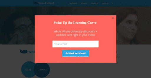
5. WholeWhale Nonprofit Popup Design
In terms of simple and high-converting popup design, WholeWhale won’t be left behind.
The copy has a clear headline and consistent Call to Action, reinforcing the idea of education to readers easily.
Many companies struggle to craft a good popup due to a lack of clarity and inconsistency. While many things run in your mind, keep your popup consistent, clear, specific, and thought-provoking.
WholeWhale can match their popup to visitors’ behavior using OptinMonster’s page-level targeting. Visit OptinMonster’s official website for more information.
6. Popup Design With Arrow – Logic Inbound: Inspiration
Client’s conversion has been a common concern for startups and even well-established companies.
There’s a trusted OptinMonster you can use if you are in the same predicament.
Just like what the company did to Logic Inbound Popup Design, your chance of converting prospects to customers is high.
With easy-to-navigate and quality popups, Logic Inbound increased customer conversions by 1500%, and free trial signups doubled. What sets Logic Inbound apart from competitors is that they always change and experiment with campaign layouts.
7. Salt Strong Slide-in Design
Over the past few years, using popups on mobile websites has been a tricky and daunting task for small, medium-sized, and large businesses.
But some platforms, like OptinMonster, make the process even easier. It’s mobile-friendly while complying with the industry’s existing regulations and standards.
With a combination of OptinMonster’s slide-in campaigns, Salt Strong could increase client conversions by 185%.
Salt Strong Slide-in Popup Design includes quizzes, builds brand awareness, and gets visitors’ attention. The design’s grey background stands apart from the competition. The CTA is also visible.

8. Geo-Targeted Design – IMSource
IMSource has been gaining massive popularity because of its practical approach to web popup design.
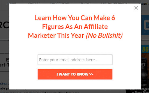
Developed to provide the audience with high affiliate marketing earnings, the IMSource Geo-Targeted Popup Design catches the interest of the company’s target market.
The design consists only of a white box with some red letters, helping visitors see the message immediately.
Since availability, IMSource is committed to reaching the highest spending prospects from different geographical areas. OptinMonster’s geo-location targeting makes it happen.
Incorporating this feature into the company’s system helps them increase conversions up to 6500%.
9. Digital Marketer Exit-Intent Design
No business owner wants to lose prospective visitors. To recover any abandoning prospect, Digital Marketer used Exit-Intent Technology from OptinMonster. They also have Yes/No forms to direct visitors to their purchase page.
Unlike other popups in this list, Digital Marketer’s design acknowledges those about to leave. But it does not stop there. The copy also gives them reasons to stay.
10. Split Tested High Converting Popups Design
How can you measure your campaign’s effectiveness? Which of your campaigns worked and didn’t?
To find answers to these questions, all you have to do is to test your campaigns.
Create and enjoy a high-converting popup design today!