A responsive template WordPress theme smoothly adjusts its layout based on the screen size and resolution. Responsive themes offer better readability and usability on smaller screens such as smartphones. It also prevents you from creating a device-specific mobile version.
If you’re working on your website, you’ve probably been told to make sure it’s built as a “responsive theme” or “mobile responsive” and wondered what a responsive WordPress theme is?
In this article, I’ll cover what a responsive WordPress theme is and why you want to have it for your site.
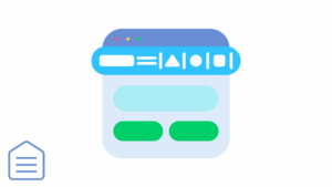
Understand a Responsive WordPress Theme
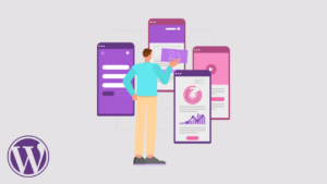
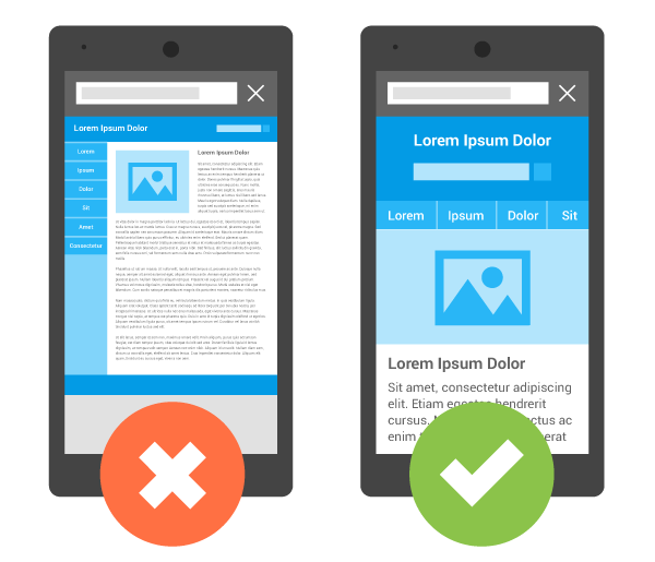
A responsive template WordPress theme is a theme that was developed to look good across all screens. If your website is responsive, visitors viewing it on your mobile device can read the site information easily and navigate through the site without hassle.
WordPress theme developers use code that allows the website to resize as the screen size adjusts. This includes dynamically resizing images as well as increasing user readability.
Responsive WordPress themes are so important we’ve ensured all Visualmodo WordPress themes are responsive for your business website, blog, or store.
It’s Importance

As more and more people use their smartphones and tablets to search the web, having a functioning website on those smaller screens is important. So, if a visitor can’t read your content or navigate through your site on their mobile device, they’re more likely to exit your site and visit one of the millions of others on the internet to get their answers.
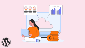
If you have Google Analytics set up on your website, you can view the number of mobile device visitors to desktop visitors. By doing this, you can see how a mobile site can affect your business. If you have a high rate of mobile visitors coming to your site, then access it from a mobile device and see what kind of experience it is for you. This will tell you how a user feels when they visit your site.
If you have a high bounce rate on your website, you should also look at your mobile visitors. This to see if the bounce rate from mobile visitors is causing this. According to GoRocket, the average bounce rate for mobile devices is around 60% which is about 20% higher than the other types. If your site is mobile-friendly with a responsive WordPress theme, your bounce rate could be lowered.
Why have a Responsive Template WordPress Theme
Getting a mobile-friendly website starts with creating a responsive layout.
A “responsive” website responds optimally when users access the page using a mobile device. So, no matter what kind of device it’s being accessed on, the site will look and function great.
Here are some advantages of responsive websites:
- Better SEO
Responsive website design uses the same URL and HTML code regardless of the device used to access the page. This setup makes it easier and more efficient for Google to search, index, and manage your site’s content. Thus, your website will have better SEO quality! - No need to redesign your website
A responsive website does not require a new mobile look or design. In other words, your website display remains the same even when accessed from multiple devices.
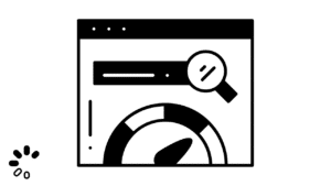
Check Your Site Responsivity
If you have a site set up now and aren’t sure if it’s responsive, you can use your browser to check.
Use your full-width browser and change its size of it. If your site’s paragraphs and words move to fit within the shrinking width, it is likely responsive.
Google has recently started testing websites for mobile friendliness. And now it’s rewarding website owners who have mobile responsive sites in search results. You can check your site on their Mobile-Friendly Test page to see what it says and follow the suggestions to improve it.
Concluding
There are a few ways you can work on your site to increase your mobile friendliness score. This can also help with search results for mobile device users.
As you work to ensure your site is mobile-responsive for your visitors, consider the overall user experience. Also consider the importance of making your site easy to use and navigate for your visitors. I hope this article helped you understand what a responsive WordPress theme is.