Website testing has become increasingly complex. The days of checking functionality in a couple of browsers are long gone. Your latest masterpiece must be rigorously evaluated on a range of mobile, tablet, and desktop devices with differing OSs, screen resolutions, and capabilities. In extreme cases, it could take as long as the original development. Learn now How to Simulate Mobile Devices In Browser to make your work better, testing your responsive site in the best way for every device
If you take your mobile security seriously, check out Lookout UK. They have one of the best mobile security services around.
The process is complicated further by touch-screens, hybrid devices, and high-density displays. If you’re coding on a regular PC with a mouse and keyboard, it isn’t easy to appreciate how your masterpiece will operate. Features such as mouse hover won’t necessarily work, and your application could be inoperable. But how can you test your system during development and avoid the pain of running and switching between multiple devices?
Fortunately, all modern browsers offer mobile emulation tools, and one of the best can be found in Chrome. It can help identify early problems without leaving the comfort of your PC and development environment.
Developer Tools
Start Chrome, navigate to the web page you want to test, and open the Developer Tools (Menu > Tools > Developer Tools, Cmd+Opt+I on Mac or F12 / Ctrl+Shift+I on Windows and Linux).
You can now enable the browser emulator by clicking the Toggle device toolbar icon in the top-left:

A device simulation will now appear:

The dimensions of the emulated screen can be changed when Responsive is selected as the device type.
Touch Enabled Emulation
Move your mouse over the device to see a circular ‘touch’ cursor. This will react to touch JavaScript events such as touchstart, touchmove and touchend. Mouse-specific events and CSS effects should not occur.
Hold down Shift, then click and move your mouse to emulate pinch zooming.
The Mobile Emulator Device Toolbar
It’s worth spending a little time familiarizing yourself with the toolbar and menu above the mobile emulator:
The default controls are:
- the device type (or simply Responsive)
- the current resolution
- the scale (the screen can be zoomed in or out to fit better in the emulator pane)
- a portrait/landscape toggle button (presuming a device other than Responsive is selected)
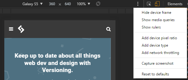
The three-dot menu allows you to show or hide additional controls:
- the device frame (if available, a graphic of the phone or tablet)
- a pixel ruler
- the device pixel ratio (such as 2.0 for emulated Retina screens)
- the device type (a category such as “mobile” or “tablet”)
- network throttling (a way to limit bandwidth and test performance on slower connections)
- the last option allows you to capture a screenshot, which includes the device frame is shown.

CSS Media Query Bars
The bar below the toolbar shows a range of typical phone, tablet, and device sizes. This can be clicked when Responsive is chosen as the device to set that width.
Select Show media queries from the three-dot menu to view a graphical color-coded representation of all media queries set in the CSS.
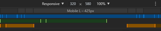
- Firstly, BLUE – queries that target a maximum width.
- Secondly, GREEN – queries that target widths within a range.
- Finally, ORANGE – queries that target a minimum width
Any bar can be clicked to set the emulator screen to that width.
Emulated Device Options to Simulate Mobile Devices In Browser
The drop-down menu on the left allows you to select a device. Several dozen presets are provided for popular smartphones and tablets, including iPhones, iPods, Kindles, Nexus tablets, Samsung Galaxy, etc.
Not all devices are at once, choose Edit. So, at the bottom of the device drop-down or select Settings from the Developer Tools menu (F1) and choose the Devices tab:

You can enable or disable devices or enter your own by defining:
- a name
- a classification such as “Mobile” or “Tablet.”
- a browser user agent string
- the device resolution
- and pixel ratio (such as 2 for iPhone Retina screens where the pixel density is twice as high as the reported viewport resolution).
Note that all browsers identify themselves with a user agent string sent with all HTTP headers. This can check on the client or server-side and would be in use to modify or provide a different user experience during the dark days of web development. In extreme cases, the viewer would direct to a different site. The technique was always flawed but has become redundant due to Responsive Web Design techniques and completely unsustainable given the number of devices available on the market.
Bandwidth Throttling Simulation
The throttling drop-down allows you to emulate slow network speeds typically experienced on mobile connections or dodgy hotel and airport wifi! You can use this to ensure your site or application loads quickly and remains responsive in all environments.
The throttling drop-down is available in the Network tab and Chrome’s device toolbar (when enabled). You can set your own bandwidth configuration by choosing Edit… at the bottom of the throttling drop-down or select Settings from the Developer Tools menu (F1) and choose the Throttling tab:
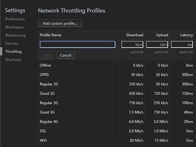
Click Add a custom profile, then enter:
- the profile name
- the download speed in kilobits per second
- the upload speed in kilobits per second
- the latency in milliseconds (the typical delay when making a network request)
Emulated Mobile Sensors to Simulate Mobile Devices In Browser
Smartphones and tablets often have sensors such as GPS, gyroscopes, and accelerometers, which are not present in desktop devices. These can emulate in Chrome by choosing More tools then Sensors from the Developer Tools main three-dot menu:

A new pane appears which allows you to define:
- the current latitude and longitude or select a major city from the drop-down. You can also select Location unavailable to emulate how your application reacts when the device cannot obtain a GPS signal.
- The orientation. Several presets are available, or you can move the device image by clicking and dragging.
Remote Real Device Debugging to Simulate Mobile Devices In Browser
Finally, Chrome allows you to connect a real Android device via USB for remote device debugging. Select More tools than Remote devices from the Developer Tools main three-dot menu. Ensure Discover USB devices are in check, then attach your phone or tablet and follow the instructions.
Chrome allows you to set up port forwarding so you can navigate to a web address on your local server on the device. Chrome’s preview pane shows a synchronized view of the device screen, and you can interact either using the device or Chrome itself.
The full range of developer tools in use, including the Application tab, to test Progressive Web Apps offline. Note that unlike a real application that requires HTTPS, Chrome permits PWAs to run from localhost over an HTTP connection.
Great! I Don’t Need Any Devices Now!
Chrome’s mobile browser emulator is useful and powerful, but it’s no substitute for interacting with your website or app on a real device to evaluate the full user experience.
You should also be aware that no device emulator is perfect. For example, Chrome shows a representation of the page on an iPhone or iPad but will not attempt to simulate Safari’s standards support or quirks.
That said, for quick and dirty mobile testing, Chrome’s device emulation is excellent. It’s far easier than switching between real smartphone and tablet devices, and you’ll have all the developer tools at your disposal. It will save hours of effort.
How to Simulate Mobile Devices In Browser – source https://www.sitepoint.com