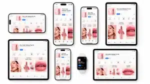
If your business needs a website with multiple primary goals, a split screen layout is a trend for the best viewing experience; See this article for the best split screen best practices tips for design.
It’s quite an unconventional design solution that gives equal importance to two important website areas that have gained popularity in recent years.
Although this solution breaks one of the oldest UI design rules, it works great, and many businesses choose to go with such a layout. It has a number of advantages over other layouts, including:
- Engaging viewers visually.
- Improving UX on mobile devices. A split design could be easily adapted for mobile viewing, which is a critical requirement for websites to rank on Google.
- Helping to focus a viewer’s attention on specific content using contrast.
- Providing an unconventional design solution that offers a unique experience.
- Aesthetic quality. When implemented properly, the layout can deliver a great viewing experience.
However, if you want to implement this split screen design trend on your site, remember that doing so without proper execution can break the UX.
Who Can Benefit From Split Screen Design?
If you think that split design is an appropriate choice for your website, remember that its purpose is to promote two or multiple things. For example, it can work great for portfolio websites. On the left side, you can include information about you or your business, and a list of your best works on the right. As a result, visitors will spend less time finding the information they came for.
Next, businesses that sell a limited range of products could also benefit from a split design layout. For example, by dividing the screen into two or more categories and dedicating each of them to a prominent product, you’ll make it easier for visitors to search for the most popular products.
Also, if you are a startup that sells one or two digital products, the split design layout viewing experience can be a perfect solution. Because it would focus the attention of visitors on them, even if they are completely different from each other.
You don’t even hire a team of programmers to make this work. Even small businesses can implement this on a WordPress website by choosing a ready-made split-screen theme.
As you can see, many users can benefit from a split design layout, so if you think you’re ready to become one, here are the tips we’ve got for you.
Best Split Screen Design Practices to Ensure a Perfect Viewing Experience For Visitors
Develop a Minimal Design with Vibrant, Contrasting Colors
This practice follows the concept of a card (after all, split screen design was inspired by cards). Using two contrasting colors to separate the two parts of the website and adopting a minimalist design. This way, you can focus the viewer’s attention on specific content.
Remember that you can use the colors of your brand! This technique will make your brand more memorable. Moreover, you can ensure that all your content will be above-the-fold, so the visitors won’t have to scroll.
Here’s an example of a website that follows these practices – The Square – an apartment complex in Ardmore, Pennsylvania.

2. Create a Flow between Two Parts
While the two parts of your website should be visually distinct, you can also make a connection between them. It can be a great design solution. It gives the impression of a visual flow from one part to another.
Take a look at the example below. The Ocean Resort Residences layers multiple elements (e.g., two text copies and a logo) across two screens to communicate a strong connection between them.

3. Emphasize the Call-to-Action (CTA) Button
The split design could be an awesome solution for home pages that act as landing pages. For example, embracing minimalism and using appropriate colors. This way, you can draw your visitors’ attention to the CTA button.
For example, the website of Sketch frame is an excellent example of making the CTA stand out without using too much contrast.
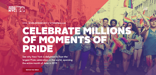
4. Apply A Colored Overplay
Doing so is a good way to ensure a pleasant viewing experience and create a unique look for your website. For example, take a look at the NYC Pride website below. Not only it applies a colored overplay, but the designers also made it cool by creatively splitting the screen.
As a result, a combination of different visual styles and colors makes the user experience unique and memorable.
The Bottom Line Split Screen Design Practices
The split screen design practice trend is an effective way to create a unique look for your website and make it more user-friendly. Moreover, they’re awesome for conveying equal importance to products, services, or sections of a website.
This is especially important today to reduce bounce rates and ensure a flawless user experience. We hope that the best split screen best practices tips for design described here will be helpful for you to make a final decision about your website design!