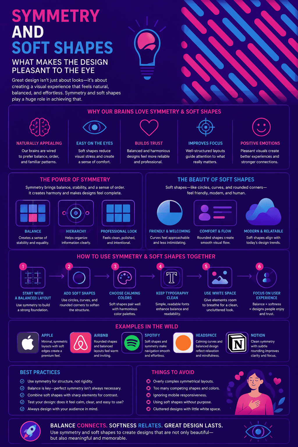
Symmetry and soft shapes, so know what makes the design pleasant to the eye; Whether it’s arranging shapes, colors, or objects in a design, symmetry is often considered one of the most aesthetic aspects. This may be because our brains are innately capable of seeing balance; and order that may not be present at all
In the wild, symmetry serves a different purpose than camouflage. Research on animal symmetry generally finds that symmetrical features act as a signal of health and genetic fitness, which is why many species select mates based partly on how symmetrical they appear, while asymmetry is more commonly associated with developmental defects, injury, or age. Camouflage, when it depends on body pattern, more often works by breaking symmetry rather than displaying it.
This blog post will examine some examples of symmetry in design and explore why it’s so interesting. We’ll also look at how the “softness” of the shape makes the design feel more familiar; and also how to use it to your advantage.
Why Is Symmetry Considered Beautiful?
Many people believe that symmetry is beautiful. This may be because humans tend to find harmony and balance appealing; or perhaps because symmetrical objects appear more orderly and structured than asymmetrical ones.
Whatever the specifics of its appeal, there is no doubt that symmetry holds a special place in our hearts. We are all drawn to symmetry at some level, whether by gazing in awe at a perfectly glowing crystal or by admiring the elegant curves of an art deco building.
Indeed, symmetry has played an important role throughout the history of art; and design, from ancient Greek amphitheaters to modern pixel-art video games.
Whether used on its own or combined with other elements, like asymmetry or contrast, it continues to inspire creativity and inspiration in all kinds of media today. In short, although it is not always obvious why symmetry always attracts us one thing is clear: it will remain a central part of what we consider beautiful for years to come.
What design research actually says about symmetry
Beyond the general sense that symmetry “feels right,” there’s a well-established body of visual perception research behind it, worth grounding the rest of this article in.
Symmetry is one of the classic Gestalt principles of visual perception, the set of ideas describing how the human eye and brain group visual elements into a coherent whole rather than processing them as disconnected parts. Symmetrical arrangements are processed faster and with less cognitive effort than asymmetrical ones, since the brain only needs to fully process one half of a symmetrical composition to understand the whole. This processing ease is part of what researchers call perceptual fluency, and fluency itself is consistently linked to positive aesthetic judgment: things that are easier for the brain to process tend to be rated as more attractive, more trustworthy, and more likeable, independent of their actual content. Nielsen Norman Group’s research on Gestalt principles in UI design covers this in detail and is a useful reference for anyone wanting to apply these principles deliberately rather than intuitively.
This is also why symmetry isn’t the only tool worth understanding. Deliberate asymmetry, used correctly, creates visual tension that draws the eye to a specific focal point, which is exactly why so many strong layouts use symmetry as a stable foundation and asymmetry as an intentional accent, rather than treating the two as opposites where one is simply better. It’s also worth knowing that specific preferences here aren’t perfectly universal; Visualmodo’s own research on cultural differences in web design found real variation across regions in how ornamentation, imagery, and layout choices are received, even where the underlying perceptual fluency effect holds broadly across cultures.
Symmetry in Website Design
Symmetry is a key element in website design, conveying organization and balance on the page. When all elements of a website are arranged with equal measure, visitors feel more at ease and can focus on the content without distraction.
Additionally, the symmetrical design allows webmasters to play with the placement and orientation of individual elements, enabling them to create a clean and modern aesthetic without looking overly rigid or structured.
Whether through slanted or centered positioning or by utilizing asymmetrical margins, symmetry is essential for creating effective and visually pleasing websites. So if you’re designing a new website; or looking for ways to improve an existing one, keep symmetry top of mind; and you cannot underestimate its impact!
How to actually apply this in a real layout
Understanding why symmetry feels pleasant is only useful if it changes what you actually do when building a page. A few concrete starting points:
For layout, a centered, symmetrical grid works well for landing pages, pricing tables, and any page where you want visitors to feel a sense of calm and order before making a decision, exactly the psychological effect this article is describing. Reserve deliberate asymmetry for the one element you most want someone to notice first, a hero image, a single call-to-action button, or a featured pricing tier, since breaking the pattern in exactly one place is what makes that element stand out against an otherwise ordered page.
For shape, the softness this article discusses in the abstract translates concretely into border-radius values in CSS. A subtle 4 to 8 pixel radius on buttons and cards reads as modern and approachable without looking cartoonish. Larger radii, 16 pixels and above, push toward a friendlier, more playful feel, appropriate for consumer and lifestyle brands but often too casual for finance, legal, or enterprise B2B contexts where a slightly sharper edge can read as more precise and trustworthy.
The practical takeaway: symmetry and softness aren’t style choices to sprinkle in decoratively, they’re tools for directing attention and setting emotional tone, and using them deliberately, rather than just because it looks nice, is part of what separates an intentional design system from a random collection of pleasant-looking elements, and it’s directly connected to how UI and UX choices affect a site’s actual SEO performance, since visitor comfort and engagement feed directly into the behavioral signals search engines weigh.
Why Are People Drawn to Soft Shapes?
Soft shapes have become increasingly popular recently, and many designers are now incorporating them into their work. While this trend seems primarily driven by aesthetics, there is a deeper reason behind this fascination with all things soft.
In essence, we seem drawn to soft shapes because they make us feel safe: they evoke memories of childhood and nestling under a blanket; they soothe our senses and help calm our worries.
Whether we realize it or not, the soothing presence of these gentle forms helps ground us; offering a sense of stability in an uncertain world. So if you’re looking for something that will bring back feelings of security and comfort, look no further than soft shapes; they may just be the perfect antidote to our modern anxieties.
Where Symmetry and Soft Shapes Can Cross Into Manipulation
Design principles that create comfort and trust can be used well or used to manipulate, and it’s worth understanding the difference directly rather than pretending it doesn’t exist.
The same visual comfort this article has been describing, harmonious layouts, soft edges, ordered composition, is deliberately used across many industries to keep people engaged longer than they might otherwise choose to be. This isn’t unique to any one sector, but it’s most closely scrutinized in categories where extended engagement carries real financial or psychological risk to the user, gambling platforms being the most studied example, alongside certain social media and mobile game interfaces.
The design and UX field has a name for techniques that use these same psychological principles specifically to work against a user’s own interests rather than to genuinely improve their experience: dark patterns, or deceptive design patterns. The U.S. Federal Trade Commission has taken direct enforcement action against companies using dark patterns, and its own guidance defines the category clearly enough to be a useful test: if a design choice makes something easy that benefits the business and hard to reverse or decline in a way that harms the user, that’s worth scrutinizing regardless of how pleasant it looks.
This matters for anyone applying the principles in this article. Using symmetry and soft shapes to make a genuinely good product feel calm, trustworthy, and easy to use is good design. Using the exact same techniques primarily to keep someone engaged past the point that serves their actual interest, without offering equally easy ways to stop, slow down, or opt out, crosses into manipulation, and increasingly, into regulatory risk. The difference isn’t in the shapes or the layout grid, it’s in what the design is actually optimizing for.
Conclusion
Websites are like first dates. You want to make a good impression, so you dress up your best features and downplay your imperfections. Just like you wouldn’t show up to a date wearing a sack, you wouldn’t want your website to be too boxy or sharp-edged.
That’s where symmetry and soft shapes come in. Symmetry conveys a sense of balance and stability, while soft shapes help to create a welcoming and approachable feeling. In other words, they give your website that certain je ne sais quoi will make visitors want to stay awhile – and maybe even come back for more.
Symmetry and design psychology FAQ
Symmetry is processed more quickly and with less cognitive effort than asymmetrical arrangements, since the brain only needs to fully process half of a symmetrical composition to understand the whole. This ease of processing, sometimes called perceptual fluency, is consistently linked to more positive aesthetic judgments independent of the actual content being viewed.
Gestalt principles describe how the human eye and brain naturally group visual elements into a coherent whole rather than processing them as separate, disconnected pieces. Symmetry, proximity, similarity, and closure are among the most commonly referenced Gestalt principles in UI and graphic design.
A subtle 4 to 8 pixel radius on buttons and cards typically reads as modern and approachable without looking overly casual. Larger radii, 16 pixels and above, create a friendlier, more playful feel suited to consumer and lifestyle brands, while finance, legal, and enterprise contexts often benefit from a slightly sharper, more precise-feeling edge.
No, deliberate asymmetry is a powerful tool for drawing attention to a specific focal point precisely because it breaks an otherwise established pattern. Most strong layouts combine a symmetrical, stable foundation with one intentional asymmetrical accent, rather than treating symmetry and asymmetry as a simple better-or-worse choice.
Dark patterns, or deceptive design patterns, are interface choices that use genuine psychological and design principles specifically to work against a user’s own interests, making a business-favorable action easy and a user-favorable action difficult, confusing, or hidden. The FTC has taken enforcement action against companies using these techniques, and the same visual comfort and trust signals used in good design can, when misapplied, cross into this category.
Infographic