The psychology behind logo design: how to choose the right logo for your brand. Branding is the #1 thing that to take care of even before launching your business. Your logo is the main element that goes into the visual brand aesthetics. And so when you start your business, it is really important to make a logo that will represent your business properly and trigger the right emotions.
Understanding the psychology behind colors, shapes, and styles for your logo design is a great way to ensure that your brand leaves an impact. Logo design is all about creating a brand’s visual identity that evokes certain emotions.
What Makes A Good Logo?
A logo serves as the identity of your business. It’s the first thing the public can immediately associate with your company. A compelling logo should be able to represent what your business stands for, as well as reflect what products and services you offer. When creating an entire brand strategy, a good technique is to align your logo with various promotional content, values, and philosophy of your business.
A bad logo can highly impact your brand’s reputation and credibility. If your team is inexperienced with creating and designing a logo, it’s best to seek logo design professionals to ensure the quality of your logo.
With that in mind, we have created an ultimate guide for creating a logo that has positive brand effects. Still, on the topic, Grief counseling can have a lot of benefits as well.
The Psychology behind color
Different colors have a different influence on the reader’s psychology and affect the way users look at your brand. When incorporating colors into your logo, make sure that you’re conveying the right message to your target audience.
Usually, Warm colors like red, yellow, or orange are related to comfort, warmth, hostility, and anger. On the other hand, cool colors like green-blue, or purple – such as red, yellow, and orange can leave feelings ranging from calmness and sadness to choose the right logo for your brand.
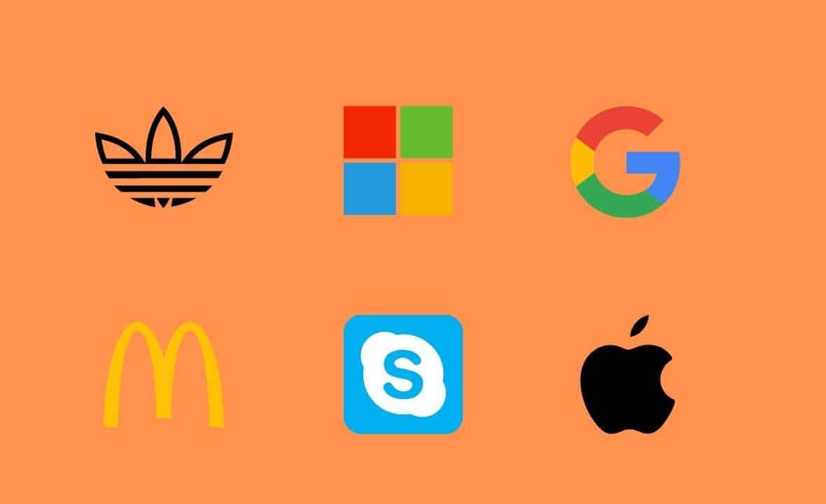
One of the best examples to help you understand the concept of color psychology is the Google official logo. The Google team did a lot of experiments to come up with a logo that has a certain behavioral effect. Just to know the depth of their experiments, the logotype G is created to reflect a childlike simplicity. The inverted e and multi-color playfulness had an important role in this.
To further optimize Google logotype they added whitespace between letterforms. Also, important to know that they had to push and adjust the vibrancy of red, green, and yellow to avoid the G from optical blending. Here’s the psychology behind the logo design.
But Google isn’t the only one to use color psychology, you can notice many other brands like Slack, Facebook (using blue color background with white alphabets for showcasing trust & sincerity).
But Google isn’t the only one to use color psychology, you can notice many other brands like Slack, Facebook (using blue color background with white alphabets for showcasing trust & sincerity).
Meanwhile, you may notice shades of red, yellow, brown, and classic black common among restaurant and food business logos. According to evidence in color psychology, red and yellow hues trigger hunger signals in humans, thus making these colors perfect for a food-related business.
Color walkthrough: Psychology behind logo design
- Blue – Dominant color used by brands like Samsung, Facebook, etc for calming impact
- Black – Used by Nike for power & strength
- Grey – For authority and professionalism, the best example is the WordPress logo from 2003.
- White – Though it’s known for evoking simplicity, perfection, and innocence, designers often use it for a combined effect.
- Green – Green could leave a wide range of influence based on the tone, but most common are nature, growth, and peace. Sprite is the evergreen example.
- Brown – The warm color used often by law or construction firms.
- Yellow – Yellow color is used for happiness and joy. McDonald’s uses it along with red for showing energy and happiness all together.
- Red – Red color triggers strong emotions like aggressiveness, energy, passion and is thus used by those targeting a young audience, for example – Coca Cola psychology behind the logo design.
Effects of logo icons/shapes and fonts
Some of the most iconic brands used logo shapes as a way to influence the way people perceive values, products, and services. More importantly, specific logo shapes affect brand commitment or customer loyalty in certain ways to choose the right logo for your brand.
While infographics, social media graphics, and presentations consider different icons/shapes as one of the many elements. When it comes to logo design, the shape is as important as color. Moreover, you can integrates itr as part of your modern logo design idea.
Companies often use different geometric shapes, organic structures, and even abstracts in some cases. When choosing the correct shape, you should ensure how you want your brand to be accepted by your customers. Is your business more on the casual and friendly side? Use rounded shapes like ovals and circles. On the other hand, if you want to establish trust, security, and efficiency, there are no better shapes than squares and rectangles.
The third pillar of your brand logo – fonts, also affect the audience behavior to an extent.
By simply changing the font style to an emotional font or a powerful font, you can do as much as making a visitor feel differently, or respond to your brand in a certain way. For instance, Baskerville, a transitional serif font, can trigger a sense of authority. Currently, Helvetica is one of the most common logo fonts by top brands.
What are the other elements that affect brand value: The psychology behind logo design
- Eye-catchy domain name – To have the best effect on your brand awareness strategy, you need to have a solid business name in the first place.
- A killer value proposition – Creating a powerful landing page. Or value proposition is a great way to get more eyes on your brands. Most of the websites use the same slider-based or stationary hero banner. You can go one step ahead by using something like a product recommendation quiz. So, engaging your visitors with pre-set workflows for spreading brand awareness.
- Fast loading pages – Any site that takes more than three seconds miss out on a lot of visitors. And so you must optimize your website for speed.
- An excellent WordPress theme – Selecting a WordPress theme is one of the tricky tasks that site owners often overlook. For those who are in for the long run, a beautiful WordPress theme that goes with your brand and logo design is important.
- Good usability – Usability is how easy it is for the visitors to perform the task website. You need to test your site to make it easy for the audience. To perform the ultimate goal (subscribe, buy a product, and more).