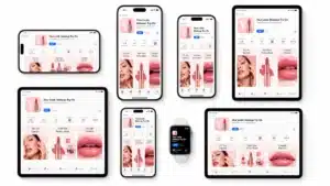
Did you know that bad web design can cost you conversions? Users lose trust in your business if your site looks unprofessional, or by simply not having your contact details on a site, you may lose more than 40% of potential customers. Check the top & best strategies for boosting your conversions rate using the web design trends.
A new infographic by Design Advisor highlights some of these issues, with a detailed list of fifteen web design trends to look out for. Each trend comes paired with case studies, advice on good practices to follow, and things to avoid to improve user experience.
Conversions Boosting Trends
Here’s an example: The section on user experience details. That almost all users (95%) value their experience in a site. As the most crucial factor for assessing whether to purchase from it. For example, the Physicians Committee for Responsible Medicine (PCRM). Up to increase mobile traffic by 40% and social referral by 1624% by utilizing branded storytelling. So, improving their aesthetics and user experience. Design Advisor recommends engaging users to scroll as a way of improving the way they experience your site.
Some trends are not as broad. For instance, adding your contact information alone can greatly increase conversions. The reasoning is simple. If users can’t easily find a way to contact you in case of problems. Or to learn more about a particular product or service trends for boosting conversions rate.
They won’t trust that the business is legitimate. This is more important than you may think. As a study mentioned in the infographic below shows that 64% of visitors will search for contact information. After landing on a company’s site.
All in all, these trends are worth keeping up with if you wish to increase your conversions. The impact of good web design on revenue is often overlooked. Yet investing in it can mean the difference between a satisfied returning customer and a less-than-impressed one. Check the infographic below to learn more about what you can do to get your web design game up to par. Finally, see the graphic now.
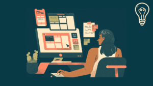
Create an Easy to Navigate Website Design Trends For Boosting Conversions Rate Strategy
The best way to get website visitors to take action is to lead them. Creating user-friendly, intuitive navigation on your website will help them find what they’re looking for and take them where you want them to go with as few clicks as possible.
Design Powerful CTA Buttons
A call-to-action (CTA) button is what a user clicks to initiate a conversion. The better your CTA button is, the higher your conversion rate. Research shows that red, orange or green CTA buttons generate the highest conversion rates whenever they stand out on the page. For more information, see our blog post, 4 Easy Steps to Improve Your Call-to-Action. So, a good use of the best web design trends and strategies for boosting conversions rate.
Use Pictures to Provide Directional Cues
If you want users to go to a specific place on your website, use images to nudge them in the right direction. Do you have a photo? Try having someone subtly point or see where on the page you want your visitor to go next, such as a button or CTA. If none of the images on the page are suitable for indication, you should use an arrow pointing to the CTA.
Minimize Selection Website Design Trends For Boosting Conversions Rate Strategy
Research shows that the more options you give someone, the longer it takes them to make a decision. In web design, you can increase conversion rates by limiting users’ choices. If you have a main desired action you want your site visitors to take, give them a clear path to take that action, not a list of options.
Follow the Thirds Rules
The rule of thirds is a design principle inherited from the print world to web design, used to determine the best areas on a page to place important content based on the user’s natural line of sight.
If you mentally draw a tic-tac-toe grid on your web page that divides the page into thirds horizontally and vertically, the four corners of the central square are the best places to place important content, such as headlines and calls to action. Good location. As a result, a good use of the best web design trends and strategies for boosting conversions rate.
Intuitive, Intentional Color Palette
Your color palette is one of those web design elements that doesn’t need anyone’s attention but can easily be noticed when done wrong. When done right, a well-designed website with an intentional color palette can do a great job driving conversions. This is an easily overlooked element of web design, but it’s quite helpful.
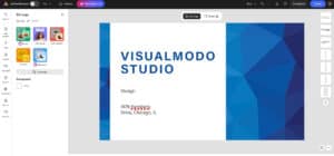
By using pops of color on calls to action and key messages, you can direct users’ attention exactly where you want it. Not to blow our own horn here, but Visualmodo’s new website is an excellent example of a conscious color palette. Just looking:
The primary colors are intense black and white. In this screenshot of our homepage, you can see the CTA highlighted in light blue. This draws attention to the CTA we want people to convert to.
Conversions Boosting Trends Tips and Strategies Infographic