Typography trends – like graphic design trends or color trends – rarely appear out of nowhere. Instead, they evolve and grow as they move from the niche to the mainstream. That’s why to forecast vital typography, fonts, and creative typeface trends.
The internet changes so quickly and often that web designers can barely keep up. What works for clients and converts well one month might ultimately falter the next. So we must keep up with trends, specifically typography, because it is foundational to every project we work on.
Typography Trends You Most Look
2023 is pretty exciting, honestly, because some trends we’re seeing may just shake up what we’ve taken for granted over the past few years.
Let’s look at what this year has in store for us!
Why Is Typography so Important?
Share The Brand Idea and Purpose: The designers understand that the creative use of fonts can bring a typography design to life. But they pick a particular font to reflect a brand’s personality. For instance, a rock music band’s logo is usually in big and bold letters to represent the band’s loud music and bold personality. Similarly, a web page to sell toys will have comic fonts. A company that boasts an ancient brand will likely use classical typography.
Makes your Business Different: Typography also helps brands stand out from their competitors. Use a different typeface or font uniquely in your logo, website, etc., and your brand will look different from your competitors.
Creates Real Brand Recognition Felling: Typography is an ideal tool in the hands of graphic designers to build brand recognition. People start associating the use of a particular font with a brand in advertisements, logos, websites, etc. This association helps in recognizing a brand immediately amid the crowd
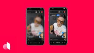
1. Broken & Chaotic
The clean, simple web of yesteryear is gone. In its place are large, flashy, chaotic, broken layouts where the user might be a little overwhelmed. At first, you might think this trend is a little overpowering, but in reality, users get drawn in by the chaos and tend to explore sites that spark something creative in them.
2. Serifs Creative Typography Trends

Again, moving away from the stark and clean lines of minimalism, serif fonts are returning to the trend to add more warmth and character to the web. As storytelling and human connection become more prevalent in branding and commerce, serif fonts are an excellent way to add elegance and sophistication to your work. Often you’ll pair a sans font with a serif font if you’re trying to convey an approachable business tone, but if you decide to go with a dual serif, your readers will get a cozier feel.
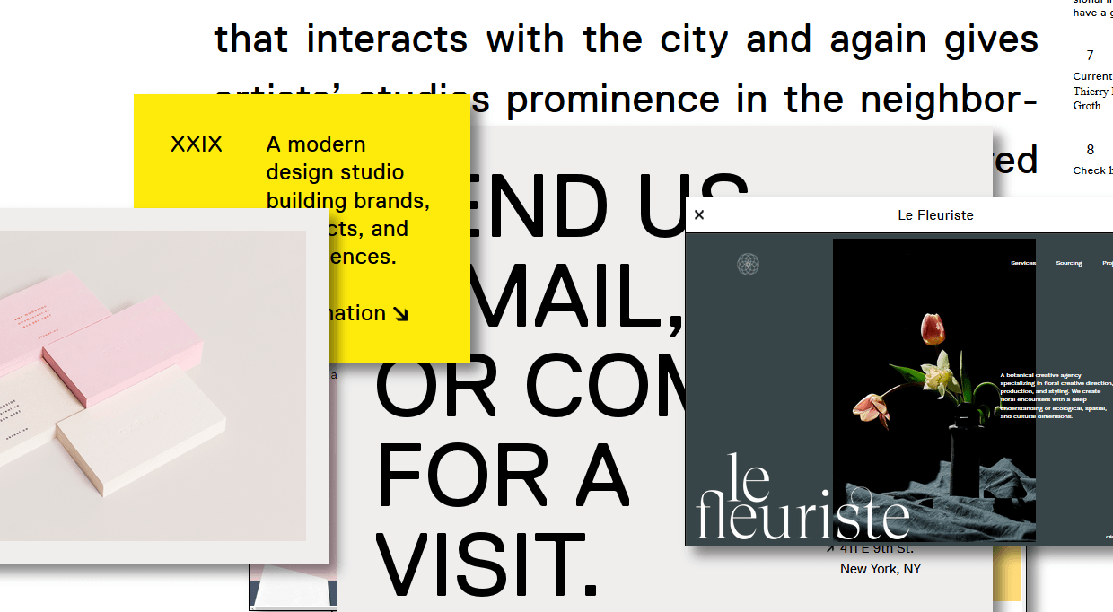
3. Cutouts and Overlays
Big, bold, and bright. That’s how 2022 is going to be remembered. And while the cutout lettering and overlay type didn’t get their start in 2022, we are going to see them gain momentum and move toward the spotlight. We will see more parallax backgrounds, animated effects, and stunning photography overlaying a site’s text or sitting a bit behind it as a background.
4. Highlights Creative Typography Trends
Whether it’s a color highlighting part of a paragraph, underlining a single word in a sentence of a headline, or using a separate font altogether, making individual elements of your typography stand out is definitely on the uptick. We will see many more sites drawing users’ attention to desired areas through typographical and creative fonts trends that mean more than traditional design.
Instead of white space and eye-catching illustrations, designers in 2018 will simply highlight what they want you to click on and read. Kind of like your teachers did on the chalkboard back in the day when they triple-underlined something for importance. What is old is new again, right?
5. Variable Fonts
One-size-fits-all might be okay for hats and freebie sweatshirts, but it is certainly not OK for fonts. And sometimes, having bold, italics, and “regular” fonts isn’t enough. Enter variable fonts. This is a scaling type with different weights and axes. You can customize every last iota of your typography now.
6. Hand-drawn Lettering
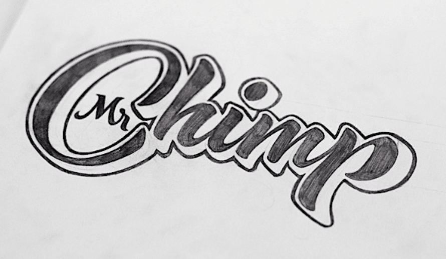
Year after year, this one just keeps coming back. Of course, in 2022, it’s not only handwriting-style fonts; the trend will be legitimately hand-drawn lettering. We are going to see a lot of sites that use not only hand-crafted fonts that are an idealized version of someone’s handwriting but also unique, hand-lettered logos and headers. Instead of a font or type, you’ll see a legitimate, one-of-a-kind creation.
Those with sloppy edges and thick lines are more popular among hand-drawn typefaces. These fonts can be easily used with watercolor textures and foils. Another reason for the popularity of such fonts is that they are irreplaceable for creating feminine designs. Graphic designers are increasingly using hand-drawn fonts to grab attention. In recent years, handwritten font styles have been limited to brands in a few companies and industries. But now it has made a comeback. Today, many hand-drawn fonts are available online like never before.
7. Gradients
Gradients are everywhere these days. When Instagram changed its logo background to an angle, the internet collectively gasped. And now, it’s just another thing that happened. And as the web has become more used to gradients as backgrounds, it was only natural that the effect moved into the type itself. 2018 typography trends are leaning heavily toward having the lettering feature the rise rather than the background. Depending on the site, it could be for a three-dimensional effect or simple stylization. Regardless, expect many colors in 2022.
Of course, background gradients are getting an upgrade, too, and they’re being called color transitions more and more often. Combine them with lettering, and you’re ahead of the curve.
8. Maximalism: Typography, Fonts, and Typeface Trends
Maximalism for fonts and typeface creative trends is on the opposite end of the minimalist spectrum. If you didn’t guess it already, the movement of making your typefaces large, in-your-face, and pretty unmissable is coming into vogue much more than it was previously. Instead of simple, clean layouts, we are seeing an increase in large, bold, clean designs. They still work on simplicity to function and on effective use of whitespace, but the tone is different than users may expect. In some ways, I can see this being seen as maximalist minimalism.
9. Hiding Content Creative Typography Trends
Weirdly enough, hiding the stuff on your website is becoming trendy in 2022. The caveat is that the hidden elements must still allow the remaining content to be legible and understandable. If you cut out part of a letter or letter, the message of the type cannot be lost. It’s a razor’s edge here because if you do it wrong, you eliminate the site’s content and alienate your user, but…it’s also ugly. However, when done right, it works as a tremendous creative typeface and fonts for your brand’s trends.
10. Off-Kilter Kerning
We take the space between letters for granted. As readers, we just expect things to be symmetrical, readable, and uniform. But 2018 will likely see a change in kerning styles, adding a lot more space between letters to give websites a clean and open feel that cramped lettering just can’t provide. This abnormal use of kerning–to put the notes at word-width apart–can help retention rates and make your users feel more comfortable and languid as they spend time on your site.
11. Outline Font typeface trends
Many websites use fonts with outlines to make them look great. This is a rapidly emerging trend among designers. Most of the time, outline fonts are sans serif and uppercase text. These fonts are often used in combination with fill fonts. You will also notice that the text elements are too large. This outline font mainly occurs in the hero section of the web page.
When building your font, make sure that the letters don’t lose their effect with the background image on your website. So when outlining fonts, consider the position, color, and contrast.
12. Problematic text effects: Typography, fonts and typeface trends
Many projects use fonts that look questionable. This is mainly to add an exciting element to the overall typographic art. The designer adopted such a font under the influence of Douyin.
However, the use of this font makes them almost unreadable. But the main goal is to make the glitch effect stand out as an artistic element. You can find many sites that use incorrect text in the Hero header with creative fonts that trends.
The Next Big Thing?
Those are some of the big trends that we see coming in 2018. We think that it’s important to stay on top of these trends so that the content and value that you bring to your clients stay as state-of-the-art (literally in this case) as possible. What’s interesting, too, is to look back on the trends from a couple of years ago and see the evolution of what was successful and what fell by the wayside.
So what do you see on the horizon for typography trends?