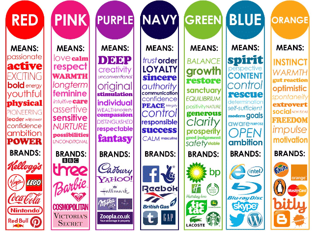
If your business has a website, it is important to understand how the colors you choose for your website design affect online behaviors and how, ultimately, color psychology & web design will impact your business.
In the greater scheme of things, color preferences can be cultural or experiential, though, in western society, it is still mostly subjective.
From a business standpoint, color can influence a person’s mood and general attitude towards your brand. In this sense, it should always be something to consider as anything that affects how people respond can be pivotal to your success or lack thereof.
Color Psychology: The Basics
Without getting into the deeper implications of color emotions in logo and web design, there are some basic principles that are easy enough to understand and apply to your advantage.
In short, color theory is about the interactivity of colors in terms of contrast, vibrancy, and how they complement each other. Psychology kicks in when these color choices and combinations begin to affect human behavior.
Having a good understanding of color theory can, in principle, help you grow your business. This can be accomplished through subtle manipulation of your website’s color theme.
Colors & Their Meaning from a Cultural Standpoint
Colors have great significance in a cultural sense. For instance, red denotes importance, abruptness, fire, passion, and urgency in our culture. Red demands our attention, and so our eye goes there first before it acknowledges other colors. In Indian culture, red symbolizes wealth, power, love, and beauty. In Chinese culture, red denotes prosperity and longevity. These are all similar concepts, but not all colors share this inherent connection.
In our society of color psychology, blue represents a masculine principle, while in Asian culture, it denotes the feminine, and in the Middle East, it signifies spirituality and immortality.
Green represents luck to the Irish. In America, it means wealth. Asian cultures view green as a symbol of new life and fertility, while in some European cultures, it stands for envy and greed and is therefore seen as unfavorable.
Yellow means jealousy and weakness in Germany and France, while in Japan and Africa, it represents bravery, valor, and wealth.
Pink is an odd color in that it didn’t exist in Chinese culture until Western influence introduced it. We typically associate pink with girls, femininity, romance, and breast cancer, while in Japan, it is much more often a part of a man’s color palette.
FUN FACT: Men and women perceive colors differently, and in general, each gender will tend to have different color preferences. Women prefer softer shades while men gravitate to bolder hues.
Summing up, if you were designing a website for a business in another country or culture, it would be wise to consider what specific colors mean before you make these decisions.
Color Choice Affects Conversion Rates Color Psychology

It has long been an inducement to purchase consumer goods from a psychological standpoint. People are more likely to buy a product from a website if the color conveys the right message. When customers were asked to correlate a particular color to a feeling or mood, these were the results:
Blue: trust, honesty, security
Black: exclusivity, quality, high price, fear
Red: expediency, speed, courage, immediacy, courage, mystical
Orange: fun, inexpensive, low quality, most minor favorite color
Purple: courage
White: trust, clarity
Grey: high tech
Numerous studies have been conducted on how color schemes tend to affect buying behaviors and a visitor’s tendency to linger on a web page. Ultimately, it is a massive subject that could fill volumes with gathered metrics and philosophy. What you really need to know is how and if your choice of colors will enrich or harm your efforts. I’ll explain more of this below.
Keep Your Website Colors Simple & Appropriate to Your Audience
While these studies’ results are fascinating from a psychological standpoint and should be considered, there are other aspects of your color scheme that should also figure high in your design decision. Here’s a primer:
Err on the Side of Simplicity & Readability
Choose high-contrast primary colors to ensure your text is readable. Colors should be contrasting, but one should not be a lot brighter than the next to avoid eyestrain. Light colors are best for the background, with a very dark color for the text itself. It’s hard to go wrong with simple black and white.
Sharp Contrast Draws the Eye: Color Psychology
If the frame you want to draw attention to is a different shade than the background, attention will automatically be drawn there. Using various contrasting shades can help direct the viewer’s attention to where you want it to go on the page.
Vibrant Shades Emphasize Emotions
If you are designing an advertisement, a landing page, or if you want to evoke a particular feeling when visitors view your site, brightening the colors are sure to elicit a response. Darker colors tend to relax, allowing the viewer’s eye to fall on other page elements. However, keep in mind that the brighter the color, the more mental energy it will draw from the viewer.

Choosing the Right Color Scheme for Your Website Design
Choosing website color schemes is an art in itself. Short of going back to school and learning all kinds of color theory, here are some tips you can leverage towards your best website color choice:
- Choose Bold, Primary Colors
Bold colors send a direct message. They are attention-grabbers, and they also provide an opportunity for high-contrast.
- Opt for a Two-Color or Three-color Scheme
Keeping it as simple as possible is always your best bet. Too many colors will give the impression of chaos, which is likely not what you’re trying to convey.
- Once You’ve Chosen the First Color, Choose Its Opposite.
In a two-color scenario, choosing the polar opposite of color on the color wheel will give you something to work with. In a three-color scheme, use a triadic methodology, in which you draw a triangle in the color wheel: choose your base color and then draw an equilateral triangle from that point. This will form the basis of your three-color scheme.

Here is an example of a triadic color scheme. Using Adobe’s Color Wheel tool is a great way to discover colors for your website.
You can explore other color theories, but keeping it to two or three colors initially will serve you well. If you are unsure about what colors you should be choosing, do some A/B testing. Try changing colors from one color scheme for a set period of time, and then after, try another. After the test period, check your analytics to view your results.
Color Psychology Conclusion
While the psychology of color is important, keeping it simple goes a long way to earning a customer’s trust and developing brand recognition. A bold, high-contrast website design that follows the basic principles of color theory will always serve you well.


