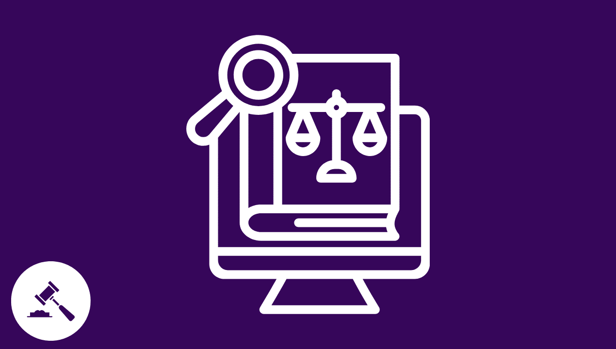
The law is built on rules and precision. Yet people experience it emotionally. To most, it feels confusing, inaccessible, expensive, and stressful. Even in its digital form, the law often remains something to endure rather than something to understand. Legal language often reads like a foreign code in tiny print. This creates distance between systems and the humans they serve. In this article, we’ll explore UX design in LegalTech, focusing on building trust and accessibility into digital law.
As law firms and legal platforms move services online, simply digitizing forms isn’t enough. These efforts often replicate the complexity instead of solving it. This is why the need for dedicated UX design in LegalTech is skyrocketing. The core mission is to shift the focus from what works for the lawyer to what gives the client clarity and peace of mind.
We’ve successfully simplified complex user flows in finance and e-commerce. Now, as we turn to legal services, it’s time to ask: What if accessing vital legal services could feel as approachable and clear as checking out with a single click? That question sits at the heart of a movement to humanize the law through design — one interface, one interaction, and one informed user at a time.
Why Legal Interfaces Feel “Inhuman” LegalTech UX Design
Why is engaging with legal services online so painful? It’s not just poor aesthetics; it stems from a reliance on dense terminology, rigid forms, and layouts built for efficiency rather than empathy. When these formats move online, they create digital experiences that feel cold and intimidating. Users often sense these systems are actively hostile.
What makes this worse is the high emotional context of most legal interactions. Whether it’s a divorce, a contract dispute, or a business agreement, the stakes are personal and high. This means clients are approaching digital services while carrying a high emotional and cognitive load. Poor design in these moments doesn’t just frustrate — it amplifies stress and confusion.
A lack of trust can also be a barrier. Many digital legal tools feel impersonal, transactional, or unreliable. When handling sensitive and life-changing information, users deserve reassurance. UX design should foster trust through clear communication, process transparency, and robust demonstrations of security and privacy.
The result? Barriers to justice that no amount of automation can fix. Users abandon online dispute forms halfway through, misinterpret critical instructions, or simply give up. Every time a user clicks away from a confusing page, they are being denied their opportunity to complete a necessary legal process. Modern legal software development services are beginning to close that gap, blending functionality with empathy to make the law more approachable.
LegalTech UX: Best Practices of a Human-Centric Design
If traditional legal systems are built on precision, good UX design adds what’s often missing — clarity, accessibility, and reassurance. We must look beyond simply making software functional and instead focus on creating experiences that are empowering. These three pillars define what truly human-centered design in law looks like building trust and accessibility in digital law.
1. Clarity & Wayfinding
Legal information should inform, not frighten. If a user can quickly find the right starting point and understand the sequence of steps, anxiety immediately drops. Good information architecture organizes documents and workflows in a logical, common-sense order. For example, we call it a Request for Supreme Court Review instead of a Writ of Certiorari. Good design uses a clear visual hierarchy, progressive disclosure (informing in steps), and helpful microcopy to allow users to navigate through complex systems with confidence.
2. Accessibility & Inclusivity LegalTech UX Design
A fair justice system is an accessible justice system. Online legal platforms’ UX should be approachable for everyone, regardless of technical skill, device, or ability building trust and accessibility in digital law. A mobile-first approach meets users where they are, and clear layouts and words accommodate different reading and language abilities. This requires adherence to WCAG standards (Web Content Accessibility Guidelines) and thoughtful design for different literacy levels. Accessibility should not be a feature; it is a responsibility that broadens access to justice.
3. Feedback & Reassurance Building Trust and Accessibility in Digital Law.
Users need to know where they stand. Status tracking for cases or documents, transparent timelines, and progress indicators answer essential questions: “What’s next?” and “Where am I now?”.
When things go wrong, the system shouldn’t respond with a technical code. Helpful error messages and proactive FAQs turn confusion into clarity, transforming legal interactions into experiences that feel trustworthy and humane. Error messages must clearly state what the problem is, why it happened, and, most importantly, how the user can fix it.
Together, these principles form the foundation of better legal technology UX. To put them into practice, it’s important to see how designers can translate these ideas into tangible, client-centered interfaces.
Crafting the Client Experience: A Designer’s Toolkit
To make digital transformation in law firms a reality, we don’t need proprietary platforms; we need better design practices applied to the tools we already use. For those building and designing web experiences, especially on platforms like WordPress, the frontline of legal transformation occurs in three key areas: content, visualization, and form design.
Content Design as Legal Translation LegalTech UX Design
Every word on a legal platform — from a button label to an error message — carries weight. If a user needs a dictionary to understand your service, the design has failed. Instead of simply mirroring legal language, we must treat text as part of the user interface itself. Content design becomes an act of translation, transforming complex legal language into clear and concise communication.
UX research in LegalTech clearly shows that an effective microcopy can transform a tense interaction into a reassuring one. Instead of a cold “Submit,” a phrase like “Your information is secure — continue” builds trust. This small addition significantly lowers the user’s anxiety about data security.
Adhere to existing web style guides to ensure language is accessible. Consistent with accessible language standards, such as communicating at an 8th-grade reading level, helps ensure users don’t feel alienated by tone, jargon, and terms. If you have to use complicated legal terms, you need to follow that with a simple explanation right away, or you can use tooltips and explanations internally.
Visualizing the Journey, Not Just the Destination
Legal processes can be lengthy and intimidating, and improving usability in legal apps is a hard necessity. Designers can lighten the load of a legal process by visualizing the journey — adding a progress indicator, milestones, or even an icon to represent where the user is, and what is coming next.
Being unsure of how many steps are ahead when signing up for a service can be a stressful experience. If it’s a lengthy process — such as filling out a trademark application — then implement a progress indicator and set milestones. A long five-step trademark application feels a lot less daunting when you can see how the steps are unfolding.
Use a simple flowchart, icons, or even an interactive timeline to illustrate the user’s physical location in the service. This directly addresses wayfinding and reassurance, as it confirms to the user, “You are here and this is what is coming next.” Visual wayfinding is not for decoration.
The Power of the Simplified Form
For many law firms and LegalTech services, the contact form or client intake questionnaire, often built using popular builders, is the most crucial interaction point. We must treat these forms as the critical front line of client intake.
In WordPress environments, common form builders, when designed with empathy, can be powerful tools of UX for lawyers and clients. Reduce errors and cognitive load by designing forms that use generous spacing, clear single-column layouts, and input masks (e.g., automatically formatting phone numbers). Too many fields crammed onto one page overwhelm the user.
Conditional fields — showing additional questions only when relevant — keep interfaces clean and approachable, proving that thoughtful design can make even complex legal intake feel effortless. By using it, you hide complexity until it’s absolutely necessary.
Together, these strategies bring human-centered design to life — turning abstract UX principles into real, measurable trust between people and digital law.
LegalTech UX Design Wrapping Up
Ultimately, digital legal services design isn’t just about smoother interfaces or faster workflows — it’s about democratizing access to justice. Every thoughtful layout, reassuring message, and intuitive interaction helps close the gap between complex systems and the people who depend on them. When UX makes the law feel intuitive and approachable, we empower people during life’s most serious challenges.
Designers and developers hold real power to make the law feel less like a barrier and more like a bridge. As the next wave of legal innovation unfolds, empathy must be at its core. By blending technology with human understanding, we can build digital legal experiences that are not only functional but fair, transparent, and deeply human.