Whether it’s for productivity, performance tracking, or presentation, learning data visualization is important for any business or professional. Data visualization is the graphic and visual representation of data and information. Its purpose is to communicate a summary of the data being presented for the purpose of the presenter. In this article, we’ll share everything that you should know about Google analytics charts.
Data visualization has multiple benefits. For one, it helps decision-makers factor in data and insights before making a call on business decisions. It also helps with pattern recognition to stay on top of the latest trends.
With the rapid development of technology, data gathering, analysis, and representation has become so much easier. In fact, there’s a chance that you’re aware of some of these technologies. For example, Google Analytics, a web analytics service, provides you with the tools for Search Engine Optimization (SEO) and marketing.
For data visualization, one of the tools that Google Analytics offers is Google Analytics Charts. As such, this article will serve as your quick guide to this particular tool. It’ll help you understand what it is if it’s for you, and how you can use it.
What is Google Analytics Charts?
Having discussed data visualization and Google Analytics, let’s discuss the nature of Google Analytics Charts.
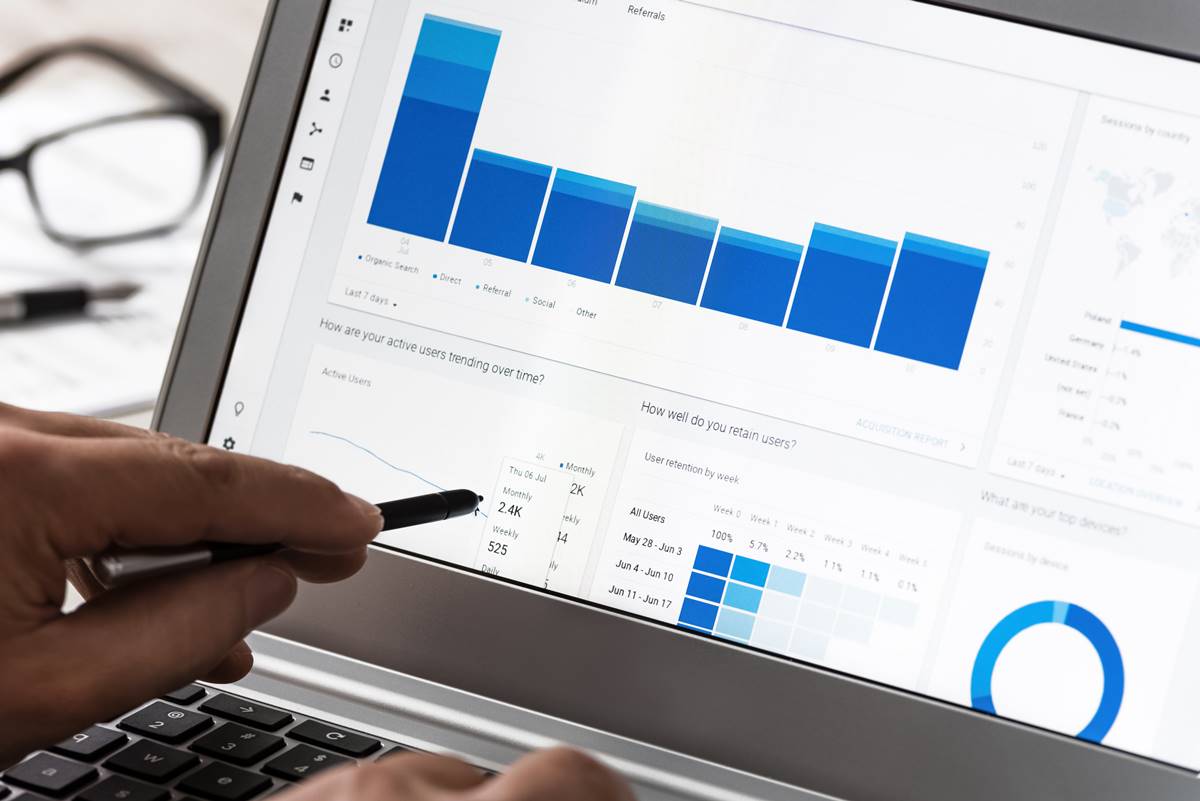
Google Analytics Chart or list widget is a tool from Google Analytics that helps you turn your data into charts. These key metrics are gathered from your website’s Google Analytics account, including data from Ads campaigns.
Visualize Further with Microsoft Power BI
Several services have their own way of integrating other technologies into the system. Fortunately, there are numerous resources for learning how to do this, such as YouTube, online courses, and blogs. For example, one of the business analytics services available right now is Microsoft Power BI. You can learn how to use Microsoft Power BI on a training course, such as this one from Acuitytraining.co.uk.
You might just be getting started on your business and choosing a new data analytics service. When using new technology or even a service, it’s important that you learn about all the features it holds. After all, you’ll want to optimize every system in your business.
Quick reference table for Google Analytics charts
| Chart type | Best for | Key settings to check | Common pitfall | Quick win |
|---|---|---|---|---|
| Line time series | Trends and turning points | Date granularity, comparison period, smoothing | Reading daily noise as a real trend | Compare this week to the same days last week to remove weekday bias |
| Column or bar | Ranking channels, devices, pages | Sort order, stacked versus grouped, top N limit | Mixing different scales in the same view | Sort by conversion rate and show top ten only for focus |
| Scatter plot | Relationship between two metrics | Metric on X and Y, point size as a third metric | Assuming correlation equals causation | Plot engagement time versus conversion rate by landing page group |
| Geo map | Regional performance and expansion ideas | Region level, normalization by population or sessions | Confusing volume with rate | Switch from total conversions to conversion rate for fair comparison |
| Funnel exploration | Form or checkout drop off | Step order, make steps optional or required | Missing intermediate steps that hide friction | Add a step for shipping method to see where decisions slow |
| Path exploration | Journey insight and loop detection | Start point or end point, node grouping | Reading every rare path equally | Group low volume nodes and focus on loops and exits |
| Cohort exploration | Retention and re engagement | Cohort by acquisition date, metric per week or month | Expecting perfect diagonal lines | Track percentage returning by week to measure sticky content |
| Segment overlap | Audience planning | Three segments, include and exclude logic | Overlapping logic that double counts | Find the sweet spot of high intent users across two behaviors |
| Treemap or heat tile | Long tail and outliers | Tile sizing metric, color metric | Overcrowding with dozens of tiny tiles | Size by sessions, color by conversion rate to spot hidden heroes |
| Free form combo | Mixed questions in one place | Row dimension, column dimension, applied segments | Mixing incompatible metrics | Build a mini dashboard per question, not one mega table |
What You Can Use It For
Google Analytics Charts can be used for several things that’ll help you communicate your web analytics. Specifically, it can be used in your reports, presentations, and dashboards. In these materials, you’ll be able to present numerous insights about your website. Some of these are your users’ information, pages per session, average session duration, and more.
For further elaboration, your users’ information can help you find out more about your audience. Meanwhile, pages per session indicate the number of page views a user does per session. Then, the average session duration refers to the amount of time a user remains on your site per session.
How It Can Help You
When using Google Analytics Charts, you’ll be able to summarize your data to make it more comprehensible. One major benefit to these charts is that they can update in real-time, keeping your insights up-to-date.
Whether you’re an SEO specialist or website owner, Google Analytics Charts helps you make decisions or suggestions based on data. To further explain, using charts helps you make sense of your data. Instead of tiring yourself reading lines and lines of spreadsheets, these charts will help you interpret your site’s performance.
Finally, by using the charts that reflect your site’s data in real-time, you can make changes and improvements. As a result, you can improve your audience’s experience when using your site. Also, you can add them into your report design for better description of results.
How to Use Google Analytics Charts
Google Analytics can integrate your charts into your reports or dashboards. First, if you wish to add the charts to your pdf reports, you can start by hovering your cursor over the gold gear icon. Then, you can click ‘add to pdf reports.’ Then, simply select the PDF report you wish your report or graph added to.
On the other hand, if you wish to add the charts to a dashboard, you can find this by hovering over the gold gear icon again. Then, do the following:
- Firstly, click add to marketing dashboard.
- Secondly, click the dashboard with the campaign name.
- Click the dashboard page of the report that you want it added to
- Click the go to dashboard if you wish to further customize the report. Make sure to refer to the report options section for the details that you can customize.
Tips On Data Visualization Using Google Analytics Charts
When creating reports, displaying your data properly, resulting in clear communication is important. Here are the top three tips to note when customizing your reports:
1. Use the appropriate charts
The four most common charts are bar graphs, pie charts, line graphs, and Cartesian graphs. Remember that all these serve their own purpose. As such, it’s important to choose the appropriate chart for your insights. For example, if you wish to see the portions that make up the total of your data then use a pie chart. Meanwhile, if you wish to see how a certain data has changed over time, then a line graph’s the perfect chart.
2. Choose complementary but contrasting colors
Did you know that color vision deficiency (CVD) affects approximately 8% of men and .5% of women? This doesn’t mean that all they see is black and white. However, they have a harder time distinguishing the difference between two shades of the same hue. So, it’s important to choose appropriate and contrasting colors so your viewers don’t have a hard time comprehending your charts.
3. Label things without over cluttering your presentation
The point of using visual representations of your data is to summarize them and make them more presentable. As such, to balance illustration and clarity of your data, make sure to moderately use labels and label only what’s important.
Conclusion
Data analysis and visualization are important for any field, especially for SEO, marketing, and website management. Fortunately, technologies and services, like Google Analytics Charts, can help you optimize your sites for a better user experience. Hopefully, this article has helped you understand Google Analytics Charts––whether you’re considering using it or getting started with it.
