
All-in-One Platform for AI-Editable Graphics
Woopicx is a modern platform designed for anyone who needs high-quality visuals but doesn’t want t...
Welcome to the Color tag archive on the Visualmodo blog. This page brings together every post about color palettes, illumination, chroma, and the full spectrum in digital design. You will find practical guidance on choosing palettes, building systems for brands and UI, improving contrast and readability, and using hue, saturation, and brightness to create better visual hierarchy. Browse the latest colored articles, explore inspiration and theory made usable, and apply these tips to websites, graphics, and product design.
Woopicx is a modern platform designed for anyone who needs high-quality visuals but doesn’t want t...

Great web design does not start with color palettes and fancy effects. It begins with a clear purpos...
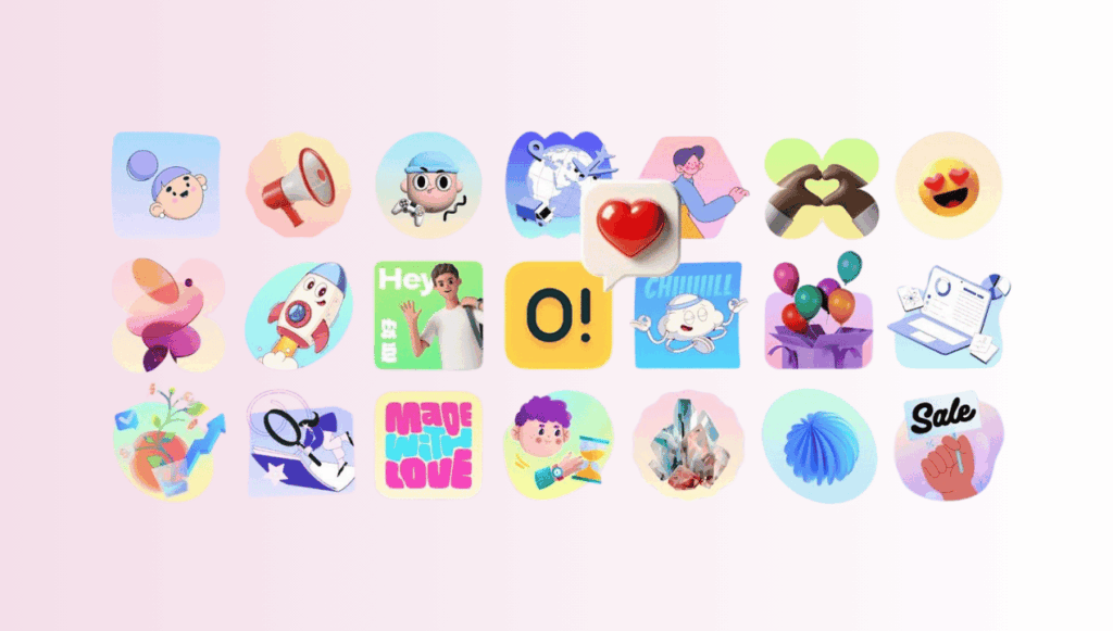
Ouch built something different: a modular system where every illustration shares DNA. In this articl...

Modern websites have grown from simple brochures into living, revenue-driving products. As a result,...

Learn how color psychology shapes digital branding, drives emotions, and builds recognition. See how...

Initially, Mardi Gras has its roots in medieval Europe — it used to be a religious event, and nowa...

Fascinating neon colors are one of the main elements of modern design. In some cases, designers use ...

Any little thing you can do to give your marketing campaign more power is a positive change. Have yo...

Humans have an incredible way of understanding and applying what we learn to enhance the world aroun...