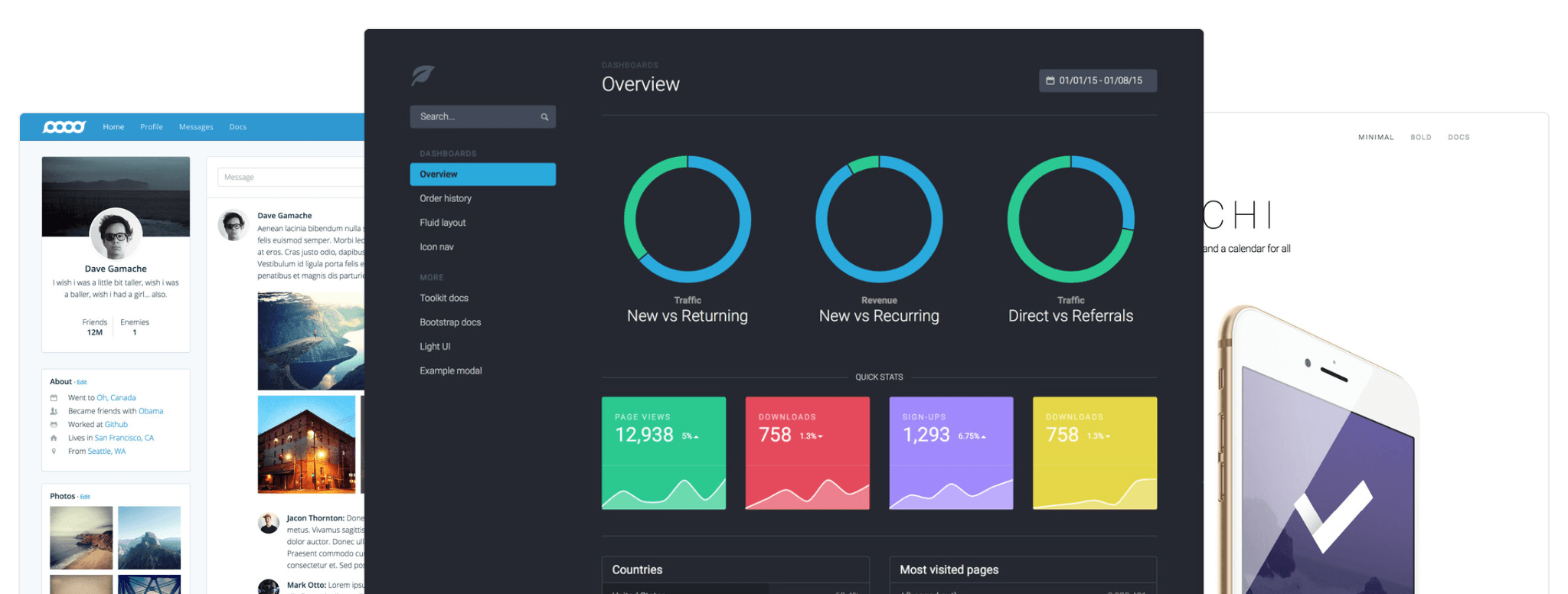
Bootstrap is the world’s most popular framework for building responsive, mobile-first sites and applications. Inside you’ll find high-quality HTML, CSS, and JavaScript to make starting any project easier than ever. Here’s how to quickly get started with Bootstrap 4.
What is Bootstrap?
- Bootstrap is a free front-end framework for faster and easier web development
- Bootstrap includes HTML and CSS design templates for typography, forms, buttons, tables, navigation, modals, image carousels, and many others, as well as optional JavaScript plugins
- Bootstrap also gives you the ability to easily create responsive designs

What is Responsive Web Design?
Responsive web design is about creating websites that automatically adjust themselves to look good on all devices, from small phones to large desktops. All Visualmodo WordPress themes are built based on Bootstrap’s latest framework codes.
Bootstrap 3 vs. Bootstrap 4
The framework v4 is the newest version of Bootstrap; with new components, a faster stylesheet, and more responsiveness.
Bootstrap 4 supports the latest, stable releases of all major browsers and platforms. However, Internet Explorer 9 and down is not part of the support-list.
If you require IE8-9 support, use Bootstrap 3. It is the most stable version of Bootstrap, and it is still working by the team for critical bug fixes and documentation changes. However, no new features will be added to it.
Moreover, a Note: Bootstrap 4 is currently in beta release (meaning that it has been thoroughly tested and close to a “final” release).
Why Use Bootstrap?
Advantages of Bootstrap:
- Firstly, easy to use: Anybody with just basic knowledge of HTML and CSS can start using Bootstrap 4
- Secondly, responsive features: Bootstrap’s responsive CSS adjusts to phones, tablets, and desktops
- Mobile-first approach: In Bootstrap, mobile-first styles are part of the core framework
- Finally, browser compatibility: Bootstrap is compatible with all modern browsers (Chrome, Firefox, Internet Explorer 10+, Safari, and Opera)

Where to Start with Bootstrap Framework
There are two ways to start using Bootstrap 4 on your own website.
You can:
- Firstly, Include Bootstrap 4 from a CDN
- Secondly, Download Bootstrap 4 from getbootstrap.com
Bootstrap CDN
If you don’t want to download and host Bootstrap yourself, you can include it from a CDN (Content Delivery Network).
MaxCDN provides CDN support for Bootstrap’s CSS and JavaScript. You must also include jQuery:
MaxCDN:
<!– Latest compiled and minified CSS –>
<link rel=”stylesheet” href=”https://maxcdn.bootstrapcdn.com/bootstrap/4.0.0-beta.2/css/bootstrap.min.css”><!– jQuery library –>
<script src=”https://ajax.googleapis.com/ajax/libs/jquery/3.2.1/jquery.min.js”></script><!– Popper JS –>
<script src=”https://cdnjs.cloudflare.com/ajax/libs/popper.js/1.12.6/umd/popper.min.js”></script><!– Latest compiled JavaScript –>
<script src=”https://maxcdn.bootstrapcdn.com/bootstrap/4.0.0-beta.2/js/bootstrap.min.js”></script>
One advantage of using the Bootstrap 4 CDN:
Many users already have downloaded Bootstrap from MaxCDN when visiting another site. As a result, it will be loaded from the cache when they visit your site, which leads to faster loading time. Also, most CDN’s will make sure that once a user requests a file from it, it will be served from the server closest to them, which also leads to faster loading time.
jQuery and Popper to Start with Bootstrap Framework?
Bootstrap 4 uses jQuery and Popper.js for JavaScript components (like modals, tooltips, popovers etc). However, if you just use the CSS part of Bootstrap, you don’t need them.
Downloading Bootstrap
If you want to download and host Bootstrap yourself, go to get bootstrap, and follow the instructions there.
Create First Web Page With Bootstrap
1. Add the HTML5 doctype
Bootstrap 4 uses HTML elements and CSS properties that require the HTML5 doctype.
In addition, always include the HTML5 doctype at the beginning of the page. In addition, along with the lang attribute and the correct character set:
<!DOCTYPE html>
<html lang=”en”>
<head>
<meta charset=”utf-8″>
</head>
</html>
2. Bootstrap is the start mobile-first framework
Bootstrap 4 is designed to be responsive to mobile devices. So, the mobile-first styles are part of the core framework.
To ensure proper rendering and touch zooming, add the following <meta> tag inside the <head> element:
<meta name=”viewport” content=”width=device-width, initial-scale=1″>
The width=device-width part sets the width of the page to follow the screen width of the device. Which will vary depending on the device).
The initial-scale=1 part sets the initial zoom level when the page is first loaded by the browser.
3. Containers To Start With Bootstrap
Bootstrap 4 also requires a containing element to wrap site contents.
There are two container classes to choose from:
- Firstly, the
.containerclass provides a responsive fixed width container - Secondly, the
.container-fluidclass provides a full-width container, spanning the entire width of the viewport
.container
.container-fluid
Two Basic Bootstrap Pages To Start
The following example shows the code for a basic Bootstrap 4 page (with a responsive fixed width container):
Container Example
<!DOCTYPE html>
<html lang=”en”>
<head>
<title>Bootstrap 4 Example</title>
<meta charset=”utf-8″>
<meta name=”viewport” content=”width=device-width, initial-scale=1″>
<link rel=”stylesheet” href=”https://maxcdn.bootstrapcdn.com/bootstrap/4.0.0-beta.2/css/bootstrap.min.css”>
<script src=”https://ajax.googleapis.com/ajax/libs/jquery/3.2.1/jquery.min.js”></script>
<script src=”https://cdnjs.cloudflare.com/ajax/libs/popper.js/1.12.6/umd/popper.min.js”></script>
<script src=”https://maxcdn.bootstrapcdn.com/bootstrap/4.0.0-beta.2/js/bootstrap.min.js”></script>
</head>
<body><div class=”container”>
<h2>My First Bootstrap Page</h2>
<p>This is some text.</p>
</div></body>
</html>
The following example shows the code for a basic Bootstrap 4 page (with a full width container):
Container Fluid Example To Start with Bootstrap
<!DOCTYPE html>
<html lang=”en”>
<head>
<title>Bootstrap 4 Example</title>
<meta charset=”utf-8″>
<meta name=”viewport” content=”width=device-width, initial-scale=1″>
<link rel=”stylesheet” href=”https://maxcdn.bootstrapcdn.com/bootstrap/4.0.0-beta.2/css/bootstrap.min.css”>
<script src=”https://ajax.googleapis.com/ajax/libs/jquery/3.2.1/jquery.min.js”></script>
<script src=”https://cdnjs.cloudflare.com/ajax/libs/popper.js/1.12.6/umd/popper.min.js”></script>
<script src=”https://maxcdn.bootstrapcdn.com/bootstrap/4.0.0-beta.2/js/bootstrap.min.js”></script>
</head>
<body><div class=”container-fluid”>
<h2>My First Bootstrap Page</h2>
<p>This is some text.</p>
</div></body>
</html>


