A beautiful tech product can win attention in seconds. A fast, intuitive one can keep that attention long enough to turn curiosity into trust, adoption, and loyalty. The best digital products do both. They look polished, feel effortless, and respond so smoothly that users barely notice the design working in the background. In this article, you’ll learn how to start balancing performance and aesthetics, top UI and UX optimization in tech products.
That balance is where UI/UX optimization becomes a business advantage. In competitive software, SaaS platforms, mobile apps, marketplaces, dashboards, fintech tools, AI products, and ecommerce experiences, users rarely judge design as a separate layer. They judge the product as one complete experience. If the interface looks impressive but takes too long to load, confidence drops. If the product is fast but visually cold or confusing, users hesitate. So, the workflow feels elegant but the buttons are hard to find, the design is working against the product.
Performance and aesthetics are not enemies, especially when a top ui ux design agency treats them. In strong product teams, they inform each other. Performance gives aesthetics a solid foundation. Aesthetics gives performance emotional value. When both are planned together, a tech product feels modern, credible, and easy to use.
Why Performance and Aesthetics Must Work Together
Many teams still treat performance as an engineering task and aesthetics as a design task. That separation creates friction. Designers create rich layouts, motion effects, custom visuals, and immersive pages. Developers then try to make those decisions fast after the fact. The result is often compromise, delay, or a product that looks good in mockups but feels heavy in real life.
A better approach starts earlier. UI choices should consider loading behavior, interaction speed, accessibility, content hierarchy, device limitations, and user intent from the beginning. This does not mean stripping away personality. It means choosing the right kind of visual impact for the job.
A product homepage may need strong visual storytelling. A payment flow needs clarity and speed. An analytics dashboard needs readable density. A mobile onboarding sequence needs warmth, simplicity, and momentum. Each screen has a job, and the visual design should support that job without slowing it down.
Users do not reward unnecessary complexity. They reward confidence. A clean transition, a sharp type system, a fast-loading hero section, and a clear call to action can feel more premium than a page overloaded with animation. The goal is not minimalism for its own sake. The goal is intentional design.
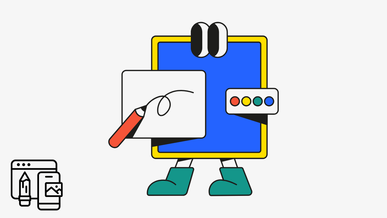
The Real Meaning of UI UX Optimization for Tech Products
UI optimization improves what users see and interact with, including layout, spacing, typography, buttons, colors, icons, visual hierarchy, and responsive behavior. UX optimization improves how users move through the product, including onboarding, navigation, task completion, feedback, trust signals, error recovery, and perceived effort.
In tech products, these two areas overlap constantly. A button is a UI element, but its placement affects UX. A loading state is a performance detail, but it also shapes emotional comfort. A dashboard chart is visual design, but its clarity affects decision-making. Good optimization looks at the whole system.
The strongest products usually feel simple because a lot of hard decisions were made behind the scenes. The team removed extra steps, reduced cognitive load, compressed assets, improved content structure, tested key flows, simplified navigation, and made the interface predictable without making it boring.
Table: How Performance and Aesthetics Influence Product Success
| Optimization Area | Performance Impact | Aesthetic Impact | Business Benefit |
|---|---|---|---|
| Image and asset optimization | Faster load times and smoother browsing | Cleaner visuals without unnecessary weight | Better retention and fewer frustrated users |
| Typography system | Reduced font bloat and layout shifts | Stronger hierarchy and brand consistency | Easier reading and stronger trust |
| Navigation design | Faster task completion | More organized and polished interface | Higher engagement and lower abandonment |
| Microinteractions | Better perceived responsiveness when lightweight | More delightful product experience | Stronger user confidence |
| Mobile-first layouts | Better performance on limited devices | More natural screen flow | Improved conversion on mobile traffic |
| Accessible color and contrast | Clearer interface for more users | More professional visual structure | Larger usable audience |
| Simplified user flows | Fewer unnecessary page loads or steps | Cleaner journey from start to finish | Higher activation and conversion |
Designing for Speed Without Making the Product Feel Plain
A common mistake is thinking that performance optimization means removing everything expressive. It does not. It means making each visual decision earn its place through UI UX optimization for tech products.
A modern product can still use rich imagery, gradients, motion, custom illustrations, videos, and interactive elements. The key is discipline. Large visuals should be compressed and served in modern formats. Animations should be purposeful and lightweight. Custom fonts should be limited and loaded carefully. Third-party scripts should be reviewed often because they can quietly slow down the experience.
Above-the-fold design deserves special attention. The first screen sets the tone for the entire product experience. If the first visible section loads quickly, communicates value clearly, and gives users an obvious next step, the product feels more trustworthy immediately. This is especially important for SaaS landing pages, product dashboards, checkout flows, pricing pages, AI tools, and mobile app onboarding.
Visual polish should not compete with comprehension. A stunning interface that hides the core action is not optimized. A fast screen that feels generic and forgettable is also not optimized. The best middle ground is clarity with character.
Aesthetics That Improve Usability
Good aesthetics are not decoration. They guide attention. They reduce hesitation. In addition, help users understand what matters first, what is clickable, what is optional, and what will happen next.
Spacing is one of the most underrated parts of UI/UX optimization. Proper spacing can make a product feel calmer, more premium, and easier to scan. It also reduces accidental clicks, especially on mobile. Typography does similar work. A strong heading, readable body text, and consistent labels can make complex information feel manageable.
Color should also be functional. A brand palette may look beautiful, but product interfaces need contrast, state changes, alerts, success messages, disabled states, hover states, and accessible calls to action. When colors are used consistently, users learn the product faster.
Motion can help when it explains change. A subtle transition between states can make the interface feel responsive. A loading skeleton can reduce anxiety. A small confirmation animation can reassure users that their action worked. But motion becomes harmful when it delays progress, distracts from content, or makes the experience feel unstable.
The Role of Perceived Performance
Users do not only respond to actual speed. They respond to perceived speed. A product that gives immediate feedback often feels faster than one that leaves users waiting without explanation.
This is why loading states, progress indicators, optimistic UI, skeleton screens, and instant button feedback matter. They make the system feel alive. They tell the user, “Your action was received.” That reassurance can reduce frustration even when a process takes a moment.
For example, an AI writing tool may need time to generate output. A fintech app may need a few seconds to verify data. A project management platform may need to sync information. In each case, the interface should communicate progress clearly. Silence feels broken. Feedback feels intentional.
A Practical UI/UX Optimization Workflow
A product team does not need to redesign everything at once. The smartest approach is to focus on the moments where performance, usability, and business impact overlap.
Use this simple sequence:
- Identify the highest-value user flows, such as signup, onboarding, search, checkout, dashboard setup, or upgrade.
- Measure where users slow down, drop off, rage-click, abandon forms, or wait too long.
- Review the interface for visual clutter, unclear hierarchy, heavy assets, unnecessary scripts, and confusing copy.
- Improve one flow at a time, then test the effect on speed, completion rate, engagement, and user satisfaction.
- Keep a shared design system so future screens stay consistent, fast, and easier to maintain.
This workflow keeps optimization grounded in reality. It prevents teams from making changes based only on taste. Taste matters, but user behavior matters more.
UI/UX Optimization for SaaS Products
SaaS products have a unique challenge. They must sell the product before login, then prove value after login. That means both marketing pages and product screens need careful optimization.
The homepage should explain the value quickly. The pricing page should reduce uncertainty. The signup flow should feel low-friction. The onboarding experience should guide users to a first win. The dashboard should help users understand where they are, what matters, and what to do next.
Aesthetics help make the product feel credible. Performance helps users feel in control. Together, they support activation and retention. A user who understands the product quickly is more likely to return. A user who feels overwhelmed or delayed is more likely to churn.
UI UX Optimization for Tech Mobile Apps
Mobile users are less patient because they are often multitasking, moving, or dealing with smaller screens and inconsistent connections. This makes performance and interface clarity even more important.
Mobile UI should prioritize thumb-friendly interactions, readable text, clear icons, short flows, and fast feedback. Heavy visuals should be used carefully. Forms should ask only for what is necessary. Navigation should stay familiar unless there is a strong reason to reinvent it.
A great mobile experience feels focused. Each screen should have a clear purpose. The fewer decisions users need to make, the easier the product feels.
UI UX Optimization for Tech AI Products
AI products need a special kind of UX clarity because users are still learning how to interact with many of these tools. The interface should make possibilities visible without overwhelming people.
Prompt boxes, examples, templates, output controls, editing options, history, and safety messages all need thoughtful design. Performance also matters because AI actions may not always be instant. The product should show progress, explain what is happening when needed, and let users recover easily if the output is not right.
A polished AI interface does not need to look futuristic. It needs to feel understandable, responsive, and useful.
Why This Matters for SEO and Organic Growth
UI/UX optimization also supports organic traffic because search performance is connected to user satisfaction. Fast pages, clear content structure, mobile usability, helpful internal navigation, and accessible layouts make a site easier for both people and search engines to understand.
For content-driven tech companies, this matters even more. Blog articles, product pages, feature pages, comparison pages, documentation, templates, and landing pages should not only target keywords. They should satisfy intent. A visitor who lands on a page should quickly understand that they are in the right place.
Better UI/UX can improve engagement signals, reduce pogo-sticking, increase page depth, and support conversions from organic traffic. That is where SEO and product design meet. Ranking is not only about getting the click. It is about deserving the visit after the click.
Common Mistakes That Hurt Both Design and Performance
One mistake is overloading pages with large videos, uncompressed images, and animations that do not support the message. Another is using too many font weights, icon libraries, popups, tracking scripts, and layout variations. These choices may seem small individually, but together they create a slow and inconsistent experience.
Another common issue is designing for desktop first, then squeezing the experience into mobile. Since many users discover and evaluate products from phones, mobile cannot be an afterthought.
The most subtle mistake is designing for internal approval instead of user momentum. A team may love a visually complex hero section, but if users cannot understand the product or take action quickly, the design is not doing its job.
The Best Tech Products Feel Effortless
The future of UI/UX optimization is not about choosing between beauty and speed. It is about building products where beauty has purpose and speed has personality.
A high-performing product should not feel stripped down. A beautiful product should not feel slow. When product teams treat performance and aesthetics as partners, they create experiences that users enjoy, trust, and return to.
That is the real value of balanced UI/UX. It helps users move forward with less friction. So, helps brands feel more credible. It helps products convert better, retain longer, and grow more sustainably. In a market full of options, the product that feels both elegant and effortless often wins.
UI UX Optimization for Tech Products FAQ
UI/UX optimization is the process of improving how a product looks, feels, loads, and works for users. It includes visual design, navigation, speed, accessibility, interaction feedback, mobile usability, and the overall path users follow to complete tasks.
Performance affects trust, patience, and engagement. When a product loads quickly and responds smoothly, users feel more confident. Slow experiences can make even a beautiful product feel unreliable.
Yes. A product can use strong visuals, animation, illustration, and branding while staying fast. The key is to optimize assets, avoid unnecessary scripts, use motion carefully, and design each visual element with a clear purpose.
Better UI/UX supports SEO by improving page speed, mobile experience, content readability, navigation, engagement, and user satisfaction. These elements help visitors stay longer, explore more, and find what they need faster.
Start with the flows that have the biggest business impact, such as signup, onboarding, checkout, search, pricing, demo booking, or dashboard setup. Improving a high-value flow usually creates more measurable results than polishing low-impact screens.
Not always. Minimal design can help, but the real goal is intentional design. A simple interface can still perform poorly if it has bloated code or unnecessary scripts. A visually rich interface can perform well if it is built carefully.
AI products can improve UX with clear prompts, helpful examples, visible progress states, editable outputs, simple controls, and easy recovery when results are not perfect. Users should always understand what to do next.
A premium product experience usually combines visual consistency, fast response times, clear copy, smooth interactions, accessibility, thoughtful spacing, reliable performance, and a user journey that feels natural from start to finish.