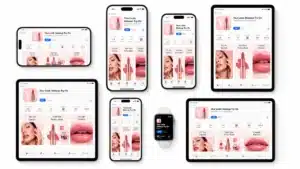
Over the past decade, internet browsing has fundamentally shifted from desktop screens to smartphones. For WordPress site owners, treating mobile responsiveness as a secondary concern is no longer a viable strategy. The modern digital landscape demands a mobile-first approach, meaning websites must be designed primarily for smaller screens before being adapted for larger desktop displays. This shift is not merely about visual aesthetics. In this article, you’ll learn how to start mastering mobile-first WordPress design for better SEO and user experience.
It is heavily tied to how search engines rank your content. With Google officially confirming the completion of its transition to mobile-first indexing, ensuring your mobile site offers a complete and fully optimised user experience is absolutely essential for sustained search visibility. For brands operating in competitive markets, ignoring this reality directly translates to lost traffic and diminishing digital growth for mobile-first WordPress design.
The Numbers Behind Mobile-First: Why This Is Not Optional
Before looking at how to implement mobile-first design, it is worth understanding the scale of what is at stake. Abstract arguments about “shifting user behaviour” are much less persuasive than concrete numbers.
According to StatCounter’s global traffic data, mobile devices now account for approximately 60 percent of all internet traffic worldwide. In many developing markets, that figure exceeds 70 percent. The average person in 2026 reaches for their phone before opening a laptop, and that habit shapes how content must be designed, delivered, and ranked.
Google completed its full transition to mobile-first indexing in 2023. That means Google now crawls and indexes the mobile version of your site first and uses that version to determine rankings. If your mobile site is missing content, has slower load times, or offers a degraded experience compared to your desktop version, your rankings reflect the mobile version, not the desktop one.
Core Web Vitals make the connection between mobile performance and search visibility even more direct. A 2023 study by Backlinko, analysing 11.8 million search results, found that pages meeting all three Core Web Vitals thresholds ranked measurably higher on average than those that did not. Google has also confirmed that Core Web Vitals are a ranking signal within its Page Experience update.
The impact on revenue is not theoretical either. Google’s own research found that as page load time increases from one second to three seconds, the probability of a mobile bounce increases by 32 percent. Increase that load time to five seconds and bounce probability jumps by 90 percent. For an eCommerce store or a lead generation site, those numbers represent real money walking out the door.
The case for mobile-first is not a design trend. It is a business imperative backed by data that gets harder to ignore every year.
Building a Solid Mobile-First Architecture
Creating a high-performing mobile WordPress site starts with careful structural choices. When a user lands on a web page using a 5G connection or a patchy local network, the delivery of that page must be swift and seamless. Heavy image files, bloated underlying code, and unoptimised custom fonts can severely drag down performance metrics. Every single millisecond counts when attempting to retain an impatient mobile audience.
Thankfully, there are numerous practical steps website administrators can take immediately to improve loading times. While you can handle foundational improvements like setting up caching plugins, minifying scripts, and compressing media using DIY guides to speed up your WordPress site, there often comes a point where out-of-the-box themes and automated plugins reach their limits.
Growing businesses aiming for peak performance frequently require highly customised technical overhauls to secure a competitive edge. When complex technical SEO integration and modern user experience strategy are in needs, consulting a professional web design agency ensures that the entire mobile ecosystem is refined to exacting standards, rather than relying on generic, heavy templates.
The WordPress Mobile-First Tech Stack: Specific Tools That Work
Knowing why mobile performance matters is one thing. Knowing which tools to use in WordPress to actually achieve it is where most site owners stall. Here are the specific categories and tools that professionals rely on.
- Performance and caching plugins. WP Rocket is the most widely trusted premium caching plugin in the WordPress ecosystem. It handles page caching, file minification, lazy loading, and database optimisation from a single interface. For teams with tighter budgets, LiteSpeed Cache performs remarkably well on LiteSpeed server environments and is completely free. NitroPack is worth considering for sites where non-technical users need automated optimisation with minimal configuration.
- Image compression and modern format delivery. Images are almost always the biggest contributor to slow load times on mobile. Imagify and ShortPixel both compress images automatically on upload and can convert them to WebP or AVIF format, which deliver the same visual quality at significantly smaller file sizes. For maximum control, Cloudflare Images handles format conversion and responsive image delivery at the CDN level, so your server never serves an oversized image to a small screen.
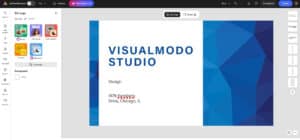
- Theme selection. The theme you choose sets the performance ceiling for everything that follows. Blocksy, Kadence, and GeneratePress are consistently cited by performance testers for their lightweight codebases, mobile-first structure, and clean output. Visualmodo’s own themes are built with responsive mobile layouts as a core feature, not an afterthought, which matters when you are choosing a foundation you will build on for years.
- Font optimisation. Custom web fonts are a frequently overlooked source of mobile render delay. Use the font-display: swap CSS property in your theme to prevent invisible text during font loading. Load only the font weights you actually use. Where possible, consider system font stacks for body text, reserving custom fonts for headings where they have the most visual impact.
- Content delivery networks. A CDN serves your static assets (images, scripts, CSS) from edge servers geographically close to each visitor, dramatically reducing time to first byte on mobile networks. Cloudflare’s free tier is a solid starting point. BunnyCDN is popular for its competitive pricing and clean WordPress integration. Kinsta and WP Engine both include CDN functionality as part of their managed hosting plans.
Combining a well-configured performance plugin with proper image compression, a lightweight theme, and a CDN covers the majority of the technical gains available from a standard WordPress installation. These are not advanced developer moves. They are table-stakes decisions that every WordPress site owner should make early.
Key Strategies for Mobile WordPress Optimisation
Transitioning to a true mobile-first design involves a strategic blend of technical adjustments and interface enhancements. To guarantee that your site appeals to both human users and automated search engine crawlers, you must prioritise the following elements during your design process:
- Touch-Friendly Navigation: Mobile users interact with their screens using their thumbs and fingers, which lack the pinpoint precision of a traditional mouse cursor. Ensure all interactive elements, such as buttons, menus, and hyperlinks, are adequately under size and spaced out to prevent frustrating accidental clicks. A minimum touch target size of 48 by 48 pixels is widely in needs by interface experts.
- Streamlined Content Layouts: Avoid cluttering the mobile viewport with intrusive pop-ups or massive blocks of dense text. Use readable typography, generous white space, and collapsible interface elements like accordions. Or tabs to organise information effectively without overwhelming the small screen.
- Core Web Vitals Management: Search engines rely on Core Web Vitals to measure the real-world user experience of a specific page. You must focus heavily on improving your Largest Contentful Paint for rapid loading speeds. Interaction to Next Paint for quick responsiveness, and Cumulative Layout Shift for overall visual stability.
- Strategic Resource Loading: Implement lazy loading protocols for all images and embedded videos. So they only download when they actually enter the user’s viewport. Furthermore, ensure you serve modern image formats such as WebP or AVIF to maintain excellent visual quality while significantly reducing file sizes.
Core Web Vitals in Practice: What the Numbers Mean and What Breaks Them
The article above introduces Core Web Vitals by name. This section explains what the actual thresholds are, what causes each metric to fail, and what you can do inside WordPress to fix them. This is the actionable follow-through that turns a list of metrics into a real improvement plan.
Largest Contentful Paint (LCP): Target Under 2.5 Seconds
LCP measures how long it takes for the largest visible element on the page to fully render. On most pages, this is a hero image, a large banner, or a prominent heading. For mobile users on slower connections, LCP is where most sites fail.
The most common causes of poor LCP in WordPress are:
Large, unoptimised hero images served at full desktop resolution to mobile devices. Fix this by using the srcset attribute to serve appropriately sized images for each screen size, or by using an image optimisation plugin that handles this automatically.
Render-blocking resources, including CSS files and JavaScript that must load before the browser can paint anything visible. Fix this by deferring non-critical JavaScript, loading CSS asynchronously where possible, and using a performance plugin to manage resource loading order.
Slow server response times, particularly on shared hosting. A Time to First Byte (TTFB) above 600 milliseconds will make hitting a 2.5-second LCP very difficult regardless of other optimisations. A move to managed WordPress hosting or a better hosting tier often produces more LCP improvement than any plugin-level optimisation.
Interaction to Next Paint (INP): Target Under 200 Milliseconds
INP replaced First Input Delay as a Core Web Vitals metric in March 2024. It measures the latency between any user interaction (a tap, a click, a key press) and the next visual response from the page. On mobile, where processing power is more limited than desktop, JavaScript-heavy pages frequently fail this threshold.
The primary cause of poor INP in WordPress is excessive or inefficient JavaScript. Third-party scripts (chat widgets, analytics tools, social embeds, advertising scripts) are frequent offenders. Audit which scripts actually run on mobile and disable any that are not essential. Use a plugin like Asset CleanUp or WP Rocket’s script exclusion features to load non-critical scripts only on pages where they are needed.
Cumulative Layout Shift (CLS): Target Under 0.1
CLS measures visual instability: how much page content unexpectedly moves during loading. On mobile, layout shifts are especially disruptive because the smaller viewport means any shift noticeably displaces content.
The most common WordPress causes are images without defined width and height attributes in the HTML, which forces the browser to recalculate layout when the image loads. Fix this by setting explicit dimensions on every image. Dynamic content injected by ads or embeds is another frequent source. Reserve space for ad units with CSS min-height declarations so the page layout does not shift when the ad renders.
Mobile UX Mistakes WordPress Sites Make Without Realising It
Passing Core Web Vitals is the technical floor for mobile performance. But performance metrics only tell part of the story. The following UX patterns are common on WordPress sites and each one quietly damages both user experience and search rankings.
- Intrusive interstitials on mobile. Google has applied a specific ranking penalty to pages that show full-screen pop-ups or interstitials on mobile immediately after a user arrives from search results. This includes newsletter sign-up overlays, cookie consent banners that block the entire viewport, and promotional modals that appear before any content is visible. If you are using a pop-up plugin on your WordPress site, make sure it is configured to either delay on mobile, use a smaller banner format, or trigger only after a meaningful scroll depth or time on page.
- Hamburger menus that are too small to tap reliably. Most WordPress themes implement mobile navigation as a hamburger icon menu. The usability problem is that many themes set the tap target for this icon below 44 by 44 pixels, making it genuinely difficult to tap accurately on a phone. Open Chrome DevTools, enable device emulation, and tap your own hamburger menu to verify it registers consistently. If it takes more than one tap, it needs to be larger.
- Body text below 16 pixels. Many WordPress themes set body font sizes between 14 and 15 pixels for aesthetic reasons. On a mobile screen, text at those sizes requires readers to zoom in, which increases friction and signals a poor mobile experience to search engines through elevated bounce rates. Set your body font size to a minimum of 16 pixels on mobile viewports. The difference in readability is immediately noticeable.
- Forms that are not sized for mobile input. Contact forms, newsletter sign-up fields, and checkout forms on many WordPress sites are built for desktop mouse interaction. On mobile, input fields that are too narrow, labels that sit inside the field and disappear when the user taps, and submit buttons that are below touch-target size all reduce form completion rates. Use input type attributes correctly (type=”email”, type=”tel”, type=”number”) so mobile keyboards present the right layout for each field automatically.
- Sticky headers that consume too much viewport. A sticky header that works elegantly on a 1920-pixel wide desktop monitor can consume 15 to 20 percent of the visible viewport on a 390-pixel wide phone screen. That shrinks the readable content area substantially. If your theme uses a sticky header, ensure it either collapses to a minimal height on mobile or is disabled on small screens using a CSS media query.
- Autoplay video above the fold. Autoplay video is a significant mobile performance concern regardless of whether it loads with audio. It competes with the page’s own resources during the critical load window, and on metered mobile data connections, it can consume bandwidth the visitor did not expect or want to spend. Lazy-load any video content below the fold and avoid autoplay on the hero section of mobile views.
How to Test Your WordPress Site for Mobile Performance Right Now
Reading about mobile performance is useful. Actually measuring your own site changes the priority list immediately. Here are the tools that matter and what to look for in each one.
- Google PageSpeed Insights. Visit pagespeed.web.dev and enter your URL. The tool runs a Lighthouse audit and returns separate scores for mobile and desktop performance, along with a real-world field data summary sourced from the Chrome User Experience Report (CrUX). Pay attention to the field data section, not just the lab data score, because field data reflects real visitors on real devices and connections. Look specifically at your LCP, INP, and CLS values and whether they fall in the green (good), orange (needs improvement), or red (poor) ranges.
- Google Search Console Core Web Vitals report. If your site is already verified in Search Console, the Core Web Vitals report under Experience shows you URL-level data aggregated from real user visits over the past 28 days. This is more valuable than a single Lighthouse run because it reflects actual mobile users, not a simulated test. Look for URLs grouped in the “Poor” category and prioritise fixing those first, as they are the pages actively harming your search performance.
- Chrome DevTools device emulation. Open Chrome, press F12 to open DevTools, and click the device toggle icon to enable responsive design mode. You can emulate specific phone models and network speed conditions (3G, 4G) from within the browser. This lets you see exactly what your site looks like and feel on a small screen without needing a physical device. Use the Performance tab to record a page load and identify which resources take the longest to process.
- GTmetrix. GTmetrix provides detailed waterfall charts showing the load sequence of every resource on your page. It is particularly useful for identifying which specific images, scripts, or third-party embeds are blocking render. Run tests from multiple geographic locations to separate server response time issues from asset delivery issues.
What scores to aim for. A PageSpeed Insights performance score above 90 on mobile is the target for competitive sites, though reaching 70 or above from a starting point below 50 already represents meaningful improvement. More important than the overall score are the individual Core Web Vitals values: LCP under 2.5 seconds, INP under 200 milliseconds, CLS under 0.1.
Bridging the Gap Between Design and Search Performance
The relationship between intuitive mobile design and search engine optimisation is entirely symbiotic. Modern search algorithms rely heavily on user behaviour signals to validate the overall quality of a ranked page. If a mobile site loads instantly, features intuitive navigation menus, and presents content clearly. Visitors will naturally stay longer and interact more deeply with the material. For eCommerce stores in particular. These seamless mobile journeys are directly correlated with higher conversion rates and drastically reduced cart abandonment.
Conversely, a site that forces users to pinch and zoom to read text. Moreover, shifting content abruptly as background elements load will result in rapid abandonment. High bounce rates and exceptionally low dwell times send strong negative signals to search algorithms. Indicating that the page fails to satisfy the user’s search intent on a mobile device.
Moving forward in 2026, WordPress administrators must view mobile design not as a
tedious technical chore but as the foundational cornerstone of their digital marketing strategy.
By investing appropriate time and resources into deep mobile optimisation, you build a robust,
future-proof platform that reliably captures traffic, engages audiences, and drives sustainable
growth in an increasingly mobile-centric world.
Frequently Asked Questions About Mobile-First WordPress Design
Mobile-first design is an approach where the website is designed and built for small screens first, then progressively enhanced for larger screens like tablets and desktops. In WordPress, this means choosing themes and page builders that apply base styles to mobile viewports and use min-width media queries to add complexity for wider screens, rather than starting from a desktop layout and scaling it down. The distinction matters because Google indexes and ranks the mobile version of your site, making mobile-first design a direct ranking factor, not just a UX preference.
Yes, directly. Google completed its switch to mobile-first indexing in 2023, meaning the mobile version of your site is the version Google uses to determine rankings for all users, including desktop users. If your mobile site has slower load times, missing content, or a degraded user experience compared to your desktop site, those weaknesses appear in your rankings. Core Web Vitals, which are official Google ranking signals, are measured primarily against mobile performance thresholds.
There is no single answer, since the best choice depends on your specific use case, but several themes are consistently recognised for their mobile-first code structure and lightweight output. GeneratePress, Blocksy, and Kadence all score well in independent performance tests and are built with mobile-first CSS as a foundational principle. Visualmodo themes include responsive mobile layouts as a core feature. Avoid themes that bundle large amounts of unused CSS and JavaScript, as these inflate load times on mobile networks regardless of other optimisations.
The most reliable starting point is Google’s PageSpeed Insights (pagespeed.web.dev), which tests both mobile and desktop performance separately and shows real-world Core Web Vitals data from actual Chrome users. Google Search Console also provides a Core Web Vitals report under the Experience section that shows which pages are flagged as poor or needing improvement based on real visitor data. Chrome DevTools device emulation lets you visually inspect your site on simulated mobile screen sizes directly in your browser without needing a separate device.
Responsive design means the layout adjusts to fit different screen sizes, typically using CSS media queries. Mobile-first design is a specific approach to building responsive layouts where the base CSS targets the smallest screen and wider screens receive progressive enhancements via min-width media queries. A site can be responsive without being mobile-first: for example, a desktop layout scaled down with max-width breakpoints is responsive but not mobile-first. The mobile-first approach tends to produce lighter, faster-loading pages because it starts with the minimum required styles and adds complexity only where needed.
Mobile-First Is the Baseline, Not the Upgrade
There is a framing problem in how mobile optimisation is often discussed. It gets positioned as something to add once the main site is finished, a refinement layer applied on top of a desktop-first foundation. That framing is backwards now, and has been for years.
Google indexes the mobile version of your site. Your visitors arrive primarily on mobile devices. Your Core Web Vitals are measured against mobile performance thresholds. Every part of how your site is evaluated, by search engines and by real people, starts from the mobile experience. The desktop version is the enhancement.
For WordPress site owners, the practical implication is clear. Theme selection, plugin choices, image formats, navigation structure, font sizes, pop-up behaviour: each of these decisions needs to be made with a mobile user holding a phone as the primary case, not as an edge case.
The good news is that the tools are available, the knowledge is documented, and the performance gains from getting this right are real and measurable. Start with a performance audit using PageSpeed Insights. Fix your largest LCP issue. Compress and convert your images to WebP. Choose a theme that does not start with 500 kilobytes of unneeded JavaScript. Then test again.
Mobile-first WordPress design is not a project with a completion date. It is a standard of care applied consistently, and the sites that treat it that way are the ones that consistently outrank those that do not.