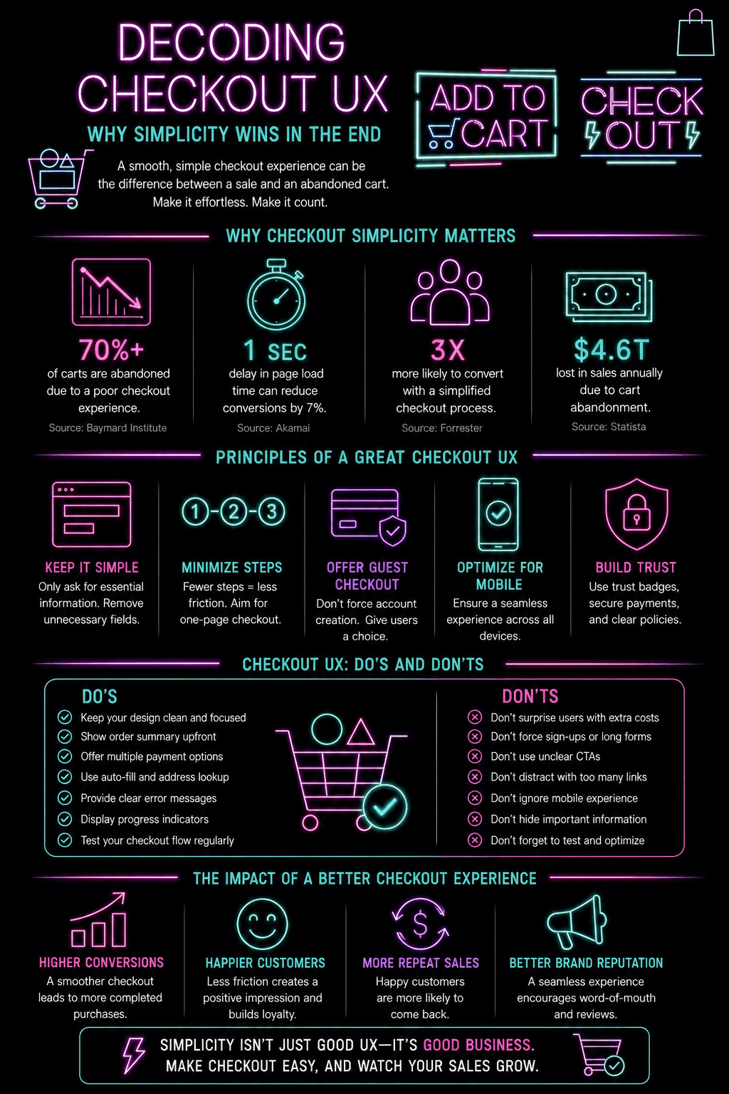
Online shoppers have more choices than ever before. If a website is confusing or difficult to use, though, many customers will leave before completing their purchases. That’s especially true during the checkout process. A smooth and simple experience at that stage of the conversion funnel, also known as the checkout UX, can make a major difference in how much business a company actually does. In this article, we’ll start decoding the checkout UX and explore why simplicity wins in the end and drives more conversions.
For businesses that operate in specialized industries, having the right payment setup is an important part of the process. Whether a company needs a credit repair merchant account or another type of payment processing solution, the checkout process should remain easy, secure, and straightforward for customers. If it is, it can help a business boost consumers’ trust, make sales, and even generate repeat business.
The Data Makes the Case Before We Even Begin
Understanding why checkout UX matters starts with the scale of what is being lost. The Baymard Institute, which runs the largest ongoing research program specifically on ecommerce checkout and usability, has found that approximately 70 percent of online shopping carts are abandoned before the purchase is completed. Across all ecommerce traffic, that represents trillions of dollars in potential revenue that never converts.
More importantly for anyone thinking about their own checkout, Baymard’s research identifies exactly why those abandonments happen. The most common reasons cited by shoppers include unexpected shipping or tax costs appearing for the first time at the final step, being required to create an account before purchasing, a checkout process that felt too long or too complicated, a site that did not appear sufficiently secure, and difficulty finding relevant contact or return information at the moment it was needed.
Every single one of those reasons is a design and UX problem, not a product or pricing problem. The customers reached the cart. They wanted to buy. The checkout experience itself turned them away. This is what makes checkout UX one of the highest-leverage investments available to any ecommerce business, because improving it converts traffic that marketing budgets have already paid to acquire, rather than spending more to attract additional traffic to the same leaky funnel.
What Is Checkout UX?
Checkout UX refers to the way customers interact with a website when they’re ready to make a purchase. It includes everything from entering shipping information to selecting a payment method and confirming an order. A good checkout experience helps customers move through these steps quickly and easily.
On the other hand, a poor experience can lead to abandoned carts and lost revenue. Customers generally want a checkout process that’s fast, clear, and easy to understand. The fewer obstacles they encounter, the more likely they are to complete their purchases.
Why Simplicity Matters
Many businesses make the mistake of adding too many steps to their checkout pages. While some information may be necessary, excessive forms, confusing instructions, and unnecessary options can overwhelm shoppers. Simple checkout experiences work because they reduce effort. Customers can focus on completing their purchases rather than figuring out what to do next.
A streamlined checkout process includes clear instructions, easy-to-read forms, and minimal required fields. Simple navigation and fast payment processing are also important. When customers can complete a transaction without hassle and confusion, satisfaction increases, and cart abandonment decreases.
Reducing Friction During Checkout: The Specific Culprits
Friction is anything that slows down or interrupts the buying process, and checkout has more specific, documented friction points than almost any other part of an ecommerce experience. Here is where the research consistently points.
- Forced account creation is the single biggest driver of abandonment. Baymard research across multiple study years has consistently identified mandatory account registration as the leading cause of checkout abandonment. The solution is not to eliminate accounts but to make guest checkout the default path, with account creation offered as an optional step after the purchase is confirmed. Amazon’s checkout, still the most studied checkout flow in ecommerce, offers this: you can complete a purchase without any account login, and only afterward are you invited to save your information for next time.
- Unexpected costs revealed at the final step. Showing a shipping cost, tax, or service fee for the first time on the final confirmation page is the second-most-cited abandonment reason in most research. The fix is simple: show all costs as early as possible in the flow, ideally on the product or cart page rather than at the payment step. Many stores now offer a shipping estimator directly in the cart to address this before the shopper even starts checkout.
- Too many required form fields. Baymard found that the typical US ecommerce checkout asks for 11 to 14 form fields on average, while an optimized checkout can collect the same essential information in 7 or fewer. Every additional field is another chance for a shopper to lose patience or find an error. Enabling address autocomplete through the Google Maps Places API, which fills in city, state, and postal code after a user begins typing their street address, can cut multiple field interactions down to one.
- Inline validation vs. error discovery at submission. Showing a field error as soon as a user moves to the next field, rather than only after they click “Place Order,” dramatically reduces the frustration of discovering multiple errors at once. The field goes red immediately with a specific, helpful message (“Please enter a full postal code” rather than “Invalid input”), and the user can fix it in context rather than scrolling back up after a failed submit.
Understanding and fixing these four specific friction points typically improves checkout conversion more than any visual redesign does, because they address the actual reasons shoppers leave rather than the page’s surface-level appearance. For a broader look at how UX and site architecture work together to support the path that leads to checkout in the first place, the guide to how UX design and site architecture shape e-commerce SEO covers the funnel above the checkout page.
Express Checkout: The Shortcut That Changes the Equation
Guest checkout removes the friction of forced registration. Express checkout goes further: it eliminates the entire manual data-entry process by pulling address and payment information from a digital wallet the customer already has set up.
Shop Pay, PayPal Express, Apple Pay, and Google Pay all work on the same principle. The customer taps one button, authenticates with a fingerprint, face ID, or a pre-approved session, and the order is placed with their saved address and payment method populated automatically. For mobile shoppers in particular, this collapses a process that might otherwise involve typing a 16-digit card number on a small keyboard into a single confirmation tap.
Conversion rate data for express checkout options is consistently strong. Shopify has published data showing Shop Pay converts at a higher rate than other checkout methods on its platform, including standard guest checkout, specifically because it removes friction at the moment shoppers are most likely to abandon. For stores not on Shopify, PayPal Express Checkout and Stripe’s Link (which saves payment details across any site using Stripe) provide similar one-tap checkout experiences for returning users.
The practical recommendation for most ecommerce businesses is to offer at least one express checkout option alongside guest checkout, rather than treating them as alternatives. Different customers trust different payment providers, and displaying Apple Pay on devices that support it, alongside a PayPal option and standard card entry, ensures the easiest possible path for the widest possible range of shoppers.
One-Page vs Multi-Step Checkout: What the Research Actually Shows
One of the ongoing debates in checkout design is whether a single-page checkout (all fields visible on one screen) or a multi-step checkout (shipping details, then payment, then confirmation across separate steps) converts better. The honest answer is that neither format universally outperforms the other, because what actually matters is the total number of fields, the clarity of instructions, and how quickly errors are surfaced, regardless of how those elements are distributed across one page or several.
That said, multi-step checkout has one clear advantage for mobile: breaking the process into discrete steps with a visible progress indicator (Step 1 of 3, Step 2 of 3) reduces cognitive load by showing the shopper exactly how much remains and where they are in the process. A single long page on mobile that requires scrolling past many fields before reaching the payment button often performs worse than a well-designed two-step flow for the same reason the original article correctly identifies: mobile users have less patience and the sense of progress matters for completion rates.
Progress indicators on multi-step checkouts are not optional for this reason. A labeled step indicator at the top of the page, showing both the completed and remaining steps, reduces abandonment by removing the uncertainty of “how much more of this is there?” which is one of the friction states that causes shoppers to give up before confirming.
Checkout UX: Building Trust Through Design
Simplicity does more than make checkout more convenient. It also helps build trust. A cluttered checkout page can make customers question whether a website is secure or legitimate. In contrast, clean layouts and organized information create confidence. Businesses should clearly display aspects like secure payment indicators, contact information, return policies, and order summaries. When shoppers feel confident about their purchases, they’re more likely to complete their transactions.
Specific Trust Signals and Where to Place Them
Research on checkout trust signals shows that placement matters as much as presence. A security badge in the footer of a page has less impact on shopper confidence than the same badge placed directly adjacent to the payment field, where the moment of trust uncertainty is highest.
The trust signals with the strongest documented impact on checkout completion rate are: an SSL padlock visible in the browser bar combined with HTTPS-secured URLs on every checkout page (this is baseline and expected, not a differentiator), recognized payment logos displayed at the payment step (Visa, Mastercard, PayPal, American Express), a clearly visible return or money-back guarantee statement near the order total, and a brief, specific description of data security rather than a generic “your information is safe” statement. “We never store your card number on our servers” is more reassuring than “Secure Checkout” because it is specific and checkable.
Contact information displayed on the checkout page, specifically a phone number or chat widget accessible without leaving the flow, also reduces abandonment by reassuring shoppers that help is available if something goes wrong. This is particularly important for first-time customers who have not yet established any trust with the brand.
Mobile Checkout Is Crucial
A growing number of purchases are happening on smartphones and tablets these days. That means checkout pages must work smoothly on smaller screens. Mobile users often have less patience than desktop users. Tiny text, difficult forms, and complicated navigation can quickly drive customers away. A mobile-friendly checkout should include large buttons, easy-to-read text, simple form fields, mobile payment options, and fast page-loading speeds. Creating a smooth mobile experience with those elements can significantly improve conversion rates.
The Role of Reliable Payment Processing
Even the best checkout design can fail if payment processing is unreliable. Customers expect transactions to be completed quickly and securely. Businesses in higher-risk industries may face additional challenges when accepting payments. Specialized payment processing solutions can help ensure transactions are approved efficiently while maintaining security standards. Reliable payment systems help reduce declined transactions, minimize disruptions, and create a better overall customer experience.
WooCommerce Checkout Optimization for WordPress Stores
For Visualmodo’s audience of WordPress and WooCommerce store owners, the checkout UX principles above translate into a specific set of implementation decisions rather than abstract design concepts.
WooCommerce’s default checkout has several well-documented friction points. The standard form includes fields that most international orders do not require (the “Company Name” field, for example, is unnecessary for most B2C stores and adds visual weight for no purpose). The default layout requires a full address entry with no address autocomplete. Guest checkout is available but not always the most prominently presented option in the default configuration.
Several approaches address these specifically within WooCommerce. The WooCommerce Payments plugin integrates express checkout options, including Apple Pay and Google Pay, directly into the WooCommerce checkout flow, without requiring a separate payment gateway. The CheckoutWC plugin replaces the default WooCommerce checkout template with a focused, distraction-reduced layout that moves progress indicators, removes unnecessary fields, and surfaces the order summary more clearly on mobile.
Abandoned cart recovery is the complementary strategy to checkout optimization. No checkout experience converts every visitor, and having an automated email sequence that contacts shoppers who left at checkout, typically one hour after abandonment, then again after 24 hours, with a reminder of what they left behind, consistently recovers 5 to 15 percent of abandoned carts, according to industry benchmarks across email marketing platforms. Plugins like CartFlows, FunnelKit, and Retainful handle this specifically within WooCommerce.
For mobile specifically, getting the checkout experience right requires testing on real devices rather than relying on desktop browser resize views. Our guide to mobile-first WordPress design covers the development and testing practices that ensure the checkout experience actually works for the mobile shoppers who now represent the majority of ecommerce traffic.
Frequently Asked Questions About Checkout UX
According to the Baymard Institute, which aggregates data across dozens of published cart abandonment studies, the average documented cart abandonment rate is approximately 70 percent across ecommerce as a whole. This means roughly seven out of every ten shoppers who add an item to a cart leave without completing the purchase. The rate varies by industry, device type, and traffic source, with mobile traffic consistently showing higher abandonment than desktop. Even a 5 to 10 percent improvement in checkout conversion, which is achievable through the UX optimizations covered in this article, translates to a meaningful revenue increase when applied to existing traffic volume.
Yes, for almost every ecommerce context. Baymard’s research consistently identifies forced account creation as one of the top reasons shoppers abandon checkout, because many buyers do not want to create and remember another account for a single purchase. Offering guest checkout as the default and account creation as an optional post-purchase step (when the customer already feels good about the experience) captures the sale first. The email address collected during guest checkout can still be used for order confirmation, shipping updates, and a post-purchase invitation to create an account, which converts a meaningful portion of guest buyers into registered customers without blocking the initial sale.
Research does not support a single universally optimal number. The better framing is to ask how many fields are required and ensure that each step collects only what is genuinely necessary at that point in the process. A two-step checkout (shipping details, then payment) with clear progress indicators typically performs well on both desktop and mobile. Adding a third order review step before confirmation can increase confidence in higher-value purchases. What reliably increases abandonment is any step that collects information that feels unnecessary or that could have been inferred from earlier inputs.
Placement-specific security indicators near the payment field, recognized payment logos (Visa, Mastercard, PayPal), a clearly visible and specific money-back guarantee or return policy summary, and visible contact information for customer support have the most documented impact on checkout completion. Generic “Secure Checkout” badges without specificity contribute less than most marketers expect. The most effective trust signal is usually not visual at all: a checkout process that is fast, error-free, and asks only for what it needs communicates trustworthiness through experience rather than through badge placement.
Google Analytics 4’s ecommerce funnel report shows exactly where shoppers are dropping off within the checkout flow, down to specific steps if ecommerce tracking is correctly configured. Session recording tools like Hotjar let you watch anonymized recordings of actual checkout sessions and see where users scroll, where they hesitate, and which fields they abandon. A/B testing specific changes, such as adding express checkout buttons or reducing the number of required fields, with a tool like Google Optimize or a WooCommerce-compatible split testing plugin, confirms whether a specific change actually improves conversion before it is rolled out permanently.
Simplicity Is a Business Strategy, Not Just a Design Preference
The case for simple checkout UX is not primarily aesthetic. It is financial. Every percentage point of improvement in checkout conversion rate, at a fixed level of traffic and average order value, translates directly into additional revenue without additional marketing spend. For a store generating 1,000 completed orders per month with an average order value of $80, a 5 percent improvement in checkout conversion adds $4,000 per month in revenue from the same traffic.
The improvements that move that number are not complicated redesigns. They are the specific, documented friction fixes covered in this article: offer guest checkout, surface costs early, reduce form fields to the essential minimum, add express checkout options, and place trust signals where the anxiety is highest. Each of these is an implementable decision, not a major development project.
For stores looking to grow the traffic that reaches checkout in the first place, the guide to driving ecommerce store traffic without buying ads covers the complementary strategies that bring more visitors into the funnel that a simplified checkout is now ready to convert.
Infographic