Most small businesses do not serve the whole internet. They serve a city. For that reason, the page that earns the most is often not the home page. It is the page built for one place: a florist in Honolulu, a plumber in Austin, a dentist in Denver. Visitors reach it from a search or a map, usually on a phone, and they arrive with a short list of questions. A good local landing page answers those questions in the order people ask them.
To keep this practical, the article follows one live example: the city page of the Pink Clover flower shop in Honolulu. A florist makes a useful case study. The order is urgent, the product is perishable, and the buyer often sits in another time zone. However, the same eight points apply to almost any local business site, whatever theme or page builder it runs on.
1. Name the place and the service in the first screen
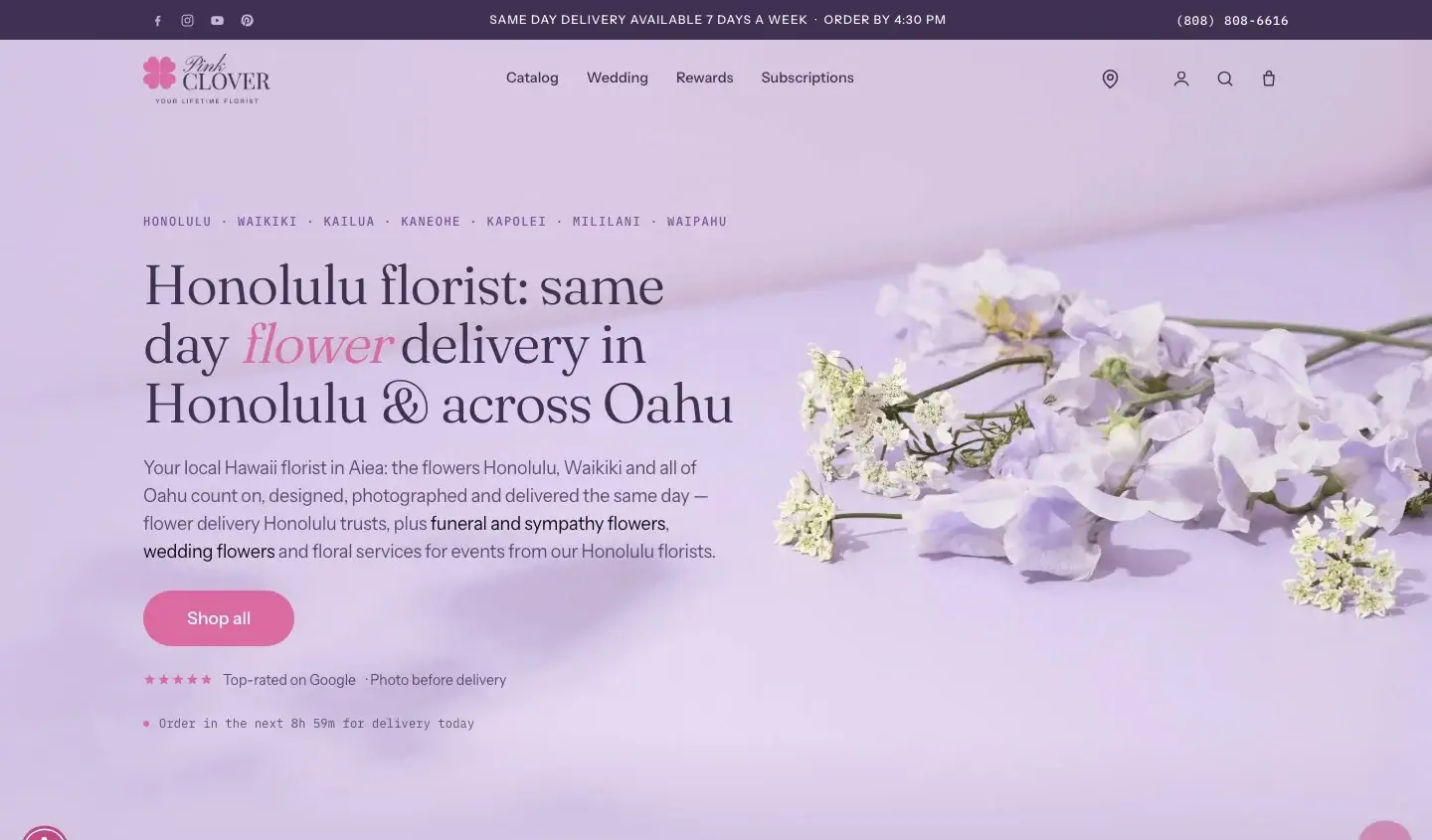
The headline on the example page reads “Honolulu florist: same day flower delivery in Honolulu & across Oahu”. Above it, a single line lists the towns the shop serves, from Waikiki to Kaneohe. As a result, a visitor from Kailua knows within two seconds that the page is meant for them.
Write your own headline the same way: place first, service second. Save the clever tagline for a spot further down the page.
2. Put the deadline where nobody can miss it
For any same-day service, the cut-off time is the most important fact on the page. The example shows it twice. First, the top bar says “Order by 4:30 PM”. Then, under the main button, a live line counts down the hours and minutes left to order for delivery today.
One detail matters here. The countdown runs on the shop’s clock, not the visitor’s. A buyer in New York therefore sees the real time left in Hawaii. If you build a similar timer in JavaScript, pass an explicit time zone when you read the current time. Otherwise, the browser uses the visitor’s own zone and shows the wrong deadline.
3. Offer one main button
The first screen has one filled button, “Shop all”. Everything else is plain text or a small link. Because of that, the eye has only one place to go.
Many local pages make the opposite mistake. They offer “Call”, “Book”, “Get a quote” and “Learn more” side by side. Instead, pick the action that brings in the most business and give it the only strong color.
4. Collect the hard facts in one block
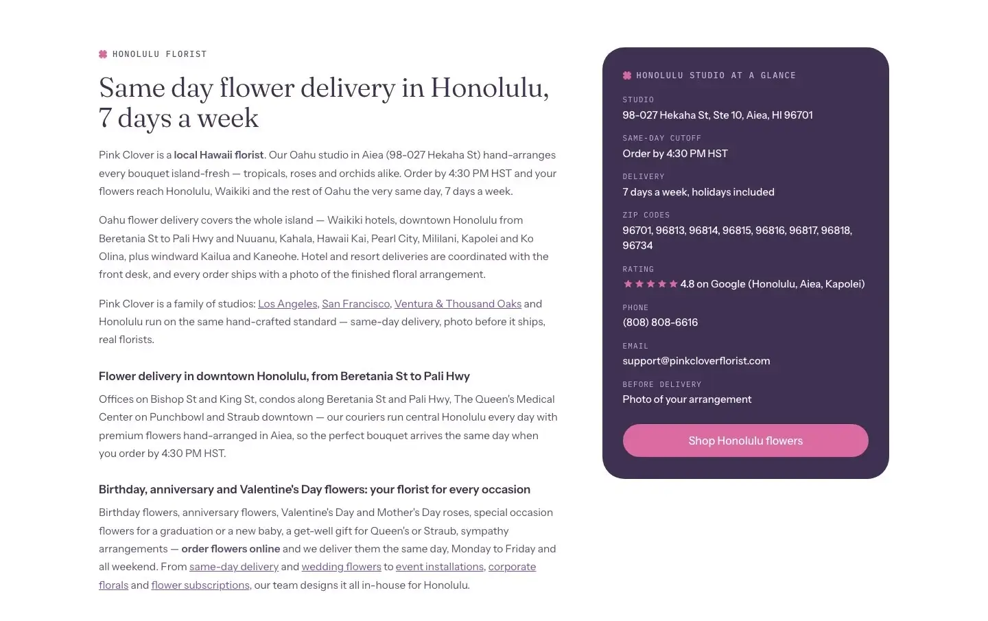
Further down, a dark card titled “Honolulu studio at a glance” lists the street address, the same-day cut-off, the delivery days, the ZIP codes, the rating, the phone number and the email. Nothing in it is marketing copy. A visitor who wants to check one fact finds it there in a second.
In addition, search engines and AI assistants pull exactly this kind of data when they describe a business. Therefore, keep the block identical to your Google Business Profile and repeat it in LocalBusiness structured data. The example page uses the Florist type, which is a more specific version of the same schema.
5. Show proof that people can check
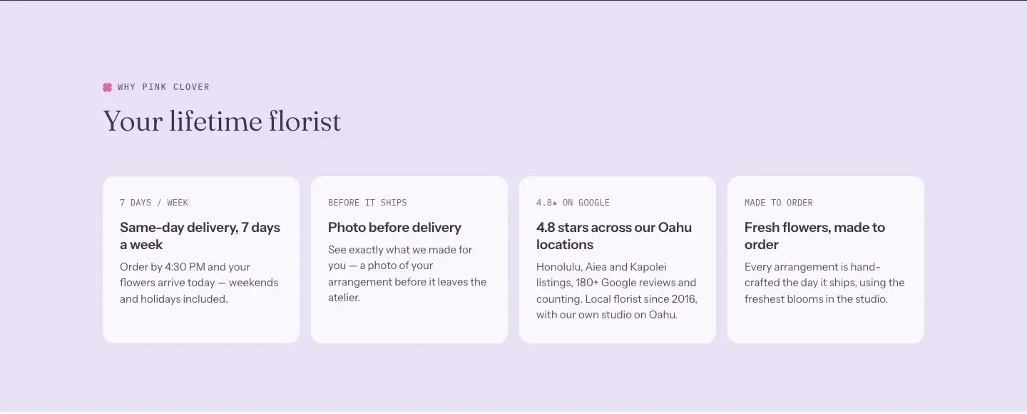
The page then gives four reasons to order, and a visitor can verify each one. Delivery runs seven days a week. The shop sends a photo of the arrangement before it leaves. The rating is 4.8 on Google, and the card states how many reviews stand behind it. Florists make every order on the day it ships. Compare that with the usual “best quality, great service” line, which tells the reader nothing.
The photo promise deserves a closer look, because it removes the main fear of buying something unseen. Most businesses have a step like it. For example, a contractor can send progress photos, and a bakery can show the cake before pickup. Find that step in your own process and put it on the page.
The same test applies to the reviews you show anywhere on your site: a named, dated review with a visible source does more than an anonymous quote. Our guide on where to put reviews on your website shows how to match each review to the page and the button it supports.
6. List the areas you serve in plain text
A map embed looks nice, but search engines read words. The example page names its neighborhoods and ZIP codes in text. It also mentions real places, such as the Waikiki hotels, The Queen’s Medical Center and the offices on Bishop Street. Those details show that the business actually works there.
However, be careful with a separate page for every suburb. Build one only when you have something specific to say about that area. Otherwise, a single strong city page works better than twenty thin copies.
7. Answer questions before the phone rings
The page ends with questions written the way customers ask them. Examples include “What time should I order for same-day delivery?”, “Can I choose a delivery time?” and “Will I see the bouquet before delivery?”. Each one opens a short answer.
To write your own list, open your inbox and your call notes. Then copy the ten questions you answer most often, in the customers’ words. An accordion built with the HTML details element keeps the section compact. Finally, add FAQ structured data so that search engines can read the pairs.
8. Design for the phone first
Most local searches happen on a phone, often minutes before the purchase. So check the page on a small screen before you approve it on a monitor. On the example page, the phone number is a tap-to-call link, and the main button is large enough for a thumb.
Also, compress your images. A slow page loses the visitor who is standing in a parking lot with one bar of signal.
A checklist you can reuse
- City and service in the main headline.
- Deadline or opening hours near the top, in your own time zone.
- One primary button.
- Address, phone, hours and service area in a single facts block.
- Proof with numbers and a named source.
- Service areas written out as text.
- Frequent questions in the customers’ words.
- A test on a real phone before launch.
None of this needs a special theme or an expensive plugin. Any WordPress theme or page builder can produce every element above. The real work lies in deciding what a visitor needs first, and then putting it there.