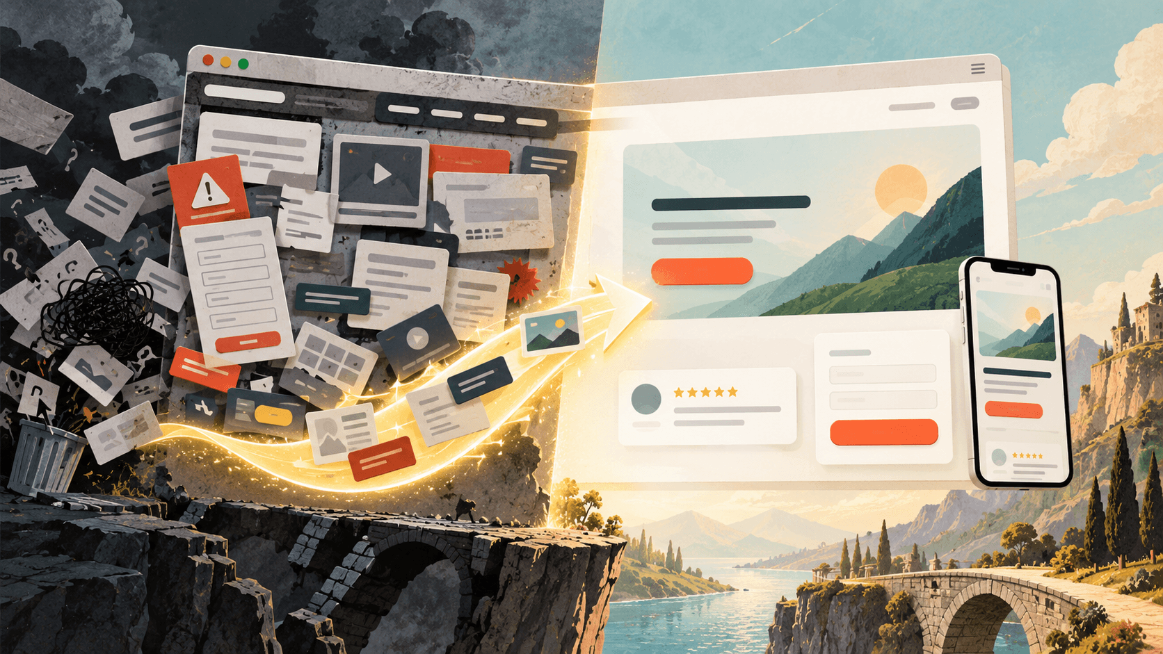
You paid for the click. The visitor arrived. Then they left within seconds, and nothing in your analytics explains why. That is the quiet cost of landing page design mistakes. The page loads, the brand colors look right, the team approved the mockup, and the form still sits empty. Most of the time the problem is not the traffic and not the product. It is a handful of design decisions that ask the visitor to work harder than they are willing to.
This guide covers the five mistakes that do the most damage to a landing page conversion rate, why each one hurts, and what to change. Every fix applies to a page you already have, whether it runs on WordPress, a page builder or an AI landing page tool.
Short answer: the five landing page design mistakes that cost the most conversions are an unclear hero section, too many competing actions, proof that sits far from the decision, forms that ask for too much too early, and layouts built for a desktop mockup instead of a phone. Fix them in that order, because a visitor who does not understand the offer will never reach your form.
Table of contents
- Why Good-Looking Landing Pages Still Lose Visitors
- Mistake 1: A Hero Section That Makes Visitors Decode the Offer
- Mistake 2: Too Many Exits and Competing Calls to Action
- Mistake 3: Proof That Sits Too Far From the Decision
- Mistake 4: Forms That Ask for Commitment Before Earning It
- Mistake 5: Designing for the Desktop Mockup Instead of the Phone
- Landing Page Mistakes at a Glance: Symptoms, Tests and First Fixes
- Score the Page Before It Goes Live
- What to Fix First When Several Things Are Wrong
- What Is a Good Landing Page Conversion Rate, and Other Questions Worth Asking
Why Good-Looking Landing Pages Still Lose Visitors
A landing page has one job: get a specific person to take a specific action. Good design helps only when it serves that job. When it competes with it, good design loses money.
The window for a first impression is brutally short. Research from Nielsen Norman Group on how long users stay on web pages found that the first 10 seconds decide whether most visitors stay or leave. In that window, nobody reads your page. They scan it for three answers. Is this what I was looking for? Is it worth my time? What do I do next?
Every mistake below breaks at least one of those answers. That also explains why fixes that look tiny in a design file, like a rewritten headline, a moved testimonial or one fewer form field, often move results more than a full redesign.
It helps to calibrate expectations too. Across more than 41,000 landing pages and 57 million conversions, Unbounce’s Conversion Benchmark Report put the median conversion rate at 6.6%, with wide gaps between industries. If your page sits well below the median for your sector and the traffic is relevant, design is the first place to look.
Mistake 1: A Hero Section That Makes Visitors Decode the Offer
The hero section is everything a visitor sees above the fold before scrolling. It is where most landing pages lose the most people, usually because the headline tries to sound clever instead of clear.
“Reimagine the way you work” could sell project software, office chairs or a coaching program. Picture someone who clicked an ad for free invoice templates for freelancers and lands on that line. They have to stop and figure out whether they are in the right place. Many will not bother.
The second version of this mistake is broken message match. Your ad, email or search result made a promise. The landing page headline should repeat that promise in nearly the same words. When the ad says “30-day free trial” and the page opens with brand philosophy, the visitor feels a small jolt of doubt, and doubt is the opposite of conversion.
The third version is complicated language. The same Unbounce research found that pages written at a fifth to seventh grade reading level converted at a median of 11.1%, compared with 5.3% for pages written at a college level. Plain words do not cheapen your value proposition. They remove the effort it takes to understand it.
How to fix it: write the headline as the outcome the visitor wants, in the words they would use. Compare “Smarter Financial Solutions” with “Get Your Small Business Taxes Filed On Time, Without the April Panic.” The second one tells the right reader they found the right page. Use the subheadline to say who the offer is for and how it works in one sentence. Pair it with a visual that shows the actual product, result or service, not a stock photo of people smiling at laptops.
Then run a five-second test. Show the hero section to someone who has never seen it, hide it after five seconds, and ask what the page offers. If they cannot answer, rewrite before you touch anything else on the page.
Mistake 2: Too Many Exits and Competing Calls to Action
Every link on a landing page is a door. Navigation menus, footer links, social icons, a “learn more” link to the blog, a second offer in the sidebar. Each one gives the visitor a reason to leave before doing the one thing you built the page for.
Conversion specialists call this the attention ratio: the number of things a visitor can click compared with the number of goals the page has. A homepage with 40 links is normal. A paid campaign landing page with 40 links has 39 leaks.
Competing calls to action cause the same damage from inside the page. “Book a demo,” “Start free trial,” “Download the guide” and “Talk to sales” stacked in one hero ask the visitor to make a decision you should have made for them. When everything is highlighted, nothing is.
How to fix it: pick one primary call to action per page. You can repeat it several times as the visitor scrolls, but it should always ask for the same thing. Remove the main navigation on paid traffic pages, or reduce it to the logo. Make the CTA button the highest-contrast element on the screen, and use Visualmodo’s color explorer to check how a button color reads against the rest of your palette, including its accessibility contrast. Write button copy that states the outcome instead of the mechanism. “Get my free template” beats “Submit” because it reminds people what they are about to receive.
There is one honest exception. If the page is built to rank in organic search and work as an evergreen resource, stripping all navigation can hurt both the visitor experience and your internal linking. In that case, keep a slim header, but still make sure one primary action dominates visually.
That visual dominance comes from hierarchy, not from louder colors or bigger arrows. Event producers solve the same problem when they guide hundreds of guests through a venue without anyone feeling lost, and how event designers think about wayfinding and empty space translates surprisingly well to landing page layouts. Generous white space around the CTA, one dominant headline size and a clear top-to-bottom reading path do more work than any flashing badge.
Mistake 3: Proof That Sits Too Far From the Decision
Most landing pages include some social proof. The mistake is where it lives and what it says.
A row of client logos at the very bottom of a long page does nothing for the visitor hesitating at the form near the top. Testimonials like “Great service, highly recommend!” signed by “John D.” read as filler, or worse, as invented. A “Trusted by 10,000+ customers” badge on a product that launched last month invites exactly the skepticism it was meant to remove.
Trust gets built at the moment of doubt. Visitors hesitate at predictable spots: right after the price, right before the form and right next to the button. That is where proof earns its place on the page.
How to fix it: place your strongest testimonial or result directly beside or below the primary CTA. Choose testimonials that name a specific outcome, and include a real name, role, company or photo whenever the customer agrees to it. Answer the most common objection in a single line next to the form, such as “No credit card required” or “We reply within one business day.” Add privacy reassurance where people type personal details.
If your business is new and proof is thin, say so with confidence instead of inflating numbers. A clear guarantee, a short note from the founder or a transparent “how it works” section builds more credibility than a counter nobody believes.
Mistake 4: Forms That Ask for Commitment Before Earning It
A form is a negotiation. Every field is a small price the visitor pays. Ask for name, email, phone, company, job title, team size, budget and “how did you hear about us” in exchange for a PDF, and most people will decide the trade is not worth it.
The number of fields is only part of the problem. Other common friction points include asking for sensitive information too early (a phone number for a newsletter), vague labels, placeholder text that disappears as soon as someone starts typing, error messages that only appear after submission, and a button that gives no hint of what happens next.
How to fix it: list every field and ask one blunt question. What changes in our follow-up if we do not collect this? If the answer is “nothing,” delete the field. For high-value offers that genuinely need more information, split the form into two short steps and ask for the easiest details first, because people who have already started are more likely to finish. Keep labels visible above the fields, validate inputs as people type, and tell visitors what happens after they click, such as “You’ll get the checklist by email in two minutes.”
Then check what happens after a successful submission. A form that works on the front end can still fail quietly behind it: notification emails that land in spam, leads that never reach the CRM, conversion tags that stop firing after a theme change. Mapping the workflows that tend to break after a website launch before your page goes live protects the conversions you worked so hard to earn.
Mistake 5: Designing for the Desktop Mockup Instead of the Phone
Most landing pages get approved on a large monitor and visited on a phone. In Unbounce’s 2024 data, 82.9% of landing page visitors arrived on a mobile device, yet desktop visitors still converted at a slightly higher average rate. That gap is where mobile design mistakes hide.
The usual suspects are easy to spot once you look for them. A hero image pushes the headline and CTA below the first screen. Body text is too small to read without zooming. Buttons sit so close together that thumbs hit the wrong one. A pop-up covers the entire screen. A phone number field opens the full keyboard instead of the number pad.
Speed belongs in this conversation too. Phones on mobile networks punish heavy pages: oversized hero images, autoplay video, a stack of tracking scripts and chat widgets that load before the content does. Google’s Core Web Vitals give you concrete targets. A good experience means the largest element loads within 2.5 seconds, the page responds to taps within 200 milliseconds, and the layout stays stable while it loads, with a Cumulative Layout Shift of 0.1 or less. Layout shift is especially costly on landing pages, because a button that jumps just as someone taps it sends them somewhere they never meant to go.
How to fix it: design the mobile landing page first and expand to desktop, not the other way around. Keep the headline, one supporting line and the CTA visible on the first phone screen. Make tap targets large enough for a thumb, set input types so phones show the right keyboard, and replace full-screen pop-ups with small banners that close easily. Compress and correctly size images, delay scripts that do not affect the first screen, and test on a real mid-range phone over a normal connection, not only in your browser’s device preview. If you build on WordPress, the principles in this guide to mobile-first WordPress design apply directly to campaign pages.
Landing Page Mistakes at a Glance: Symptoms, Tests and First Fixes
Use this table as a quick diagnostic. Start with the symptom you see in your analytics, then run the test before you change anything.
| Mistake | What you see in the data | Quick test | First fix |
|---|---|---|---|
| Unclear hero section | High bounce rate and very short time on page | Five-second test with someone outside your team | Rewrite the headline as a specific outcome that matches the ad or search query |
| Competing calls to action | Clicks spread across many links, few on the main button | Count every clickable element above the fold | One primary CTA, with navigation removed or reduced for paid traffic |
| Distant or weak proof | Visitors reach the form, then leave | Check what sits within one screen of each CTA | Move a specific, attributed testimonial next to the button |
| Form friction | Many form starts, few submissions | Complete the form on a phone and time it | Delete fields that do not change your follow-up and add inline validation |
| Desktop-first layout | Mobile conversion far below desktop | Load the page on a mid-range phone over mobile data | Put the headline and CTA on the first phone screen, then fix load time and layout shift |
Score the Page Before It Goes Live
The cheapest time to fix a landing page is before it receives paid traffic. Once a campaign is running, every day with a confusing hero or a leaking form costs real money, and A/B tests on a low-traffic page can take weeks to produce a reliable answer.
A short pre-launch routine catches most of these problems:
- Read only the headline, subheadline and button text. Do they explain the offer without the rest of the page?
- Compare the first line of the page with the ad, email or search result that sends people to it.
- Count the exits and confirm that one primary action clearly stands out.
- Check that proof and objection handling sit within one screen of every CTA.
- Submit the form on a phone, then confirm the lead arrived where it should.
After that, get a review that does not come from the people who built the page. Teams grow blind to their own work, which is why an automated check makes a useful final gate. PageKiss’s pre-launch scorer reviews a landing page across credibility and conversion signals such as structure, clarity, SEO and E-E-A-T, and points out what is limiting performance while changes are still cheap. Treat any score, automated or human, as a list of hypotheses to check rather than a final verdict. Real visitor behavior always has the last word.
What to Fix First When Several Things Are Wrong
Most underperforming pages have more than one of these problems at once. Fix them in the order a visitor experiences them. Clarity comes first, because someone who does not understand the offer never gets as far as your testimonials. Focus comes next, then trust, then form friction, then the technical layer of speed and mobile layout.
There is one exception to that order. A page that takes eight seconds to load on a phone jumps straight to the top of the list, because nobody judges a headline they never see. If your scores are poor, start by learning how to improve your PageSpeed Insights results on WordPress before you rewrite a single word.
Resist the urge to start with button colors. Color tests are popular because they are easy to run, not because they matter most. A clearer headline or a shorter form usually does more for conversion rate optimization than any shade of orange.
When you do run A/B tests, change one meaningful element at a time and wait for enough conversions to trust the result. On a page with modest traffic, a test that ends after three days usually measures noise. If your traffic is too low for reliable testing, make the changes your diagnostic points to, then compare results across similar periods while keeping seasonality and campaign changes in mind.
Most landing page best practices come down to the same idea. A high-converting landing page is rarely the product of one brilliant trick. It is the result of removing small reasons to leave, one at a time, until the easiest thing left to do is say yes.
What Is a Good Landing Page Conversion Rate, and Other Questions Worth Asking
Unbounce’s 2024 benchmark data puts the median across industries at 6.6%, but the spread is wide. SaaS pages tend to sit lower, while some categories convert well above 10%. A more useful benchmark is your own page over time, compared against the median for your industry and traffic source. Email traffic usually converts much better than cold paid traffic.
The biggest ones are unclear headlines that do not match the ad, too many links and competing calls to action, weak or badly placed social proof, long forms, and layouts that break or load slowly on phones. Together they explain most of the conversions lost on otherwise good offers.
For paid campaign pages, usually not, or only a logo. Every extra link is a way out. For pages designed to rank in organic search, a slim header can help visitors and search engines understand the site, as long as one primary action still dominates.
As long as the decision requires. A free newsletter signup can work in a single screen. A high-ticket service or B2B software page often needs more sections to answer objections. Length only hurts when it delays the CTA or buries the answer the visitor came for.
Only the fields that change what happens next. For newsletters and downloads, an email address is often enough. Sales inquiries commonly use three to five fields. If you truly need more, split the form into two steps.
Place the primary CTA above the fold on desktop and on the first screen on mobile. Then repeat it after each major section so visitors never have to scroll back up to act.
Start with behavior data. A high bounce rate with very short sessions points to the hero section. Lots of clicks on secondary links point to a focus problem. Form starts without submissions point to friction. A large gap between mobile and desktop conversion points to layout or speed. Heatmaps and session recordings will confirm what the numbers suggest.