Picture a logo animation that looks lovely on a laptop: a soft gradient, a subtle lens flare, the wordmark easing in from the left. Now load it onto a 3D hologram fan in a shop window. The gradient lights the whole disc into a hazy circle, the flare turns into a smudge, and the wordmark sits inside a glowing blob that nobody on the sidewalk looks at twice.
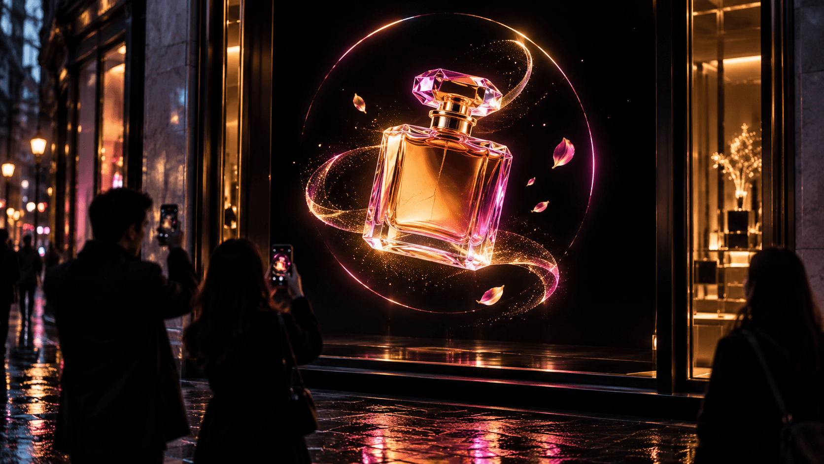
Now picture the rebuild, which takes about an afternoon. Pure black background. The client’s product, say a perfume bottle, rendered in 3D and turning slowly. Nothing else. This is the version that makes people outside stop with their phones up, trying to work out how a bottle can float behind the glass.
Same hardware, same window. The only difference is the design.
The short version: build hologram fan content on a square canvas with a pure #000000 background, keep one bright subject inside a circular safe zone, move it slowly, use saturated color and heavy type, and export a 10 to 15 second MP4 at the fan’s native resolution.
Hologram fan content follows different rules from web or screen design, because the display has no screen, no corners and no background. Below, you’ll find why each rule works, the hologram fan video specs most models expect, where to place the fan, how to test and film it, and a pre-flight checklist to run before every upload.
Table of contents
- How a 3D Hologram Fan Works: Your Canvas Is a Circle of Light
- Six Design Rules for Hologram Fan Content
- Hologram Fan Video Specs: Size, Format, Frame Rate and Loop Length
- Where You Place a Hologram Fan Changes What You Design
- Designing Across a Multi-Fan Hologram Wall
- Choosing a Hologram Fan: LED Density, Brightness and Size
- Test in the Room, and Through a Phone Camera
- Reusing the Product Renders and Brand Assets You Already Have
- Pre-Flight Checklist Before You Upload
- Why the Extra Effort Pays Off
- Hologram Fan Video Formats, Loop Length, Filming and Safety
How a 3D Hologram Fan Works: Your Canvas Is a Circle of Light
A 3D hologram fan, also sold as a holographic fan or LED hologram display, is a set of spinning blades lined with LEDs. Each LED switches on and off at precise points in the rotation, and because the blades move faster than the eye can follow, persistence of vision blends those flashes into one floating image. Anything the LEDs don’t light stays empty, so the viewer sees straight through it.
It isn’t a hologram in the scientific sense. There’s no laser and no recorded interference pattern, only a fast, well-timed light show. The illusion is strong enough that most passers-by read it as one, though, and that illusion is what you’re designing for. If you want the hardware side in more depth before you open your motion software, Holofex’s explainer on how 3d hologram fans create a floating picture is a quick, useful read.
The mechanics rewrite a few rules most of us take for granted in web and screen work. There’s no background color, because there’s no screen. There are no corners, because the blades sweep a circle. And brightness, rather than pixel count, is often the first thing viewers notice.
One more detail most guides skip: the fan draws in rings, not a grid. Near the center, the LED positions sit close together. Toward the rim, the same number of positions is spread around a much longer circumference, so fine detail softens at the edge. On many models, the motor hub also sits at the dead center. That’s why the strongest hologram fan design puts the subject in the middle band of the disc and keeps tiny details away from both the hub and the rim.
Six Design Rules for Hologram Fan Content
Each rule below follows from how the fan physically draws light, so breaking one shows up the moment your file plays on the real display.
Rule 1: Black Means Air, So Use True #000000
Treat #000000 as transparency. Every truly black pixel is a gap the viewer sees straight through, and that’s what sells the float. Near-black is a trap. A background at #0a0a0a or a dark vignette lights the LEDs just enough to show a faint disc, and the object stops floating and starts sitting on a dim plate.
Check your exports in a levels or histogram view. The background should sit hard against zero. Kill film grain, noise, soft shadows and glow falloff that bleed into the background, because each of them lights LEDs you meant to leave dark.
If a test still shows a faint disc even though your comp is pure black, check the export itself. A full versus limited color range mismatch between your encoder and the fan’s player can lift black to a dark gray. Re-export, then inspect a frame of the final MP4, not just the timeline.
Rule 2: One Hero Subject With Room Around It
The strongest hologram content has one subject. A shoe, a logo, a mascot, a bottle. Give it room around the edges so the viewer’s eye reads it as an object in space instead of a picture in a frame. If you’re tempted to add a tagline, a price burst and a second product, make three separate loops and let the playlist rotate them.
Rule 3: Design for the Circle and Its Safe Zone
Most fans take a square video, but only the circle inscribed inside it is visible. Anything in the corners disappears. Build a circular safe zone into your artboard template and keep critical content well inside it, since the outermost ring is where the image is least detailed.
A reusable template saves time on every project. Set up a square comp at the fan’s native resolution, add a circle guide layer that doesn’t render, and draw an inner ring at roughly 80% of the diameter as a starting point for anything critical, such as text, faces and logos. Add a small marker at the center to remind you where the hub sits, then adjust both guides after your first test on the real fan.
Rule 4: Use Slow Motion to Show Depth
The floating object feels three-dimensional when motion and lighting tell the eye it has volume. Slow rotation is the classic move for good reason. A 3D render turning through 360 degrees, with a key light that shifts across its surfaces, reads as solid in a way a flat logo never will. A full turn every six to ten seconds is a calm starting point that you can tune after testing.
Keep camera moves minimal. The fan is the camera. Fast cuts and strobing effects fight the way the image is built and tire viewers out quickly. Strobes are also an accessibility problem in a public window: the W3C’s guidance on flashing content draws the line at three flashes in any one second and treats saturated red flashes as a special risk. It was written for screens, but a bright display at eye level in a mall or at a trade show is exactly the place to respect it.
Rule 5: Give Color Room to Glow
Saturated color looks spectacular on a fan: deep reds, electric blues, clean greens. Dark, muddy tones do the opposite, because dark on this medium simply means dim. If the brand palette leans navy or charcoal, lift it for the hologram version. The client will forgive a brighter navy much sooner than an invisible one.
The same logic that makes neon colors stand out on dark backgrounds applies here, except that on a fan the dark background is literally empty air. Use pure white for highlights rather than large fills, since big white areas can look harsh and flatten the form you worked to model.
Rule 6: Go Big and Bold With Type
Thin weights break up as they spin. Use heavy weights, generous tracking and short words. Two or three words at a time is plenty. If the message needs a paragraph, it belongs on a sign next to the display.
When you shortlist a typeface, filter for heavy display and sans serif families first; Visualmodo’s web fonts browser lets you sort by category before you commit. Keep text horizontal and near the center rather than curving it along the rim, where detail is weakest.
Hologram Fan Video Specs: Size, Format, Frame Rate and Loop Length
Specs vary by model, so the manufacturer’s manual always wins. The defaults below draw on manufacturer spec sheets and product listings. Treat the frame rate and loop length as starting points to test on your own fan, not hard rules.
| Setting | What to use | Why it matters |
|---|---|---|
| Canvas | Square, 1:1 | The fan reads a square file and shows only the circle inside it. |
| Resolution | The native figure on the fan’s spec sheet | Budget models often list sizes such as 512 x 512 or 640 x 640. Upscaling past native adds file weight, not detail. |
| File format | MP4 video, with H.264 as the safest codec; PNG or JPG for stills | These are the formats most fan apps accept without conversion. |
| Background | #000000, verified in the exported file | Any value above zero lights the LEDs and reveals the disc. |
| Frame rate | 25 or 30 fps unless the maker says otherwise | The fan redraws at its own rotation rate, so higher frame rates rarely add smoothness. |
| Loop length | 10 to 15 seconds per message | Passers-by give a window a few seconds, and makers commonly suggest this range. |
| Loop point | First and last frames match | A visible jump breaks the floating illusion. |
| Flashing | No more than three flashes per second | Comfort and accessibility in public spaces. |
Upload methods depend on the model: a microSD card, a phone app over Wi-Fi, or an HDMI input on some commercial units. Whatever the route, keep your master file and the upload copy separate, so a quick re-export never overwrites your source.
Where You Place a Hologram Fan Changes What You Design
Like any form of digital signage that pulls in foot traffic, a holographic display only works when people see it from the right distance and angle. Know the placement before you design, because it changes how big the subject should be and how bright the palette needs to run.
The effect is strongest from the front. Viewers far off to the side see a squashed image and, at steep angles, the blades themselves, so aim the fan at the main walking line rather than into the shop. Bigger discs read from farther away: a small fan suits a counter or reception desk, while a window facing a busy street usually needs a larger unit or a multi-fan wall.
What sits behind the fan matters as much as what plays on it. A dark backdrop makes black read as empty air, while a bright wall or direct sun washes the image out. If the window catches afternoon sun, run your test at that hour, not first thing in the morning.
Plan for safety from the start. The blades spin fast, so in any space where people can reach the fan, mount it out of reach or fit the manufacturer’s protective cover. Most fans aren’t weatherproof, so outdoor use needs a sheltered enclosure, and some makers recommend a rest period after long continuous runs. Check the duty cycle in the manual before you promise a client a 12-hour window display.
Designing Across a Multi-Fan Hologram Wall
Some commercial fans can be synced so several discs show one large image. Design the master at the combined size, then split it across the units with the maker’s software. Treat the gaps between discs like the gutter on a printed spread: keep faces, text and the product’s key feature away from them, and let motion travel across the wall instead of sitting on a seam.
Choosing a Hologram Fan: LED Density, Brightness and Size
Good design gets you most of the way. The hardware decides how much of that detail survives.
Four specs matter most when you compare models. LED count, often listed as resolution, sets how crisp curves and small serifs look. Brightness, quoted in cd/m², decides whether saturated colors hold up under shop lighting. Diameter sets viewing distance. And for public spaces, check whether the model takes a protective cover, how content gets uploaded, and whether units can be synced into a wall.
Compare LED count against diameter, not LED count alone, because the same number of LEDs spread over a bigger disc gives coarser detail. The range is wide. A budget 42 cm fan on one wholesale marketplace lists 224 LEDs, while Holofex lists 1280 LEDs on its 65 cm HoloU65 Ultra and quotes LED brightness of up to 2800 cd/m², which it describes as up to four times brighter than its entry-level models. At the higher density, curves stay smooth and the fine highlights on a glossy product render survive the trip from After Effects to the air, and the extra brightness is what keeps carefully chosen reds red in a shop window at midday.
Editor’s note: Holofex, an Australian company founded in 2021, is used here as a reference because it publishes LED counts and brightness figures for its models. Visualmodo has no commercial relationship with Holofex and received nothing for this mention. The numbers above are the manufacturers’ own specifications.
Test in the Room, and Through a Phone Camera
Your monitor is lying to you about this medium. Load a draft onto a real fan as early as you can, and view it in conditions close to the final venue. Stand where shoppers will stand. Walk past at normal speed. Look from off to the side. You’ll catch problems that no preview window will show you, like a gradient that glows, an edge that crowds the rim, text that breaks up as it turns, or a loop that’s too long for a passer-by.
Then film it the way your audience will. People point their phones at hologram fans, and phone cameras don’t capture the whole frame at once. A rolling shutter scans the sensor line by line, so a spinning display can show stripes, gaps or half an image. Check your loop through two or three different phones. For your own promo footage, use a camera or app that lets you lock a slower shutter speed, around 1/30 or 1/50 of a second, so each frame catches a complete image.
Reusing the Product Renders and Brand Assets You Already Have
Web and ecommerce teams usually own more usable material than they realize. 3D product renders from a WooCommerce or Shopify catalog are a head start. So are brand marks in vector form and mascot rigs from social campaigns. Strip the backgrounds to pure black, center the subject, add a slow turn, and you have a first draft of your hologram fan content.
If your product shots are photos rather than 3D renders, the same cutout tools behind AI product images give you a clean subject to drop onto black. A flat cutout won’t rotate convincingly, so animate it with a slow push-in, a light sweep across the surface or a gentle float instead of a turn.
For the build itself, Blender (free), Cinema 4D and After Effects all handle a square comp and a turntable render. Most fan makers also ship a companion app, and some, such as Holofex with its Studio and AI Holo Lab tools, generate hologram-ready loops, which is handy when there’s no motion designer on the job.
Pre-Flight Checklist Before You Upload
Run this list on every file before it goes on the fan.
- The background reads 0, 0, 0 in the exported MP4, not just in the comp.
- There’s one hero subject, centered and inside the inner safe ring.
- Nothing important sits on the hub or along the rim.
- Colors are lifted and saturated, with no large dark or muddy areas.
- Type uses a heavy weight, two or three words per screen, set horizontally.
- Motion is slow, with no rapid cuts and no more than three flashes per second.
- The loop runs 10 to 15 seconds and joins without a visible jump.
- The file is square, at native resolution, tested on the real fan in venue lighting and filmed with a phone.
Why the Extra Effort Pays Off
Get the design right and the result is striking: a bright, sharp object suspended in the air, turning slowly, with nothing around it. People slow down, lean closer and try to find the trick, and then they film it. For a designer, it’s a rare chance to make work that people physically walk toward.
Hologram Fan Video Formats, Loop Length, Filming and Safety
Most hologram fans play MP4 files, and H.264 is the safest codec to export. Many also accept PNG or JPG stills. Check the manual for your model, because some budget fans only read files converted through their own companion app.
Export a square 1:1 file at the native resolution on the fan’s spec sheet. Budget models often list sizes such as 512 x 512 or 640 x 640, while denser commercial fans go higher. Upscaling past the native size adds file weight without adding detail.
Something in the background is not true black. Near-black fills, vignettes, film grain, soft glows or a color range mismatch in the export all light the LEDs slightly. Check a frame of the final MP4 in a histogram and make sure the background sits at zero.
No. A hologram fan is an LED display on spinning blades that relies on persistence of vision, while a true hologram records a light interference pattern. The fan creates a convincing floating illusion, which is why the content design matters so much.
For shop windows and trade show booths, 10 to 15 seconds per message works well, because most passers-by only give a display a few seconds. Rotate several short loops in a playlist rather than building one long video.
Phone cameras use a rolling shutter that scans the frame line by line, so they catch the spinning blades mid-sweep. Filming with a slower shutter speed, around 1/30 or 1/50 of a second, usually captures a complete image.
They are when installed correctly. The blades spin fast, so mount the fan out of reach or fit the manufacturer’s protective cover, keep it away from rain and moisture, and follow the maker’s guidance on continuous running time.