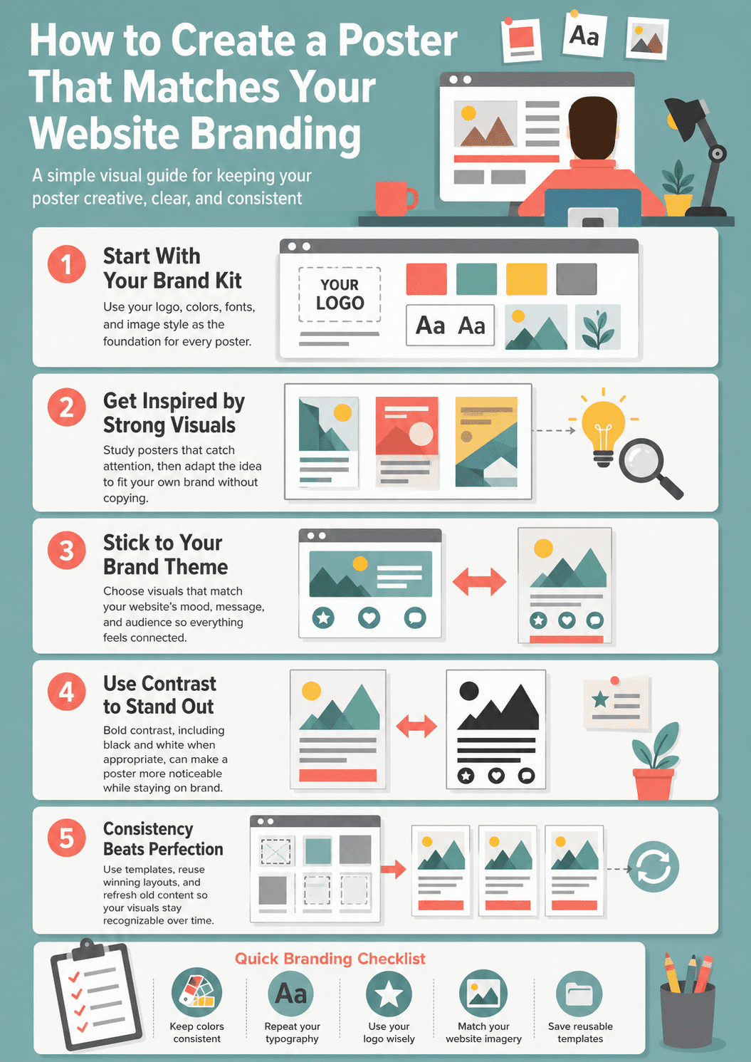
Know how to easily create a poster that matches your website branding; A brand is one of the most important assets in the business world because it represents your company and also the message you want to spread. Next to branding, you have consistency – people love clear and consistent branding because they can easily identify it no matter the context.
Step One Before You Design Anything: Extract Your Brand Assets
The most common reason branded posters look slightly off is not poor design skill. It is working from memory rather than working from the actual numbers. Before you open any poster design tool, spend five minutes gathering the three things that define your visual identity: your exact color codes, your fonts, and your logo file.
Finding your brand’s hex color codes
Every color you see on your website is defined by a six-character hex code. To find yours, install the free ColorZilla browser extension for Chrome or Firefox. Once installed, hover over any color on your website and click to get the exact hex code. Do this for your primary brand color, your secondary color, your background, and your text color. Write these codes down or paste them into a notes file.
Alternatively, open your browser’s developer tools (right-click anywhere on your site and select “Inspect”), click on any colored element, and look for the color value in the CSS panel on the right. Both methods give you the precise six-character code you can enter into any design tool to match your colors exactly.
Identifying your website’s fonts
Open your website and use the free WhatFont browser extension or simply right-click on any text, select “Inspect,” and look for the “font-family” property in the CSS. Most professional websites use fonts from Google Fonts, which are free to use in any design tool. Note your heading font and your body font.
Getting your logo in the right format
For poster design, you need your logo as an SVG or high-resolution PNG with a transparent background. SVG scales to any size without losing quality, which makes it ideal for print. If you only have a JPG version of your logo, it will show a white rectangle behind it on colored backgrounds. Ask your web developer or designer for an SVG version, or find it in your brand assets folder.
Once you have your hex codes, font names, and logo file ready, you can create a branded poster in any tool without second-guessing a single design choice.
Why Brand Consistency Matters Across Every Visual
And if you want to create a poster for one of your campaigns (or any other visuals, for that matter); you must make sure it is consistent with your website branding. However, it can be difficult to keep being both creative and consistent after a few dozen marketing visuals.
To boost, we have a few tips on how to create a poster that can still stand out without losing consistency.
The Best Online Poster Makers for Brand-Consistent Design in 2026
Knowing your brand assets is half the job. The other half is choosing the right tool to work with them. Here are the most widely used poster design tools for businesses, with an honest breakdown of when each one makes sense.
Canva
Canva is the dominant online poster maker with over 170 million registered users. Its standout feature for branded design is the Brand Kit, available on Canva Pro and Canva for Teams. The Brand Kit lets you upload your logo, save your hex color codes, and store your fonts so they are available in every template with one click. Canva has thousands of poster templates and a drag-and-drop interface that requires no design experience. For most small businesses and marketing teams, Canva is the right starting point.
Adobe Express
Adobe Express (formerly Adobe Spark) offers a similar template-based workflow with the added advantage of deep integration with Adobe’s creative ecosystem. If your team already uses Photoshop or Illustrator, Adobe Express makes it easy to pull in assets from Creative Cloud. The brand kit feature is available on the paid plan. The templates are generally more refined than Canva’s, making it a good fit for brands with a more premium aesthetic.
PosterMyWall
PosterMyWall is specifically built for event and promotional poster design and has the largest library of niche-specific templates in this category: concerts, school events, restaurant promotions, fitness classes. If your poster has a specific event or promotional purpose, PosterMyWall’s template library will have something much closer to what you need than a general design tool.
Visme
Visme positions itself as a full visual content platform covering posters, infographics, presentations, and social graphics. It has strong data visualization tools built in, which makes it a better choice than Canva if your poster includes charts, statistics, or structured data alongside branding.
GIMP
GIMP is a free, open-source image editor that gives you professional-level control over every element of a poster design. The learning curve is steeper than any of the tools above, but for designers who need pixel-level precision or who want to avoid subscription costs, GIMP is a fully capable alternative to Photoshop for poster creation.
| Tool | Free Plan | Brand Kit | Best For |
|---|---|---|---|
| Canva | Yes (limited) | Pro plan | Most businesses, beginners, templates |
| Adobe Express | Yes (limited) | Paid plan | Adobe ecosystem users, premium brands |
| PosterMyWall | Yes (watermark) | Paid plan | Event and promotional posters |
| Visme | Yes (limited) | Paid plan | Data-heavy branded content |
| BeFunky | Yes (limited) | No | Photo-based artistic effects |
| GIMP | Fully free | No | Advanced users, no-subscription option |
Get Inspired by Established Visuals
Visuals surround us, so why not use some of the ones that have already proved successful as inspiration?
Let’s take the Barack Obama “Hope” poster as an example. To catch the public’s attention, the artist turned a normal portrait photo into a powerful symbol of hope by removing the detail from the image and reducing everything to a mesmerizing contrast of blue, beige (white), and red.
so, by using the colors of the American flag, the artist remained consistent with the branding and the message (so to speak).
If you feel inspired by this image, check out this guide from BeFunky to learn how to use the technique for your posters. To keep in line with consistency, you can use your brand’s colors or insert your company’s logo in the visual.
But make sure you use this type of imagery as inspiration only to avoid infringing on any creators’ rights!
How to Design a Branded Poster in Canva: A Step-by-Step Walkthrough
Canva is the most accessible starting point for poster design for business, and its Brand Kit feature is specifically built to solve the brand consistency problem this article addresses. Here is how to create a poster that genuinely matches your website from start to finish.
Step 1: Set up your Brand Kit
Create a free Canva account at canva.com. If you are on Canva Pro or Teams, go to Brand Hub in the left sidebar and click “Add a brand.” Upload your logo, enter your hex color codes in the color palette section, and add your brand fonts by name. On the free plan, you can still add colors manually to any design, but the Brand Kit automates this across every template.
Step 2: Choose the right poster dimensions
Click “Create a design” and either search for “Poster” in the template search or enter custom dimensions. Standard poster sizes include:
For print: A4 (210 x 297 mm), A3 (297 x 420 mm), A2 (420 x 594 mm), or the US standard 18 x 24 inches and 24 x 36 inches. For digital use: 1080 x 1920 pixels (Instagram Stories or vertical social), 1080 x 1080 pixels (square social media), or 1200 x 628 pixels (Facebook and LinkedIn feed).
Choose the dimensions based on where you intend to publish or print the poster. Starting with the correct dimensions avoids resizing issues later.
Step 3: Choose a template and apply your brand colors
Browse Canva’s poster templates and choose one whose layout matches your content structure: text-heavy, image-forward, event-focused, and so on. Once you have selected a template, click on each colored element and replace it with your brand hex codes. Work through every element systematically: background, headline, accent color, button or CTA element.
If you have set up a Brand Kit, your brand colors appear at the top of the color picker with a single click.
Step 4: Apply your brand fonts
Click on each text element and change the font to your brand’s typeface. Use your primary brand font for headlines and your secondary font for body text. If you only have one brand font, use different weights (bold for headlines, regular for body) to create hierarchy without adding a second typeface.
Step 5: Place your logo correctly
Upload your logo SVG or transparent PNG using the “Uploads” panel. Place it in the poster according to the convention for your brand: top-left for a traditional brand mark placement, bottom-center for a supporting brand signature, or prominently centered if the poster is primarily a brand awareness piece. Keep the logo clear of busy backgrounds and ensure it has enough surrounding space to remain legible.
Step 6: Export in the correct format
For digital use, export as a PNG at the default resolution. For social media, Canva handles the resolution automatically. For professional print, export as a PDF (Print) with “Crop marks and bleed” enabled if your print vendor requires it. Avoid exporting print posters as JPG, as the compression reduces quality at large print sizes.
Define and Protect Your Visual Theme
Your poster must fit with the brand’s general theme. Otherwise, it will feel out of place. To reap all the benefits of consistency, you must start your company and branding with a theme in mind.
So, what’s yours? If you’re not sure yet, check out big brands’ visuals and see how it makes you feel. Nike, for instance, uses adventure through movement as a theme; while Apple is all about making you feel special through technology. decide what feelings; and emotions you want to create in someone who sees your visuals and sticks with them.
Use Black & White
It might seem strange, but these days, black and white images can help you stand out from the crowd by creating a poster that matches your website branding! When everyone is working with color images; a black and white poster will be extremely easy to spot (even while absently browsing your feed).
And of course, this means you won’t be able to rely on your brand’s colors to maintain consistency; but you still have the theme, the logo, and other visual elements that make part of your branding strategy.
So, black and white images seem to work well on social media platforms like Instagram, where the feed is often filled with vivid images. On a side note, Instagram is an amazing platform for businesses because it gives you access to a diverse, global audience.
Balance Creative Freshness with Brand Consistency
Every business owner wants to have a unique branding strategy that immediately separates them from the crowd and places them as the authority figure in the niche. But when you have standards this high, it’s easy to get stuck and lose your creativity altogether.
So, when you are in a creative rut, remember that consistency is important. Your content posting should also be consistent, not just your brand visuals. You can use templates or even refresh old posts for times like these.
Typography Rules for Branded Poster Design
Typography is one of the most powerful brand consistency signals in any visual, and one of the most frequently mishandled elements in poster design. The rules are simple and apply across every tool and every project.
Use a maximum of two font families
Professional poster designers rarely use more than two typefaces in a single piece. One for headlines, one for supporting text. Using three or more font families in a poster creates visual noise and makes the design feel amateurish, regardless of how good the individual fonts are.
If you only have one brand font, use weight variation to create hierarchy. A bold 84-point headline and a regular 18-point body text in the same typeface create clear visual distinction without introducing a second font family.
Choose complementary pairings, not competing ones
The most reliable font pairing principle is contrasting categories: a serif headline with a sans-serif body, or a display font for the headline with a clean geometric sans-serif for the supporting text. Avoid pairing two decorative or two serif fonts together, as they fight for attention.
Font Pair is a free resource that shows tested combinations specifically for Google Fonts, which are the same fonts most websites use. If your website uses Google Fonts, you can find a proven pairing for your existing typeface in under two minutes.
Match font weight to information hierarchy
Every element in a poster has a job: the headline captures attention, the subheading explains the context, the body text provides the detail, and the call to action tells the viewer what to do next. Each level should be visually distinct through size, weight, or color, not all three simultaneously. Using bold, large, and bright red for every text element removes the hierarchy you are trying to create.
A practical starting point: headline at 60 to 100 points bold, subheading at 24 to 36 points medium or regular, body text at 14 to 18 points regular, call to action at 18 to 24 points bold with a contrasting color or background.
Poster Sizes, File Formats, and Print Versus Digital
One of the most common points of confusion in poster design for business is the technical output side. The right answer depends entirely on where the poster will be used.
Standard poster dimensions
- Print posters follow either metric ISO sizes (A4, A3, A2, A1, A0) or US standard sizes (11 x 17 inches, 18 x 24 inches, 24 x 36 inches). The most common choice for in-store or event posters is A3 or 18 x 24 inches. For outdoor or large-format display, A1 or 24 x 36 inches is standard.
- Digital posters should be sized to the platform where they will appear. A 1080 x 1920 pixel vertical format covers Instagram Stories, TikTok, and Pinterest. A 1200 x 628 pixel horizontal format works for Facebook, LinkedIn, and Twitter feed posts. A 1080 x 1080 pixel square works universally across most social platforms.
Print resolution: always 300 DPI
For any poster intended for print, design at 300 DPI (dots per inch). Designing at 72 DPI, the standard for digital screens, and then sending the file to a printer produces blurry, pixelated output at physical sizes. Most design tools let you set the resolution at the start of a project. Always set 300 DPI before you begin working on a print-intended poster.
RGB versus CMYK color modes
Screens display color using the RGB (Red, Green, Blue) model. Printers use CMYK (Cyan, Magenta, Yellow, Key/Black). Colors that look vivid on screen, particularly bright blues and greens, can appear duller when printed in CMYK. If your poster will be professionally printed, ask your print vendor whether to deliver files in RGB or CMYK and set your design to that color mode from the start.
Canva designs in RGB by default. Adobe Express and GIMP both allow you to switch to CMYK. For most office or home printing, RGB is acceptable. For commercial print runs, CMYK is the industry standard.
Choosing the right file format
- PNG: Best for digital use and for files that will be embedded on websites or in presentations. Supports transparency, which is important if your poster has a non-rectangular shape or a transparent background.
- JPG: Acceptable for digital use where file size matters. Avoid for print because JPG compression reduces quality at large physical sizes. Never use JPG for a file that will be enlarged.
- PDF (Print): The professional standard for files going to a commercial printer. Preserves all design elements at full quality, supports embedded fonts, and handles bleed marks correctly. Export as PDF when sending to a print vendor.
- SVG: The best format for vector elements like logos and illustrations. SVGs scale to any size without quality loss and are ideal for web use. Most poster tools do not export full poster designs as SVG, but logos should always be sourced as SVG before placing them into your poster.
Six Branded Poster Mistakes That Undermine Consistency
Understanding what to do is useful. Knowing what actively works against your brand consistency saves even more time.
- Using off-brand colors “just this once.” It is tempting to reach for a brighter or more contrasting color when a design feels flat. But every off-brand color choice teaches your audience that your brand does not have reliable visual rules. The fix is to use your brand color at a different weight or opacity rather than reaching for a new color entirely.
- Too many fonts. Three or more typefaces in a single poster signal that no one made a deliberate typographic choice. Pick one or two and create hierarchy through size and weight instead.
- Ignoring white space. Beginners tend to fill every part of a poster with content. White space is not wasted space: it directs the viewer’s eye to the most important element and makes the design feel confident and professional. If your poster feels crowded, remove something rather than shrinking everything.
- Using a low-resolution or raster logo. Placing a small JPG logo into a large print poster and scaling it up produces a blurry, pixelated brand mark that damages perception of your brand. Always use SVG or high-resolution PNG for logo placement.
- Designing for print at screen resolution. Creating a poster at 72 DPI and then sending it to a printer is one of the most common costly mistakes in poster design for business. The output looks fine on your screen and terrible at physical size. Set 300 DPI at the start of any print project.
- Overloading with text. A poster is a glance medium. If reading your poster takes more than five seconds, it contains too much text. Strip your message to the single most important thing you want viewers to remember and let the design carry everything else.
Frequently Asked Questions About Poster Design and Brand Consistency
The right poster size depends entirely on where it will be used. For standard office or event print use, A3 (297 x 420 mm or approximately 11.7 x 16.5 inches) is the most common choice. For larger display or wall posters, A2 (420 x 594 mm) or the US standard 18 x 24 inches are widely used. For digital display on social media, the recommended sizes are 1080 x 1920 pixels for vertical formats (Instagram Stories, TikTok) and 1080 x 1080 pixels for square social feeds. Always decide where the poster will appear before you choose dimensions, because resizing a completed design rarely produces clean results.
Start with a high-quality template from a tool like Canva or Adobe Express and replace only the colors, fonts, images, and text with your own brand assets. Most amateur poster mistakes come from starting with a blank canvas. A good template provides the layout logic, spacing, and hierarchy. Your job is to apply your brand consistently to that structure. Stick to two fonts, use your exact brand colors rather than approximations, and leave more white space than you think you need.
Canva’s free plan is the most capable free option for most businesses. It includes thousands of poster templates, supports custom colors and font uploads within individual designs, and exports in PNG and PDF formats. The Brand Kit feature that saves your colors, fonts, and logos automatically requires a Canva Pro subscription, but for occasional poster creation the free plan is sufficient. GIMP is the most powerful completely free option but has a steeper learning curve suited to users with some design background.
The most reliable method is to extract your exact brand assets before you begin. Install the ColorZilla browser extension to get the precise hex codes of your website colors. Use WhatFont or your browser’s developer tools to identify the fonts your website uses. Obtain your logo as an SVG or high-resolution transparent PNG. Enter these exact values into your poster design tool rather than choosing similar colors or fonts by eye. The smallest color discrepancy is visible when your poster and your website are seen together, and it signals inconsistency even to viewers who could not identify why something looks slightly wrong.
For digital use, save as PNG for the highest quality with the smallest file size impact. For professional print, always save as PDF (Print) rather than JPG. JPG compression degrades image quality at the large physical sizes required for printing, and the degradation becomes particularly visible in text edges and fine details. When submitting to a commercial printer, ask whether they require PDF with crop marks and bleed, as most professional print vendors do.
One or two font families is the professional standard for poster design. Use your primary brand font for the headline and, if needed, a complementary secondary font for body text and supporting information. If you only have one brand font, use different weights (bold, regular, light) to create visual hierarchy without introducing a second typeface. Using three or more font families in a single poster makes the design feel cluttered and unfocused, regardless of how individually attractive each font is. The goal of typography in a poster is to guide the viewer’s eye in a clear sequence, and fewer font choices make that sequence more obvious.
Consistent Branding Compounds Over Time
A single branded poster will not define how your audience perceives your business. But fifty branded posters, all using the same colors, the same fonts, the same logo placement, and the same visual logic, add up to a recognizable identity that people can spot before they read a single word.
The work of setting up your brand assets once in a tool like Canva’s Brand Kit pays back every time you create something new. The hex codes are already there. The fonts are already loaded. The logo is already uploaded. Each new poster takes a fraction of the time of the first one, and it looks exactly right because the decisions have already been made.
That is what brand consistency actually means in practice: not straining to be creative within constraints, but building a system that makes consistency the default and creativity the layer you add on top.
For a deeper look at how color choices shape your brand’s perception across every touchpoint, the guide to color theory in branding and design on this site is worth reading alongside your poster project. And if you are building or refining the website your poster needs to match, the professional web design workflow guide covers the design decisions that make brand extraction straightforward.
Infographic